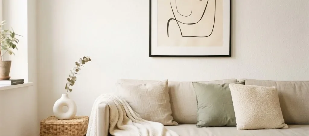
I grew up in a house where most of the furniture was somebody else’s castoffs, and the walls were either completely bare or covered in the kind of random, mismatched stuff that just accumulates over years. Neither felt good. Bare felt unfinished. Cluttered felt noisy. It took me a long time decorating rentals, small apartments in particular, to figure out that the answer was almost never “add more.” It was almost always “add less, but put it in the right place.”
That’s exactly what minimalist wall art is. It isn’t a style you have to be committed to across your whole apartment. It’s just a way of treating a wall that makes a room feel calmer, more deliberate, and more like yours. And the good news is that it’s one of the most budget-friendly approaches to decorating there is, because it almost always means buying fewer things.
Here’s everything I’ve learned about doing it well, whether you’re working with a blank rental wall, a small bedroom, or a living room that just needs to breathe a little.
Why Minimalist Wall Art Creates a Calmer Room
Before we get into specific ideas, it helps to understand what’s actually going on when a minimalist wall “works.” The answer is a design principle called negative space. In art and interior design, negative space is the intentional empty area around a focal point. It’s not emptiness for lack of ideas. It’s emptiness that gives your eye a place to rest. When there’s a lot going on on a wall, your brain keeps moving, scanning, processing. When there’s one considered piece with breathing room around it, your brain can actually settle.
This matters a lot in small apartments and rentals, where rooms are already doing multiple jobs and where surfaces tend to accumulate stuff naturally. A wall that stays calm is one of the most effective ways to make the whole room feel more peaceful, even if the rest of the space is imperfect.
The minimalist approach also works for almost any decor style.
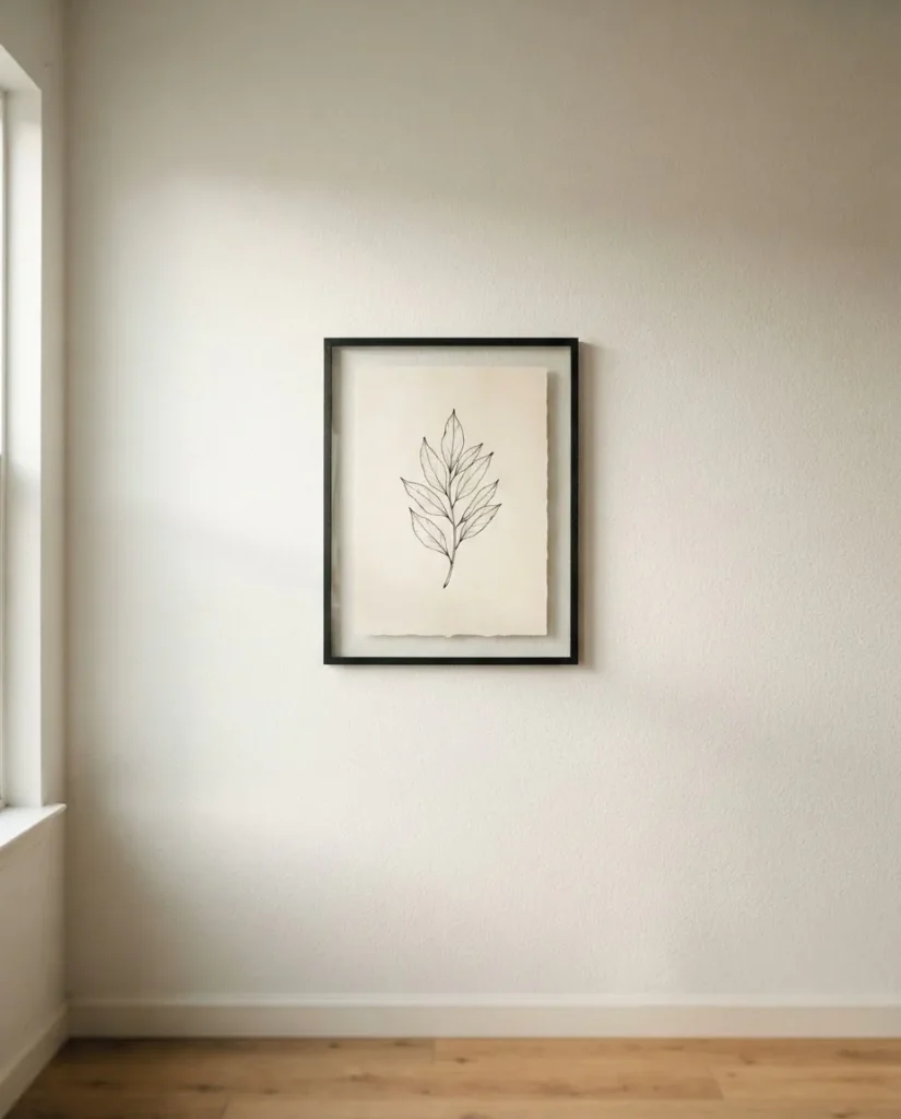
A single framed abstract line drawing works in a modern apartment. A soft botanical print works in a cottagecore or Scandinavian-inspired room. A black and white photograph works in a loft or a studio. The art style itself can vary, but the principle stays the same: give it space to breathe.
How to Choose the Right Size Art (and Stop Going Too Small)
The single most common mistake I see in rental and small-apartment styling is choosing art that’s too small for the wall. One tiny 8×10 frame hung alone on a big wall doesn’t read as minimalist. It reads as lonely and unfinished. Minimalist wall art should feel intentional and confident, which means the scale has to be right.
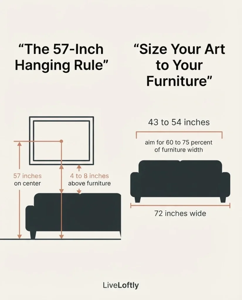
Here’s a simple rule to use as a starting point: artwork hung above a piece of furniture should be roughly 60 to 75 percent of the width of that furniture. So if your sofa is 72 inches wide, you want art that spans somewhere between about 43 and 54 inches. That might mean one large piece, or it might mean two or three pieces hung together as a simple cluster with consistent spacing between them.
For a single statement piece with no furniture below it, think about the wall itself. A piece that’s roughly half to two-thirds the width of the wall gives it presence without overwhelming the room. A complete wall art size guide breaks this down by room type if you want to get more precise before buying.
For reference, common large-format print sizes that work well as statement pieces in living rooms and bedrooms are 18×24, 20×24, and 24×36 inches. These sizes are widely available from online print shops and are usually affordable when you’re buying an unframed print or a simple digital download.
The 57-Inch Rule: Where to Actually Hang It
This is the rule I wish someone had told me on my first apartment move-in day. It would have saved me from patching a lot of holes in the wrong places.
The standard hanging height for art is 57 to 60 inches from the floor to the center of the piece. This aligns with the average human eye level and is the standard used in most professional galleries. The reason it matters is that art hung too high disconnects from the rest of the room. It floats up near the ceiling, unrelated to the furniture and the people in the space. Art at 57 inches, on the other hand, feels like it belongs to the room.
Apartment Therapy’s guide to the 57-inch rule walks through the exact math step by step, which is helpful the first time you do it. The short version: measure 57 inches up from the floor, mark it lightly in pencil, then figure out where the hook needs to go based on how far your wire or hanging hardware sits from the top of the frame. It takes about five minutes once you understand it.
One adjustment worth knowing: when art hangs above furniture, the bottom of the frame should sit about 4 to 8 inches above the top of that piece. This keeps the art visually connected to the furniture rather than floating away from it.
For rooms where people are mostly sitting, like a living room with a sofa, staying closer to 57 inches works well. For rooms where people are mostly standing, like a hallway or entryway, you can go a little higher, up to about 65 inches on center, and the art will still feel at eye level.
23 Minimalist Wall Art Ideas Worth Trying
These are organized by approach rather than by room, because most of these ideas will work in multiple spaces. I’ll note where an idea is especially well-suited to a specific room.
The Single Statement Piece
1. One large abstract line drawing. A single large-scale line art print in black ink on white paper is one of the cleanest, most timeless looks you can put on a wall. It reads as artistic without demanding a lot from the room around it. Works beautifully in a living room above a sofa or in a bedroom above a dresser.
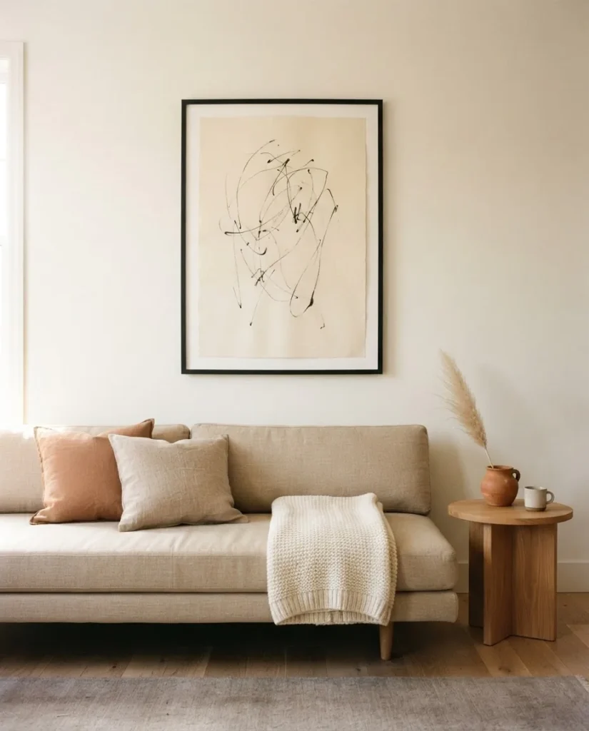
2. A single botanical print in a thin black frame. Choose something with a lot of white space in the composition itself, a single leaf on a cream background, a minimalist branch study, a simple flower in ink. The white space in the art doubles the breathing room effect.
3. One piece of black and white photography. A landscape with a lot of sky, an architectural study, or an abstract close-up of texture (stone, bark, water) in black and white keeps things calm and works with almost any color palette in the room.
4. A single canvas in a neutral wash. Abstract expressionist canvases that use pale wash techniques in warm white, warm gray, sand, or soft sage can anchor a whole wall. The texture of a canvas gives depth and warmth even when the color is nearly neutral.
5. An oversized typographic print. One meaningful word or a short phrase in a quiet, clean typeface. The key is restraint: one word, not a paragraph. One font, not a collage. A lot of open space in the composition itself.
Simple Clusters and Grouped Arrangements
6. Two matching prints, hung horizontally. Two identically framed prints of the same size, hung side by side with 2 to 4 inches of space between them, reads as a single cohesive unit. This is an easy way to fill a wider wall without going oversized on budget. Keep the frames identical, either both thin black or both thin natural wood.
7. Three small prints in a vertical line. Perfect for a narrow wall, a hallway, or the space beside a door. Three pieces of the same size (try 5×7 or 8×10) in matching frames, hung vertically with consistent 2 to 3 inch gaps, creates a quiet, organized moment that looks considered without being complicated.
8. A diptych (two-part art set). Some print shops sell two complementary pieces designed to be displayed together. This takes the guesswork out of pairing and almost always photographs as intentional and cohesive.
9. A triptych of abstract shapes. Three simple prints that each feature one geometric shape (circle, arc, rectangle) in the same muted color palette but different compositions. Hung in a row with consistent spacing, this reads as quiet, thoughtful, and modern.
10. A mix of one large and two small pieces. Place the large print in the center, hang one smaller piece on each side at a slightly lower or higher center point, keeping the overall group balanced. The rule here is that the visual center of the whole group should sit at 57 inches.
Renter-Friendly Approaches (No Nails Required)
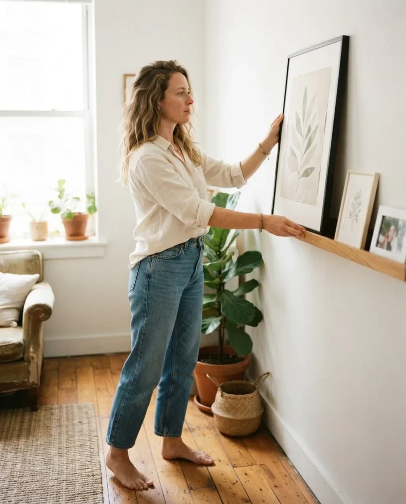
11. A leaning canvas or framed print. One of my favorite zero-damage options is simply leaning a large framed print or canvas against the wall on a shelf, a console table, a dresser, or directly on the floor. A large leaning piece (think 24×36 or bigger) looks intentional and gives a very modern, laid-back feel. This is especially good in bedrooms and living rooms.
12. An art ledge or picture rail with resting prints. IKEA’s MOSSLANDA picture ledge (among others) can be attached with adhesive strips rated for the weight, which we’ll cover in a moment, and lets you lean and swap prints freely without new holes every time you change your mind.
13. A tapestry or fabric wall hanging. A simple woven textile in neutral tones, cream, warm gray, pale tan, hung from a thin wooden dowel, adds texture and warmth to a wall without a single nail in the drywall. It brings in that soft, organic quality that a framed print can’t quite replicate.
14. An art poster hung with poster strips. A large, well-designed poster (movie art, travel photography, botanical illustrations) can look perfectly intentional when hung with good-quality adhesive poster strips and a simple frame. The key is the frame: even an inexpensive thin black frame completely changes how a poster reads.
15. Washi tape art installation. Geometric shapes, simple grids, or abstract line designs made directly on the wall with washi tape are fully reversible and can be removed without damage. This is a bolder option but absolutely renter-safe.
Using the Wall Itself as Part of the Design
16. One piece, deliberately off-center. In a small room, hanging a single piece slightly to one side of the wall rather than dead-center can feel more dynamic and intentional than perfectly centered. The negative space on the wider side becomes part of the composition.
17. Low-hung art. Hanging art lower than the standard 57 inches, like just above the floor on a very low console table, or sitting on a floating shelf rather than on the wall at all, is a deliberate stylistic choice that reads as modern and editorial when done intentionally.
18. Leave a wall intentionally blank. This one feels counterintuitive, but it’s something I’ve come to believe in. In a small space, one truly bare wall gives your eye a rest and makes the pieces on the other walls feel more meaningful. Choosing not to fill a wall is a minimalist move, not a lazy one.
Budget and DIY Ideas
19. Frame a free digital print. There are genuinely lovely free minimalist art prints available online for download. Artifact Uprising’s free printable wall art collection is one well-known source with clean, simple black-and-white designs. Print at a local print shop on good paper (cardstock or matte photo paper reads much better than regular printer paper), drop it in an inexpensive frame, and the result can look as good as something you paid $40 for.
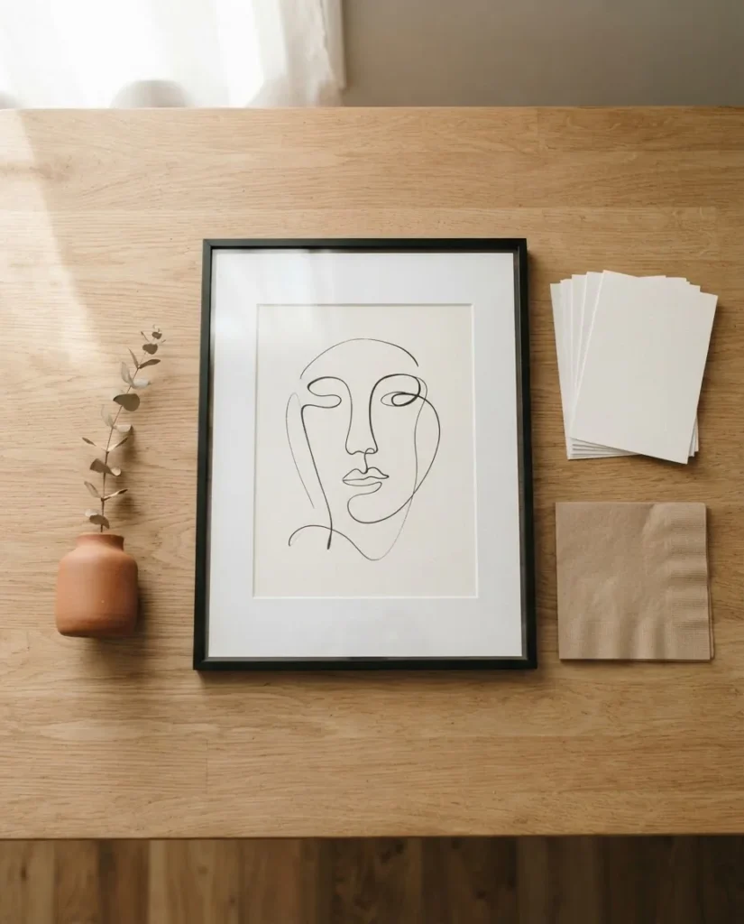
20. Thrift a frame, change the art. Thrift stores regularly have large frames in good condition at very low prices. The original art inside is often not the point. Strip it out, replace it with a digital print or a page from a beautiful art book, and you have a perfectly sized, well-proportioned framed piece for a few dollars.
21. Frame fabric or textured paper. A piece of linen fabric, a square of handmade Japanese washi paper, or a page torn from a large-format art book can be framed simply and look beautiful. The texture does the work. You don’t need a “real” print.
22. Create your own abstract. Simple abstract watercolor paintings are genuinely within reach for beginners. A wash of warm beige on watercolor paper, or a few overlapping circles in muted earth tones, can be framed and hung as original art. There’s no pressure for it to be technically perfect. Minimalist abstract art thrives on imperfection.
23. A framed piece of music or text. A page from a book you love, a piece of sheet music, handwritten words from a poem that matters to you, framed in a clean thin frame, is completely personal and costs almost nothing. It’s also something no one else has.
Picking the Right Frame for a Minimalist Look
The frame does a lot of heavy lifting here. The wrong frame can make a beautiful print look cheap. The right frame can make a free printout look intentional.
For a minimalist look, thin frames almost always work better than ornate ones. The most universally flattering options are thin flat black frames, thin flat white or off-white frames, and thin natural wood (light oak or birch) frames. These styles are available at almost every price point. A $10 black frame from a big box store with a simple matte print inside will look clean and considered.
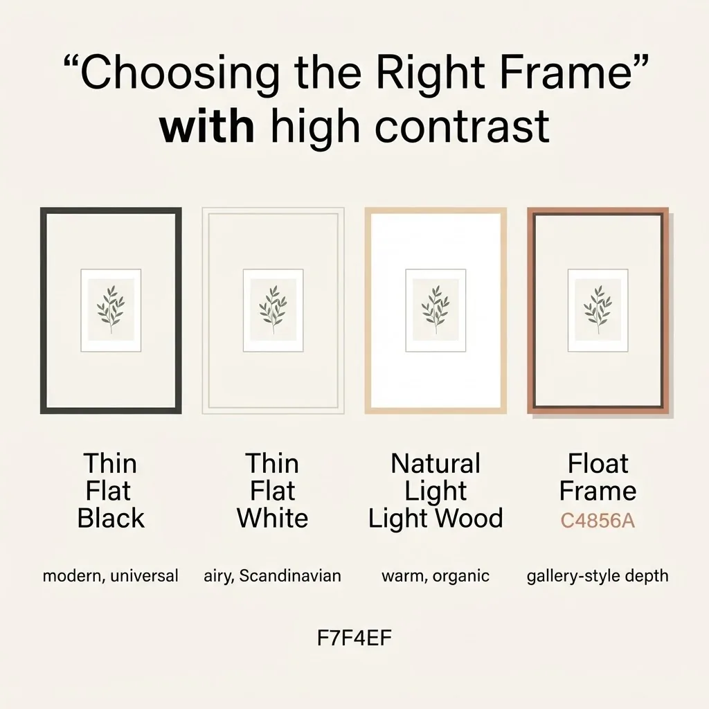
A $60 ornate gold frame with the same print inside will fight with it.
Floating frames (where the art appears to float inside the frame with a shadow gap around it) work beautifully for canvas prints and give even an inexpensive piece a high-quality gallery feel. These are worth the small price premium.
Matte boards matter too. A wide white mat around a small print gives it visual weight and importance without needing to go to a larger print size. An 8×10 print matted in a 16×20 frame looks far more intentional than the same print in a tight 8×10 frame.
Choosing Colors That Feel Genuinely Calm
The colors in minimalist wall art do a lot of the emotional work. Research on color psychology in art consistently finds that neutral-toned work in soft whites, warm grays, warm beiges, and muted earth tones reads as calm and creates a sense of visual rest. Color psychology in wall art is a real phenomenon worth understanding before you buy, because a print that is “technically minimalist” in subject matter but uses high-contrast, saturated colors can still feel visually busy in a room.
For a calm bedroom or living room, look for art in soft warm whites, warm charcoal, blush, sage, terracotta, warm caramel, and dusty blue. These colors sit quietly in a room without demanding attention. High-contrast black and white photography can work beautifully too, but choose images with a lot of open space in the composition itself, wide sky, open water, spare architecture.
Avoid neon or highly saturated pops of color if calm is your goal. Save those for accent pieces somewhere else.
Hanging Without Holes: The Renter’s Practical Guide
This is the part that keeps most renters from putting anything on the wall at all, which is a shame, because blank walls are one of the quickest ways a rental feels like a rental instead of a home.
The good news is that adhesive hanging products have gotten genuinely reliable. The key is understanding the weight limits and following the application instructions precisely. According to the official Command product weight limits guide, Command Large Picture Hanging Strips hold 4 lbs per pair, and using four pairs together holds up to 16 lbs, which covers a large framed canvas or a heavier metal-framed print with room to spare. Small strips hold 1 lb per pair. Medium strips hold 3 lbs per pair.
The mistakes that cause Command strips to fail are almost always application errors, not product failures: not cleaning the wall surface thoroughly before applying, not pressing the strips firmly for 30 seconds, hanging before the 60-minute bonding wait, or choosing a frame that is much heavier than the strips are rated for. Follow the instructions on the box and they work as described on surfaces that accept adhesive (painted drywall, smooth tile, glass). They do not work reliably on textured walls or fresh paint less than a week old.
For very heavy pieces (heavy framed mirrors, oversized canvases with thick wood stretchers), leaning is genuinely the better choice for renters. It’s not a compromise. It looks intentional and modern, and it keeps your deposit safe.
For a broader look at the negative-space philosophy that underlies why minimalist arrangements work so well, this perspective on negative space and how it functions in 2025 art trends is worth a read if you’re still figuring out your own eye.
Where to Find Affordable Minimalist Art Prints
You don’t need to spend a lot on minimalist art. Here’s where to look, organized roughly from free to worth-a-small-splurge:
Free: Free printable art sites and collections (look for black-and-white botanical illustrations, line art, and abstract compositions), Unsplash for high-resolution photography you can print yourself, and art out of old books from thrift stores and estate sales.
Under $20: Print-on-demand shops like Desenio, which sells clean Scandinavian-influenced posters and prints starting around $8 for smaller sizes, are consistently popular with renters and apartment decorators for exactly this reason. Society6 is another solid source for prints from independent artists, with a wide range of minimalist and abstract styles.
$20 to $50: Etsy has a huge inventory of digital download prints in minimalist styles (abstract line art, botanical illustrations, Japandi-inspired work). You pay for the file and print it yourself, which keeps costs low while still supporting an independent artist.
Worth the splurge (occasionally): A single well-made canvas print or a framed fine art print from a quality printer. This is the piece you center the wall around. Everything else can be budget. One good piece can anchor a whole arrangement.
A Few Things Worth Skipping
Since I try to be honest about what is not worth your money: skip “inspirational quote” prints unless the quote genuinely means something specific to you. These are the most overused category in rental decor and rarely age well. Skip cheap canvas sets sold as four-piece or five-piece coordinated groupings in box stores. The individual pieces are usually too small and the canvas quality is often thin and warped. Skip anything with super-saturated colors that “pops” if your actual goal is calm. It will fight with the room.
And skip the temptation to fill every wall. That is the opposite of minimalist, and it is also the quickest way to make a small space feel smaller.
Putting It Together: A Simple Starting Point
If you’re completely new to this and just want a place to start: pick your most-used wall, the one you see when you walk in or the one you look at most when you’re sitting down. Choose one piece that is appropriately sized (60 to 75 percent of the furniture width, or about half the wall width if there’s no furniture). Hang it at 57 inches on center. Give it breathing room on all sides. See how the room feels for a week.
Most of the time, that one deliberate piece does more for how a room feels than anything else you could add. The blank space around it isn’t emptiness. It’s the whole point.