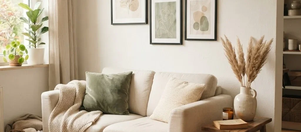
There is a specific feeling you get when you move into an apartment and the walls are just… white. Completely white. And empty. And no matter how much you tidy up the rest of the room, those bare walls make the whole space feel temporary, like you are camping in your own home instead of actually living there.
I have been there more times than I can count. Most of my adult life has been spent decorating rentals, and one of the first things I learned is that your walls do more work than almost anything else in a room. Fill them thoughtfully and the whole space clicks. Leave them bare and even a really nice sofa cannot save the vibe.
Here is the part that used to trip me up: I assumed good wall art cost a lot. It took a while to realize that beautiful, affordable prints are genuinely everywhere, and that making them look polished is mostly about how you choose, size, frame, and hang them, not about how much you paid. Most of the options in this guide are under $20, and several of them are free.
Let me show you how to do this well.
The Real Secret: Cheap Art Does Not Look Cheap. Cheap Framing Does.
Before we get into where to find the prints, I want to address the fear I hear constantly: “What if it just looks like cheap art?”
Here is what I have come to know after years of rental styling. The art itself is almost never the problem. A $3 botanical print from Etsy can look genuinely beautiful on a wall. A $150 print in a flimsy, off-brand frame can look like it came from a gas station. The frame, the sizing, and the way pieces relate to each other on your wall determine whether the result looks polished or thrown together.
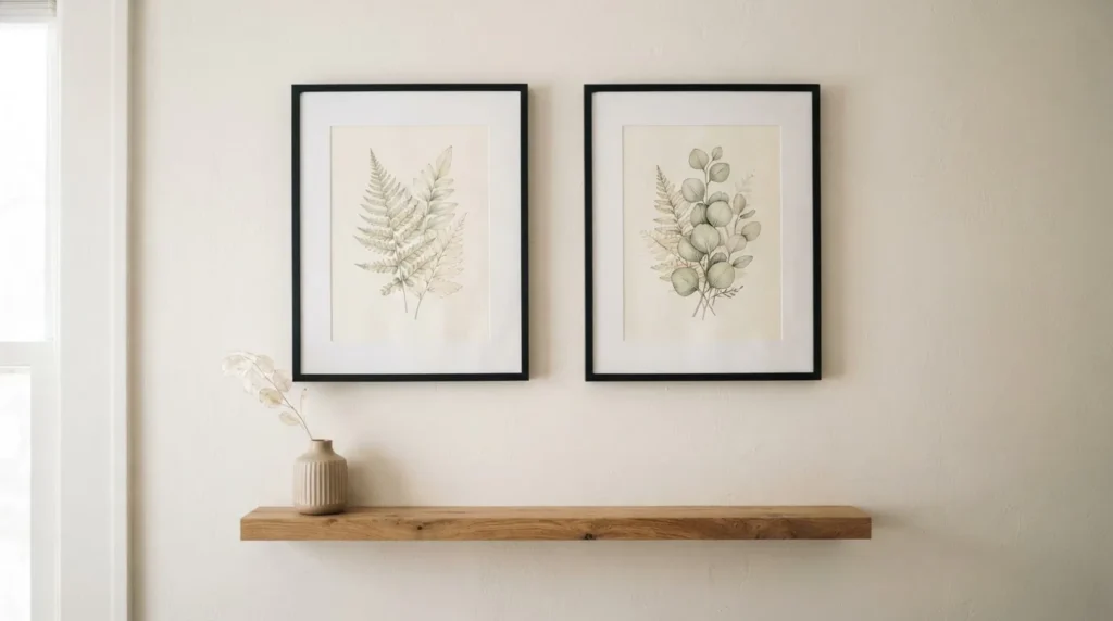
This is good news, because it means the budget part is the easy part. The artful part just takes a little intention.
What Counts as “Aesthetic” Wall Art (and Why It Matters to Pick a Direction)
Aesthetic” is the word a lot of younger renters use to mean art that has a cohesive, curated feel, art that matches a vibe rather than just filling space. Before you buy anything, it helps to have a rough sense of which direction feels like you, because mixing wildly different styles on one wall is the fastest path to a room that feels chaotic rather than calm.
Here are the five that come up most often in budget wall art searches:
Minimalist: Clean line art, simple botanical illustrations, black-and-white photography, neutral palettes. Works beautifully in small spaces because it adds presence without adding visual noise.
Boho: Earthy tones, arches, abstract organic shapes, warm terracotta and sand colors, moon phases, trailing plants. Forgiving of mix-and-match and very popular on Etsy in the under-$10 range.
Cottagecore: Vintage botanical prints, mushrooms, wildflowers, soft watercolor illustrations, slightly aged or antique-feeling imagery. A goldmine for free public-domain art (more on that below).
Coastal: Soft blue and white palettes, shells, simple ocean photography, sand dune illustrations. Very achievable with free nature photography.
Modern / Clean: Typographic prints, simple color-block shapes, abstract gestures in a neutral or two-tone palette. Great for living rooms and home offices.
You do not need to commit rigidly to one style. But having a general palette, say warm neutrals and botanical greens, gives your wall a reason to feel intentional even when the prints come from five different sources.
Where to Actually Find Cheap Aesthetic Wall Art (Under $20)
Etsy Digital Downloads
This is, honestly, where I would start for most people. Etsy has tens of thousands of digital art prints, typically in the $1 to $8 range, that you download as a high-resolution JPG or PDF file the moment you pay. No waiting for shipping, no minimum order, and many sellers offer their best designs in a variety of sizes so you can print at whatever scale fits your wall.
When you buy a digital download on Etsy, you get the file delivered directly to your Etsy account, and you can download it from your Purchases page. Etsy’s own help page walks through exactly how to access your files, which is helpful if this is your first time. From there, you take the file to a local print shop (Walgreens, CVS, FedEx Office, or Costco are all popular options) or print at home if you have a decent color printer. An 8×10 print at a Walgreens photo counter typically runs $2 to $4, which means your total investment including the digital file is often under $10 before framing.
What to look for when browsing Etsy for digital prints: check the resolution listed in the seller’s description. You want at least 300 DPI at your intended print size. Most reputable sellers list this. Also, read the reviews and look at buyer photos, not just the seller’s mockup, to get a realistic sense of color and detail.
Rawpixel’s Free Public Domain Art
This is one of the most underused resources in budget decorating. Rawpixel has an entire public domain section featuring digitally restored vintage art, botanical illustrations, Japanese woodblock prints, and fine art reproductions, all under CC0 license, meaning completely free to download and print for personal use. We are talking genuine quality, the kind of botanical prints that look like they came from a museum gift shop. Cottagecore people, this section was made for you.
Download, take to your local print shop, print at the size you need. Done.
Society6 and Redbubble Physical Prints
Both platforms print art by independent designers and ship physical prints, typically unframed. Society6 art prints generally start around $10 to $15 for an 8×10 and go up from there depending on size and finish. Redbubble has a similar range and often runs discount codes. The quality on flat paper art prints from both platforms is generally decent for the price, though not what you would call heirloom quality. For a rented apartment wall where you want something that looks good at normal viewing distance, either platform works fine.
One honest note: I have seen mixed reports on their canvas products specifically. Stick to the flat fine art paper or matte prints if you are shopping here on a budget.
Amazon Art Prints
Amazon’s wall art selection is enormous and the quality varies widely, but there is genuinely good stuff in the $8 to $18 range if you filter carefully. Read the actual buyer reviews, look at the photo uploads from real customers, and pay attention to listed dimensions. Many Amazon print listings are a bit deceptive about scale in their product photos. An 8×10 can look enormous in a well-staged mockup and then feel small on a real wall.
Target and IKEA
Both are worth checking when you want physical prints with no wait. Target’s art section carries framed prints in the $15 to $25 range, occasionally lower on clearance. IKEA’s BJÖRKSTA and PJÄTTERYD collections have large-format prints for under $20 unframed. IKEA is particularly good if you want something with scale, a large single print that reads from across the room, at a price that does not hurt.
Print Sizing: The Part Most People Get Wrong
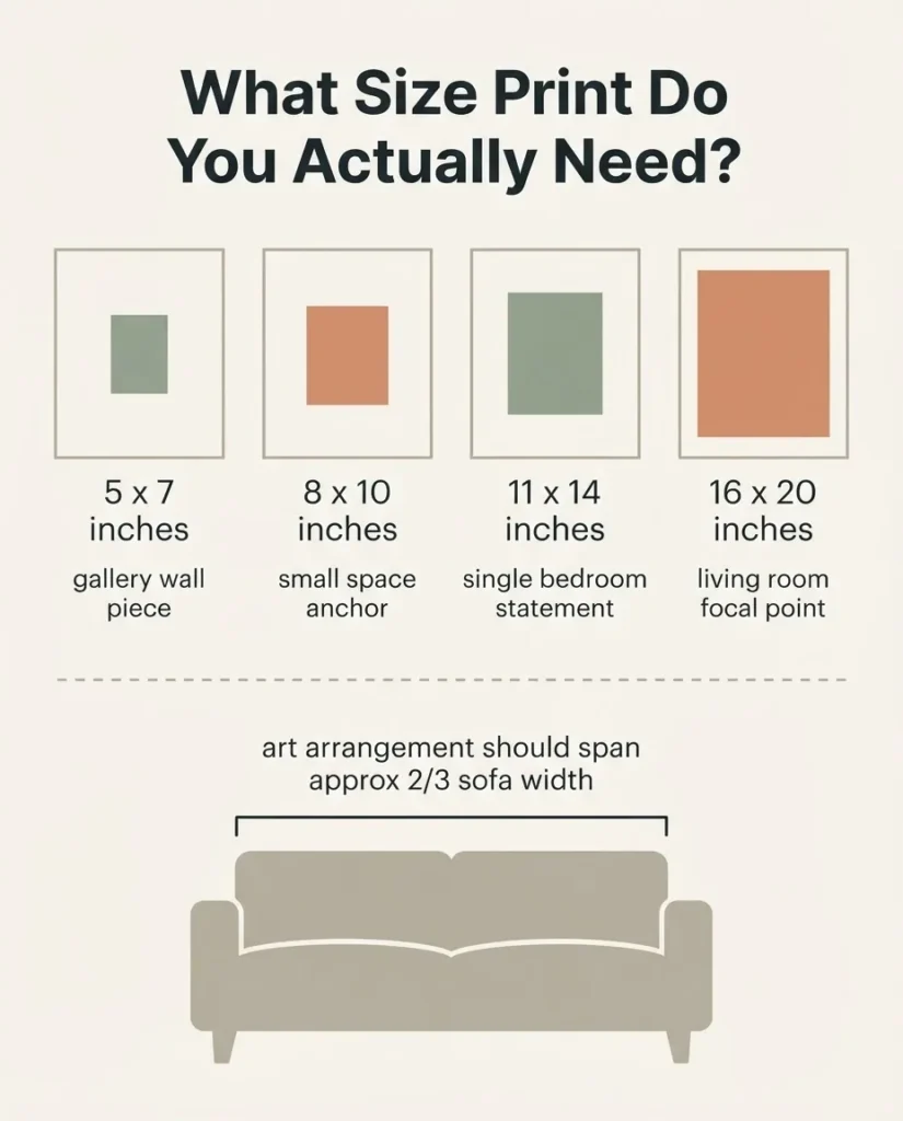
Choosing the wrong size is one of the most common and most fixable wall art mistakes I see. People tend to buy things too small. A single 5×7 on an empty living room wall just looks lonely. Here is a quick mental guide.
The most common print sizes and what they work for:
For gallery walls and grouped displays, 5×7 and 8×10 are the sweet spot because they sit nicely next to each other and fit into widely available inexpensive frames. For a single statement piece on a larger wall, you generally want something at least 16×20 or larger to hold the space. For a small bedroom or a narrow hallway wall, a vertical 8×10 or 11×14 can work beautifully as a solo piece. Printify’s art print size guide has a useful breakdown of standard print dimensions and what they look like in practice, including recommended pixel resolutions if you are printing a downloaded file.
A general rule of thumb: your wall art grouping should cover roughly two-thirds of the width of the furniture piece it sits above. Above a 60-inch sofa, that means your art arrangement should span about 40 inches. A single 8×10 centered above that sofa will look like a small island floating in a lot of wall. Either go bigger with one piece, or create a group.
Hanging It Without Wrecking Your Walls
This is the part I care about almost as much as the art itself. Lose your security deposit over nail holes and the “cheap aesthetic art” experiment just got very expensive.
The good news is that damage-free hanging has genuinely gotten much better in the last decade. The official Command Picture Hanging Strips guide is worth reading before you start because there are a few important rules people skip: don’t apply to walls within 7 days of fresh paint, don’t use on wallpaper, and don’t exceed the weight rating for each pair of strips. Medium strips hold up to 3 lbs per pair, large strips hold up to 4 to 5 lbs per pair. Most lightweight paper prints in basic frames fall comfortably within those limits.
A few other renter-friendly methods worth knowing:
Picture ledges / floating shelves. This is my personal favorite for rentals, honestly. A simple picture ledge (IKEA’s MOSSLANDA is around $10–15) requires only a couple of screws that patch invisibly when you leave, and lets you lean and layer multiple prints without committing each one to a specific spot on the wall.
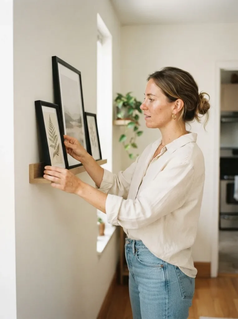
You can rearrange seasonally, add pieces, and swap art around without ever touching the wall directly with a hook.
Push pins for paper prints. If you are hanging an unframed print or a poster, a small push pin in each corner leaves the tiniest possible hole, far easier to patch than a nail, and works well for lighter paper art. Not ideal for frames.
Sticky-tack or wall putty. Works for very lightweight prints and paper art. Not reliable for anything with any real weight.
For anyone who wants a fuller look at the method options, Frame It Easy’s renter damage-free hanging guide covers the differences clearly including when each method makes sense and what their limits are.
The 57-Inch Rule (And Why Your Art Probably Hangs Too High)
Almost everyone hangs their wall art too high. It is one of the most consistent mistakes in beginner decorating, and it makes rooms feel slightly off in a way that is hard to diagnose.
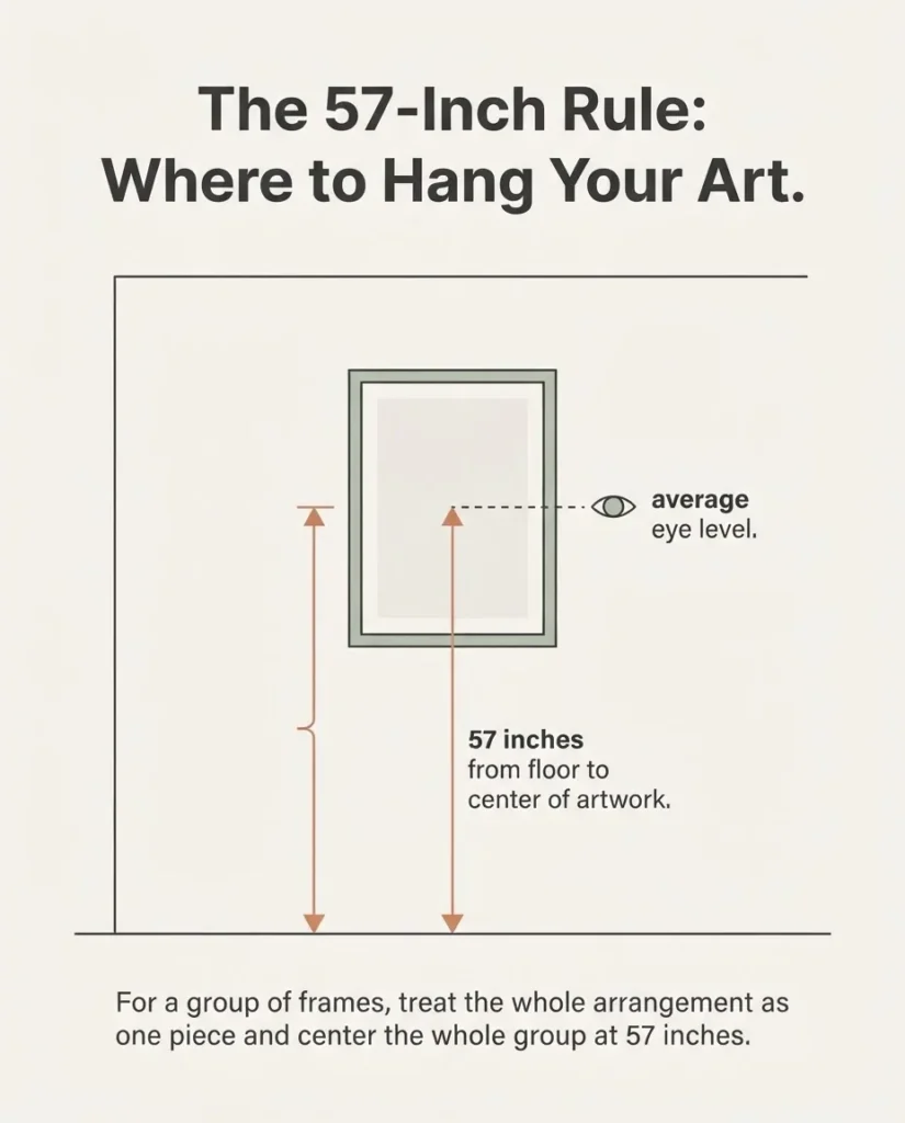
The fix is simple: galleries and museums hang artwork so the vertical center of the piece sits at 57 to 60 inches from the floor. That is roughly average human eye height. Apartment Therapy explains this well and it is the same standard I use in every room I style. Measure up 57 inches from your floor, mark it lightly in pencil, and use that as your center point when placing your hook or strip. When you do this consistently throughout a home, all your art shares the same visual centerline, which creates a calm, cohesive feeling even when the pieces are different sizes.
For art hanging above furniture, the general guideline is 6 to 8 inches of space between the top of the furniture piece and the bottom of the frame.
Much more than that and the art starts to float away from the furniture and lose its connection to the room.
Making Budget Prints Look Like They Belong Together
This is the styling step most cheap-art advice skips, and it is where the real magic happens.
Unify through frames. The single most effective move for making mismatched budget prints look cohesive: put them all in matching frames. A set of five different botanical prints from five different Etsy sellers can look completely unified in matching black IKEA RIBBA frames. It does not matter that the art came from different sources. The matching frame is what the eye reads as intentional.
Limit your color range. Two to three colors across all your prints is enough. If you are doing a gallery wall, lay everything on the floor first and look at it as a group. A print with a jarring orange in an otherwise soft neutral arrangement will not work, even if it is beautiful on its own.
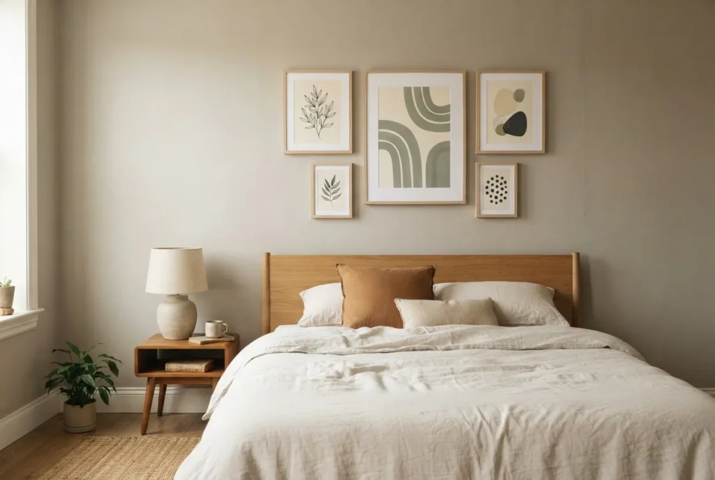
Mix sizes, not styles. Varying the sizes of your frames (say, one 11×14 as an anchor, surrounded by several 5x7s) adds visual rhythm. Varying the styles wildly, contemporary photography next to illustrative typography next to geometric abstraction, without any unifying color or frame creates noise.
Leave some breathing room. Gallery walls look best with 2 to 3 inches of space between frames. Tighter than that and things start to feel crowded. More than 5 or 6 inches and the grouping loses cohesion and starts to look like individual prints that happen to be near each other.
Consider one large piece over a grouping. For very small spaces, a single well-sized, well-hung print can look more intentional than a crowded gallery wall. There is a calm confidence in one good piece. Do not feel obligated to fill every inch of wall.
Free Printable Art: Actually Worth Your Time
Before spending anything, it is worth knowing that genuinely beautiful wall art is free if you know where to look.
Beyond Rawpixel’s public domain section mentioned earlier, Canva has free editable art print templates at canva.com that you can customize and download, then take to a print shop. Pinterest is full of people sharing links to legitimately free printable art, and searching “free printable wall art [your style]” gets you to useful resources quickly. The quality varies, so look for files described as 300 DPI and read the download instructions carefully to confirm personal print use is permitted.
When printing free art at home, use the highest quality setting on your printer and plain matte photo paper rather than regular copy paper. The difference in how the print looks on a wall is significant, and a ream of matte photo paper is inexpensive.
The Honest Worth-It / Skip-It Notes
Worth it: a set of matching frames, even if it costs more than the art. Cheap frames undermine even good prints. IKEA RIBBA or similar basic black or white frames are the budget workhorse here.
Worth it: printing digital downloads at a local print shop rather than at home if your home printer is not great. The cost difference is small and the result is noticeably better.
Worth it: buying two or three prints in one cohesive style rather than ten prints in five different styles. Edit down. A focused wall always looks more intentional than a stuffed one.
Skip it: extremely cheap canvas prints from unknown Amazon sellers in the $6 to $10 range. The canvas material and color printing on very-low-price canvases tends to look washed out and slightly fuzzy up close.
Skip it: buying prints first and framing second without confirming the size match. Standard print sizes (4×6, 5×7, 8×10, 11×14) fit standard frames. Non-standard sizes mean custom framing, which quickly erases your budget savings.
Skip it: impulse-buying a print just because it looks great in the seller’s mockup. Always check buyer photos and reviews.
A Few Final Thoughts
Cheap aesthetic wall art is not a compromise. Done thoughtfully, it is just smart decorating. I grew up in a home where most things came secondhand, and some of the calmest, most beautiful spaces I have ever spent time in were put together on almost nothing. The secret was always intention: choosing a direction, editing out what did not belong, and taking care with the details of framing and placement.
Your walls can feel like yours this weekend for less than you would spend on a nice dinner out. Start with one cluster, one style, one matching set of frames. Get that right, and the rest of the room will follow.