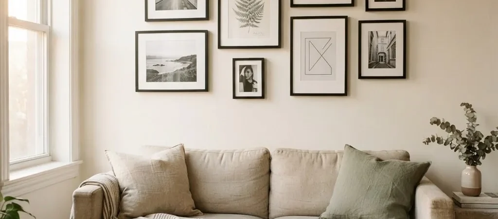
There is a particular kind of wall paralysis that I think a lot of us know. You have a blank wall. You have a few frames. You know roughly what you want it to feel like, something collected and calm, a little personal. But every time you hold a frame up against the paint and tilt your head, you put it back down. What if it ends up lopsided? What if the spacing looks wrong? What if you punch eight holes and it still looks like a ransom note?
I have been there, in rental after rental, staring at walls I was not allowed to touch too aggressively. And what I learned from doing this enough times, on tight budgets with second-hand frames and a lot of measuring tape, is that a gallery wall does not need to be complicated. It just needs a plan. And the plan has almost nothing to do with how much you spent.
This is that plan.
Before You Touch a Single Nail: The Floor Method
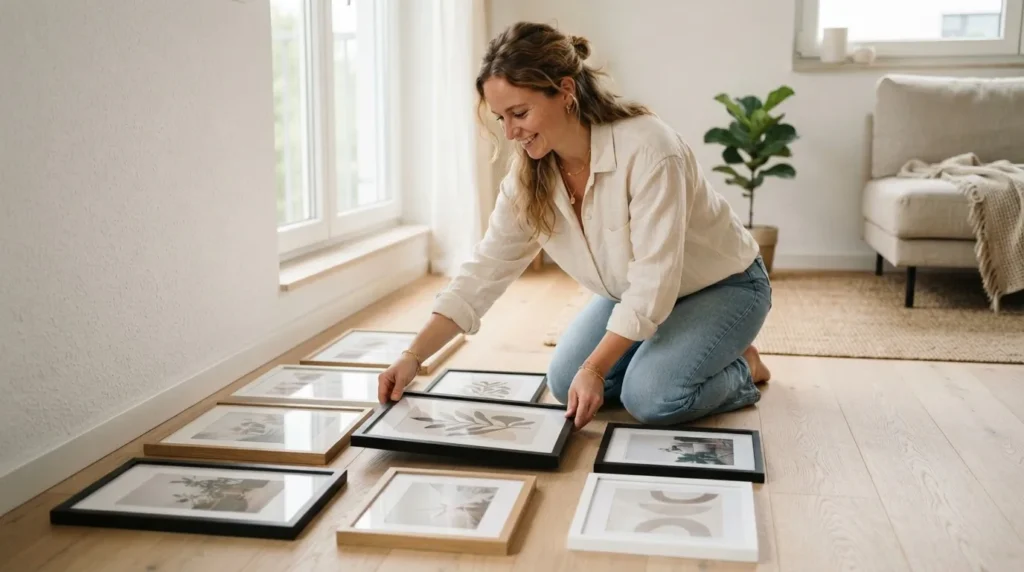
The single most useful thing I can tell you about gallery walls is this: lay everything out on the floor first. Every piece, every frame, arranged roughly the way you want them on the wall. This costs you nothing and saves you from the thing everyone actually dreads, which is standing on a step stool at 10 PM surrounded by crooked frames and spackle.
Lay out your frames on the floor directly in front of the wall where they will hang. Work with them there. Shuffle things around. Swap a vertical for a horizontal. Add a gap, close a gap. Live with it for an hour. Take a photo from standing height so you can see it the way it will actually look from across the room. When you love what you see on the floor, trace around each frame with a pencil on craft paper, cut the shapes out, and tape those paper templates to the wall with painter’s tape. Step back. Adjust. Then and only then, start hanging.
It sounds slow but it is genuinely the fastest path to a result you will not want to redo in a week.
The Three Numbers That Make or Break Any Gallery Wall
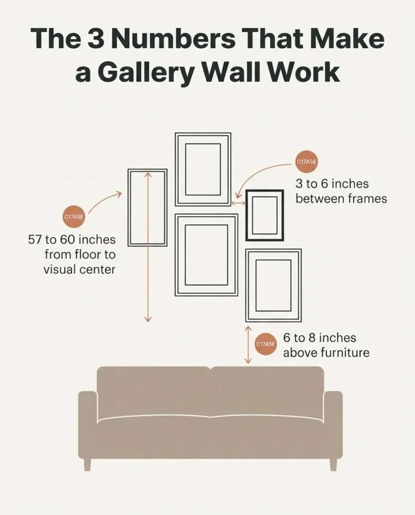
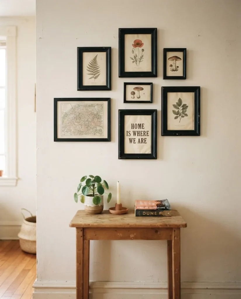
Before we get into specific layouts, you need to know three measurements. They are not rules you must follow to the letter, but they are the reason some gallery walls look intentional and others look like the frames just fell there.
The first is 57 to 60 inches. That is the height, measured from the floor, where the visual center of your arrangement should land. It is the standard gallery-viewing height, derived from roughly average eye level. For a single piece of art, you measure to the center of the frame. For a gallery wall with many pieces, you find the rough visual middle of the whole cluster and aim to have that point at 57 to 60 inches. Apartment Therapy’s guide to hanging artwork measurements explains the full math for calculating exactly where your hook should go based on wire placement, which is worth bookmarking for when you’re standing on a chair with a pencil.
The second number is 3 to 6 inches. That is the gap you want between frames. Less than 3 inches and the arrangement starts to look cramped and accidental. More than 6 inches and the frames lose their visual connection to each other and start to look like separate, unrelated pieces instead of one cohesive arrangement. Three inches is clean and structured. Four to five inches is relaxed and natural. Pick one and stay consistent throughout your layout.
The third is 6 to 8 inches. That is how much space should sit between the top of your furniture (the back of a sofa, the top of a headboard) and the bottom edge of the lowest frame in your arrangement. Less than 6 inches and the art starts to look like it is perched uncomfortably on the furniture. More than 8 inches and the art and the furniture start to feel like strangers who don’t know each other.
Keep those three numbers in your notes app. They will solve about 80 percent of the problems that make gallery walls look off.
The Two-Thirds Proportion Rule (Especially Above a Sofa)
If you are building a gallery wall above a sofa, a bed, a console table, or any other piece of furniture, there is one proportion rule that makes a bigger difference than almost any styling decision: the total width of your gallery arrangement should span roughly two-thirds the width of the furniture beneath it.
On a 72-inch sofa, that means your gallery should spread about 48 inches wide. On a 90-inch sofa, aim for something around 60 inches. Going too narrow makes the art look pinched and the sofa look enormous. Going wider than the sofa makes the arrangement look like it is floating untethered from the room. The two-thirds number lands your gallery right in that proportional sweet spot where the furniture and the wall feel like they were designed together, even if they came from completely different stores and different decades.
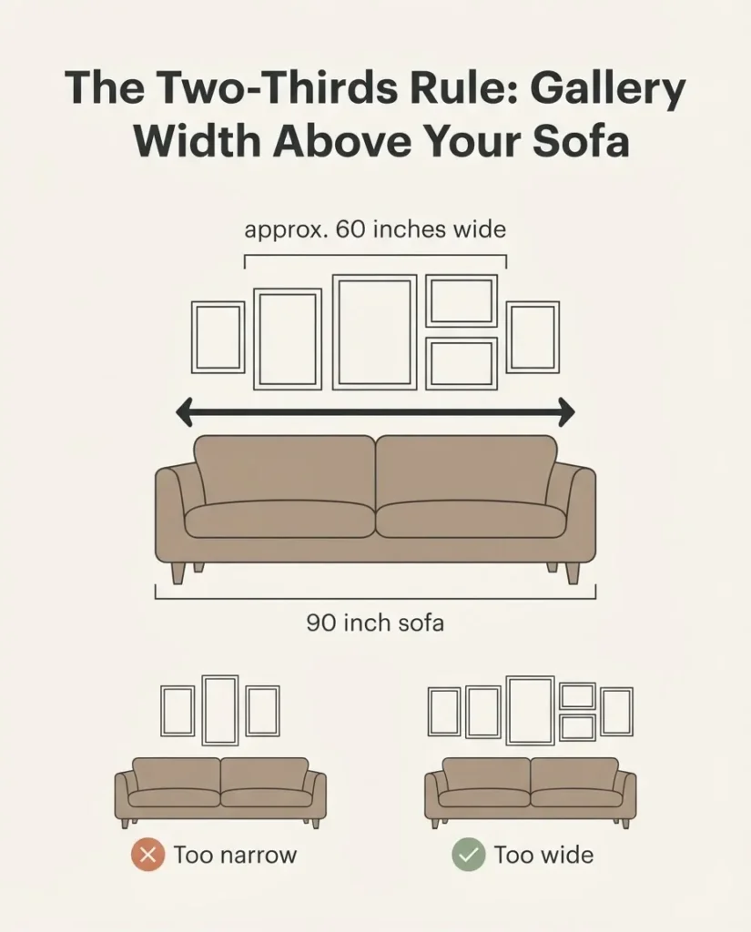
You can read more about this proportion approach, sometimes called the two-thirds rule, in Apartment Therapy’s art sizing guide for above sofas, which is a genuinely useful reference for getting the scale right before you buy a single frame.
17 Gallery Wall Layout Ideas, From Simple to Salon-Style
Here is where we get into the actual layouts. I have organized these from the simplest and most beginner-friendly through to the more layered and complex, so you can find your level and work from there.
Simple and Structured Layouts
1. The Even Grid
This is the most forgiving layout you can do. Same-size frames, same spacing, same orientation, arranged in a clean rectangle. A 3×2 grid of 5×7 frames is a classic starting point. A 4×3 grid of 4×6 photos feels intimate and personal. The key is true consistency: same spacing between every frame horizontally and vertically, typically 2 to 3 inches in a grid because the structure itself is the visual interest. If your frames are even slightly different sizes the grid will look unintentional, so this layout genuinely requires identical frames.
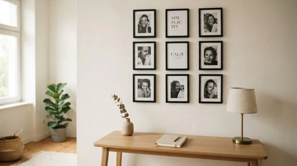
IKEA’s RIBBA and RÖDALM frames are popular for this exact reason: uniform, affordable, and easy to mix sizes within a matching family.
2. The Single Row
One horizontal row of frames at the same height. Works beautifully in a narrow hallway, along a short wall, or in a small apartment where you don’t have the wall real estate for anything larger. Mix sizes within the row for rhythm, or use identical frames for something more minimal. Keep the centers of all frames level to a shared center line, not the top edges. This is the layout that looks sharpest in a rental hallway where you really only have about 18 inches of wall height to work with before you hit a light switch or a door frame.
3. The Triptych
Three pieces arranged in a row, typically with the center piece slightly larger or hung slightly higher for emphasis. It reads as one composed piece of art rather than three separate frames, which is why it works so well in smaller rooms. You can use three photos printed at different sizes, a triptych print set, or three coordinating botanical illustrations. The proportions tend to work best when the outer two pieces match and the center is larger or taller.
4. The Vertical Stack
Two or three frames stacked vertically in a column. Ideal for narrow walls, the wall beside a doorframe, or the slim vertical space between two windows. Stack matching frames for a clean look, or stack a vertical photo over a horizontal one for a little more energy. Keep the spacing tight at 3 inches and align the centers on a shared vertical axis.
5. The Square Block
Four frames arranged as a two-by-two square. This feels more substantial than a single piece but is much less intimidating to execute than a large salon wall. It works well over a small console, in a powder room, or as a starting point for a larger arrangement you plan to expand over time.
Mid-Level Layouts (a Little More Personality)
6. The Anchored Asymmetric
This is the layout that gives beginners the most trouble but is actually very logical once you understand the anchor principle. Start with one large piece, typically your biggest or most meaningful frame, positioned slightly off-center. Everything else builds outward from there. Your second-largest piece goes diagonally from the first, not directly beside it. Fill in from there with smaller frames, keeping your spacing consistent. The off-center anchor is what makes this layout feel collected and personal rather than rigid, because it mimics the way art accumulates in a real home over real time.
7. The Row Cluster
Two or three informal rows, not quite a grid because the pieces don’t perfectly line up, but not fully free-form either. Think of it as an approximate grid with a little breathing room built in. Horizontal rows read left to right but pieces within rows are allowed to vary slightly in height. This is one of the most commonly pinned gallery layouts for a reason. It is relaxed and livable but still has enough order to look intentional.
8. The All-Black-Frame Mix
This one is more about cohesion strategy than pure geometry, but it belongs here because it is one of the most reliable ways to make a mixed gallery wall with different image sizes, different art styles, and different print types look like it belongs together. Stick to a single frame color, typically matte black, and the variety of what is inside the frames stops reading as chaotic and starts reading as intentional. You can mix an 8×10 photo print with a small abstract painting and a typographic print from a thrift store, and the matching frames do the work of visual unification. American Frame has a useful breakdown of how mixing frame styles and art types can still produce a balanced gallery if you want to understand the mechanics behind this approach.
9. The Symmetrical Pairs
Two matching arrangements on either side of a central point, typically a doorframe, a window, a light fixture, or a mirror. This works beautifully in formal dining rooms and entry halls where symmetry reads as intentional elegance rather than rigidity. Use matching frames throughout, and the effect is understated and quietly polished.
10. The Landscape Panorama
All horizontal frames, three to five in a horizontal sweep, hung at the same center height. This layout feels calm and wide, which makes it ideal for low-ceiling apartments where you want the room to feel more spacious, not taller. Works especially well with landscape photography, botanical prints, or any imagery with a strong horizontal line.
Layouts for Specific Spots
11. Above the Sofa: The Low and Wide Float
Take the two-thirds rule, apply the 6-to-8-inch above-furniture clearance, and create a wide, relatively low arrangement that hugs the top of the sofa without climbing too high up the wall. Keep the total height of the arrangement modest, roughly 18 to 24 inches from bottom frame to top frame, and let the width carry the presence. This keeps the arrangement grounded with the sofa instead of floating away from it.
12. The Staircase Diagonal
Frames arranged in a rising diagonal line that follows the slope of a staircase. The trick here is to hang each frame so that its center sits at approximately the same vertical distance above the stair nosing below it, rising consistently as you go up. Keeping the spacing between frames consistent is more important here than the size or arrangement of the frames themselves. Mix portrait-orientation frames for a classic look, or add a few landscape frames for visual rhythm.
13. The Small-Wall Accent Cluster
This one is specifically for the renters and small-space people. You have a wall that is maybe 30 to 40 inches wide, maybe the wall in a breakfast nook, a tiny hallway, or the wall beside the bathroom door. Three to five frames in a loose, slightly asymmetric cluster, centered on that small wall. Do not try to fill the whole wall. Let the cluster breathe within the space around it. A small cluster on a small wall looks deliberate. A grid that stretches to the edges of a small wall looks like you ran out of room.
14. The Above-Bed Wall
Wider than it is tall, positioned to visually read as a headboard substitute or headboard accent. The center of the arrangement should sit about 60 inches from the floor (slightly higher than above a sofa because you are looking at it from a seated or reclined position, not a standing one). Keep the total height of the arrangement at 20 to 30 inches so it does not feel like the wall is coming down toward the bed.
15. The Mixed-Media Gallery
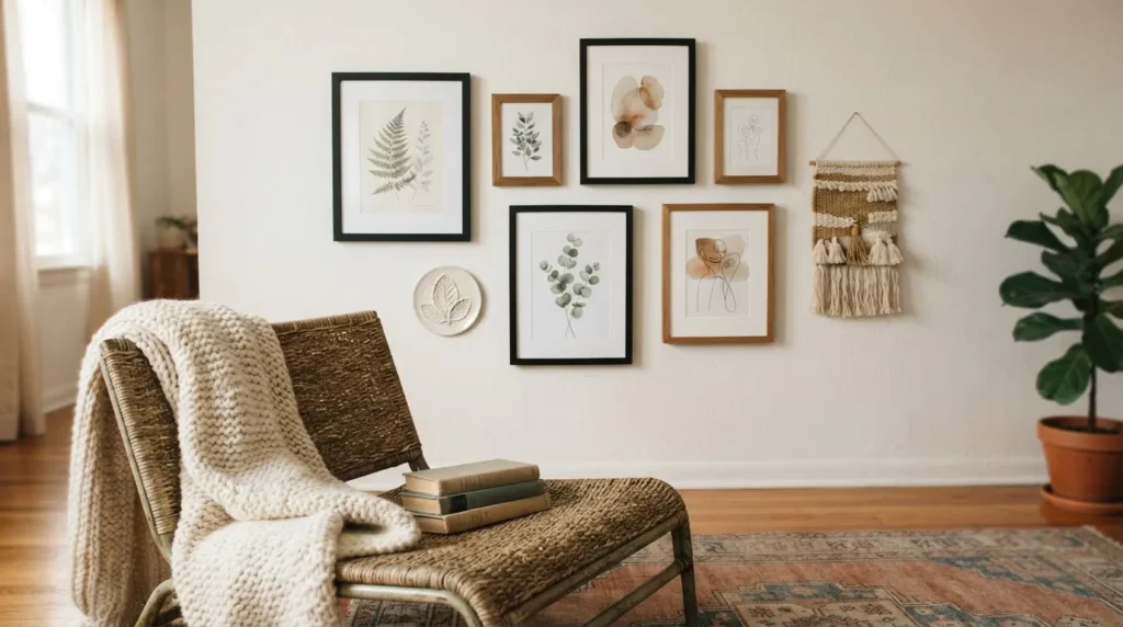
Frames mixed with non-frame objects: a small ceramic wall hanging, a woven textile piece, a decorative plate, a small mirror, a dried flower wreath. This adds depth and texture that a frame-only arrangement cannot achieve. The trick is to treat every object as though it has an invisible frame around it, give it the same spacing from its neighbors as you would a frame. The objects need to feel anchored within the arrangement, not floating separately.
Maximalist and Statement Layouts
16. The Salon Wall
This is the fully loaded, floor-to-ceiling (or at least floor-adjacent to near-ceiling) arrangement associated with traditional European picture-hanging salons. Everything lives within the arrangement. Large pieces anchor the bottom. Medium pieces spread through the middle. Small pieces and accent objects fill gaps near the top. The overall silhouette of the arrangement should be roughly rectangular even when the internal arrangement is organic and asymmetric. This layout works best in a room where you already have a lot of other visual calm, because the salon wall is doing a lot of talking and needs quiet furniture to balance it.
17. The Gallery Cluster
This is the apartment-friendly alternative to the full salon wall, and honestly one of my favorite approaches for renters. Instead of one enormous arrangement, you create two or three smaller, distinct clusters of three to five frames each, placed on different walls or in different parts of the room. Each cluster feels intimate and intentional. The overall effect is a room full of art without any single wall being overwhelmed. It is much easier to execute, much easier to adjust, and much kinder to rental walls.
The Renter Section: Hanging Without Hurting Your Walls
If you rent, all of this is still completely doable. You just need to know a few things about adhesive hanging and work within them honestly.
Adhesive picture hanging strips (the most common are Command Brand) are genuinely excellent for most gallery walls when you use them correctly and choose the right weight rating. The large Command strips hold up to 16 lbs per pair, and the heavyweight version holds up to 20 lbs. The official Command weight limits guide lists the capacity for every strip size clearly so you can match your strip to your frame weight. Never stack two strips and assume you can exceed the rating. Never use strips on fresh paint, wallpaper, or brick. For a typical gallery wall of lightweight prints in 4×6 to 8×10 frames, adhesive strips work reliably. For heavy frames, ceramic pieces, or anything with glass and a large mat, weigh the frame before you hang it and choose the strip accordingly.
If your lease truly prohibits holes of any kind, you can also lean small frames on a picture ledge shelf (no holes in the frames, and the shelf itself is a single row of fasteners rather than a hole per piece), or use a clipboard and adhesive hook system for swappable prints. Both approaches give you a gallery-style look with minimal wall commitment.
Where to Actually Find Art That Doesn’t Break the Budget
The frames matter. The art inside them matters too, but it does not need to cost much.
The National Gallery of Art offers a free open-access download of over 60,000 artworks in the public domain, all under Creative Commons Zero, meaning you can print them freely for personal use. This is one of the most underused resources in the budget decorating world. Download, print at a local copy shop, and drop into a thrift store frame for a few dollars total.
Artvee is another excellent source: a searchable, curated collection of high-resolution public domain paintings, botanical illustrations, vintage travel posters, and more, all free to download and print. Looking for something that matches your color palette or style? You can browse by category. Botanical and landscape categories are particularly strong for a calm, nature-forward gallery wall.
Beyond free prints, thrift stores reliably yield frames in usable condition for under $5. Paint them all the same color (chalk paint dries quickly and adheres to most surfaces without priming) and they will look like a deliberate set. Dollar-store frames for 4×6 and 5×7 photos are genuinely serviceable for lightweight paper prints. The frame budget for a 9-piece gallery wall with thrifted and dollar-store frames, combined with free public domain prints, can realistically come in under $40 total.
The One Habit That Makes the Biggest Difference
Before you hang a single piece, take a photo of your floor layout from standing height. Then a photo from kneeling height. Then step back and look at it like a whole piece rather than individual frames.
What you are looking for is visual balance, which is not the same as symmetry. A balanced arrangement is one where the visual weight, meaning the size, color density, and busyness of the frames, is distributed so that the arrangement does not feel heavy on one side. If all your large pieces cluster on the left and all the small pieces sit on the right, the arrangement will look like it is tipping. Move your anchor piece first, then the second-largest, then fill. Take another photo. Adjust until the floor version sits quietly and feels right. Then trust it, translate it to the wall with paper templates, and hang.
A gallery wall that feels curated took someone about 20 minutes of shuffling frames on a carpet. It just looks like it took longer.