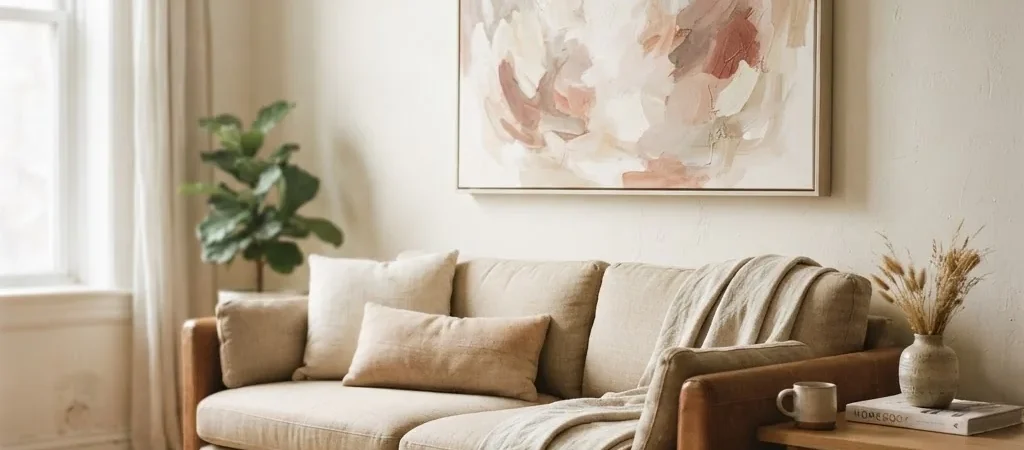
There is something specific that happens to a room when you finally hang the right piece of art. The whole space settles. It stops looking like a collection of furniture pushed against walls and starts looking like somewhere a person actually lives. I have felt that shift dozens of times across a string of rentals, and I have also felt the opposite: spending money on a canvas that sat leaning against the baseboard for six months because it never quite looked right.
Abstract canvas wall art is one of the most searched, most pinned, and most bought categories in home decor, and also one of the most misunderstood. People love the look of it but feel nervous about choosing it. They worry it will look cheap, or try too hard, or simply confuse the room. This guide is for anyone who has ever opened a browser tab to shop for abstract art and then quietly closed it twenty minutes later without buying anything. Let’s fix that.
What Abstract Art Actually Is (And Why It Works So Well in Real Homes)
Before we get into sizing and styling, it helps to understand what you’re working with. According to the Tate museum’s official art glossary, abstract art uses shapes, colors, forms, and gestural marks rather than trying to accurately depict a specific visual reality. That definition sounds fancy, but in practice it means the painting isn’t trying to be a photograph of anything. It exists on its own terms. And that is exactly why it works so well in everyday homes.
Because abstract art doesn’t lock you into a specific subject, it’s flexible in a way that landscape prints and botanical illustrations aren’t. A canvas with soft cream and warm taupe brush marks will complement a boho living room, a minimalist bedroom, and a cozy rented studio with equal ease. The art doesn’t fight with your furniture. It breathes alongside it. That’s the quiet power of abstraction, and it’s why you see it everywhere from coffee shops to high-end hotel lobbies to the apartments of people who have genuinely good taste without a big budget.
The Fear of Buying the Wrong Piece (And How to Stop Letting It Paralyze You)
Here is what I hear from people who have been staring at a blank wall for months: “I just don’t want it to look cheap.” I understand that completely. There’s a version of abstract canvas art that looks like it belongs in a dentist’s waiting room, and there’s a version that looks like it belongs in a beautifully curated home. The difference is almost never the price. It is the choices you make around it: the size, the placement, the palette, and how you style the room it lives in.
The hesitation comes from a real place, but it shouldn’t stop you from starting. You don’t need a design degree to make a good call here. You need a few practical rules, and you need to trust your eye a little more than you probably do.
Step One: Start With Color, Not Style
Most people start shopping for abstract art by browsing styles, and then they feel overwhelmed by choice. I’d suggest flipping it. Start with color instead.
Walk into the room where the art will hang. Pick out the two or three colors that appear most often, the sofa, the rug, the curtains, the throw pillows. These are your anchor colors. Now pick out one color in the room that feels slightly underused but that you like, maybe a warm rust in your rug, or a soft dusty blue in your cushions. That’s the color your abstract canvas should bring forward.
You don’t need an exact match. In fact, exact-match art often looks forced. What you’re looking for is harmony. If your room is built on warm neutrals, look for canvases in cream, soft ochre, raw umber, or warm blush tones. If your room is cool and calm, try canvases with misty blue-grey washes, sage, or soft white with charcoal marks. If your room has an earthy boho palette, look for terracotta, rust, warm brown, and organic linen tones. Color is the single fastest way to make abstract art feel intentional rather than random.
Step Two: Get the Size Right (This Is Where Most People Go Wrong)
The most common mistake I see people make with abstract canvas art is buying something too small. A single 16×20-inch canvas on a large living room wall looks apologetic. It floats there, unanchored, and makes the room feel emptier than it did before the art went up.
Here are the sizing rules I rely on, stated plainly:
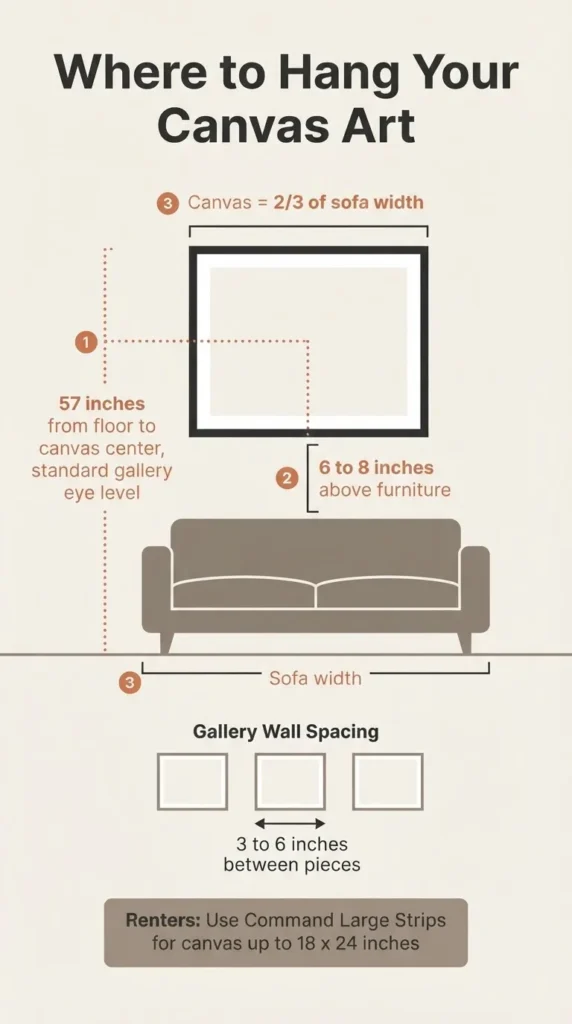
For art above a sofa or bed: The artwork or grouping should span roughly two-thirds the width of the furniture below it. If your sofa is 84 inches wide, you’re aiming for something in the range of 47 to 63 inches wide. You can achieve that with one large canvas or with a pair of medium canvases hung close together. The bottom of the frame should sit 6 to 8 inches above the top of the sofa or headboard.
For art on an empty wall: Your art or gallery grouping should take up 60 to 75 percent of the wall’s width. A 100-inch wide wall calls for art spanning roughly 60 to 75 inches. The Nations Photo Lab wall art size guide has a useful furniture-specific chart if you want to get precise, including recommended widths for everything from a twin bed to a 96-inch sofa.
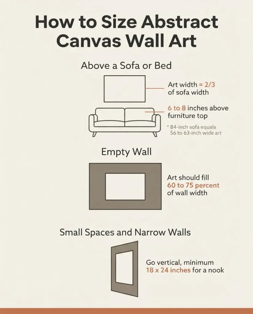
For small spaces and narrow walls: Don’t be afraid to go vertical. A tall, narrow canvas in a hallway or beside a doorframe draws the eye up and makes a tight space feel taller. Aim for something at least 18×24 inches for a small nook, and 24×36 inches or larger for any wall you want to feel intentional rather than incidental.
For gallery walls: Mixed-size groupings work best when you anchor the arrangement with one or two larger pieces (24×30 or bigger) and fill in around them with smaller pieces. Treat the whole grouping as a single visual unit. Aim for 3 to 6 inches of space between frames to keep things organized without feeling crowded.
Step Three: Know Your Abstract Styles and Match Them to Your Room
Abstract art is not one thing. It is a broad category that contains a lot of very different visual languages, and knowing a few of them will help you shop with more confidence.
The Tate’s brief history of abstract art traces abstraction from its early 20th-century roots through movements that each produced a distinct visual feeling. You don’t need to know art history to shop well, but understanding a few style categories helps you find what you actually want.
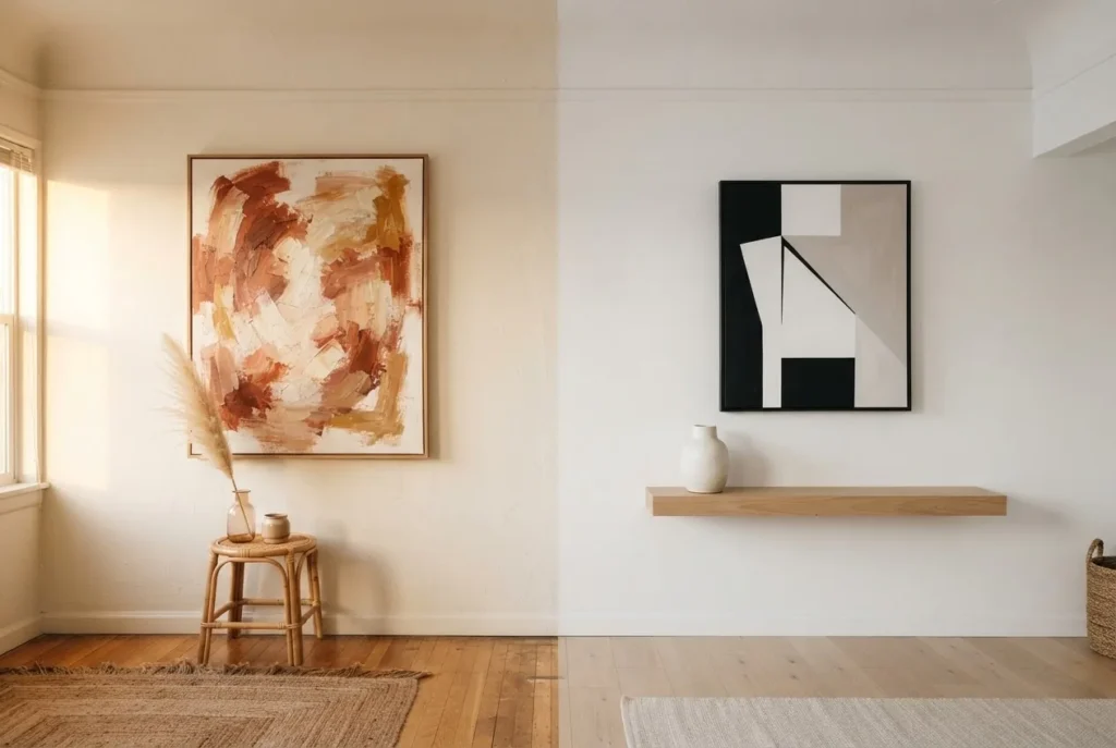
Gestural abstract (loose brushstrokes, expressive marks): This is the most popular style for home decor right now. Think visible paint strokes, textural layering, a sense of movement and warmth. This style suits boho interiors, eclectic maximalist rooms, and any space that wants to feel lived-in and creative. Colors range widely, from earthy neutrals to bold ochre and rust combinations.
Minimalist abstract (geometric shapes, clean lines, limited palette): Flat planes of color, simple shapes, a sense of order. This style suits modern and contemporary interiors, Scandi-inspired rooms, and spaces built on neutral palettes. It’s also the style I’d recommend for someone who feels nervous about abstract art, because it’s calm and structured, not chaotic.
Color field and wash abstracts (large areas of blended color): Soft, almost atmospheric, these pieces read more like mood than image. Think watercolor-style washes in muted blues, greens, or warm pinks. These suit coastal interiors, cottagecore rooms, and any bedroom where you want to encourage a sense of calm rather than visual excitement.
Bold graphic abstract (high contrast, strong shapes, saturated color): Black and white geometric abstracts, bright primary color compositions, or high-contrast patterns. These work best in modern rooms with strong architectural lines, or as a single statement piece in a small space that needs one visual anchor.
Step Four: Where to Find Good Abstract Canvas Art at a Real Budget
Let’s talk honestly about price, because this is where a lot of decor advice falls apart. Budget matters, and pretending it doesn’t helps no one.
At the under-$40 range, you are mostly working with mass-produced prints on thin canvas, often with visible pixelation or low color accuracy. Some of these are fine for a gallery wall where they’ll be one piece among several, but they rarely hold up as a solo statement piece. Worth it in the right context, skip it as your main focal point.
In the $40 to $100 range, quality improves significantly. Gallery-wrapped canvas prints (meaning the image wraps around the sides of the frame, so you don’t need a separate frame) in this range are often quite good, especially from mid-tier print-on-demand platforms. At this price point you can get genuinely nice pieces that look far more expensive than they are.
In the $100 to $200 range, you start finding higher-quality canvas textures, better color reproduction, and original or semi-original pieces from independent artists. This is also where Etsy becomes an excellent source. Etsy sellers often sell hand-painted originals or very high-quality prints at prices that would be laughed at in a gallery. Platforms like Society6 also carry a huge range of artist-designed abstract prints on canvas, with sizes starting affordable and scaling up for larger pieces. Print-on-demand platforms let independent artists sell their work without a gallery middleman, and that savings gets passed to you.
For a true statement piece, I’d prioritize spending in this $100 to $200 range on size rather than on a “name.” A large, high-quality canvas print of a beautiful gestural abstract will do far more for a room than a tiny original from a known artist.
Step Five: Hang It Right (This Is Especially Important for Renters)
All the right choices about color and size fall apart if the art hangs in the wrong place or at the wrong height. Here are the rules I follow.
Hang at 57 inches to the center. The widely used gallery standard is to hang the center of the artwork at 57 inches from the floor, which corresponds to average human eye level. This is the guideline that Park West Gallery’s professional art installers use consistently, and it works in virtually every room. Measure 57 inches up from the floor, mark it lightly with a pencil, then position the canvas so its center point (half of its height) lands at that mark. This keeps the art at a comfortable viewing height rather than uncomfortably high on the wall, which is the most common mistake.
Above furniture, drop closer. When hanging above a sofa, console, or headboard, the center-at-57 rule gives way to the furniture relationship rule. The bottom of the frame sits 6 to 8 inches above the furniture. The art should feel connected to what’s below it, not marooned up near the ceiling.
For renters: Command Picture Hanging Strips are real and reliable for canvas. The key is matching the strip size to the weight of the canvas. According to 3M’s official Command weight limits guide, large Command Picture Hanging Strips hold up to 4 pounds per pair, and using four pairs together can hold up to 16 pounds, with a maximum frame size of 18×24 inches. For a lightweight gallery-wrapped canvas, medium strips are often plenty. For anything larger or heavier, check the canvas weight against the strip capacity before committing. Always apply to a clean, dry wall surface and follow the wait-before-hanging instructions on the package.
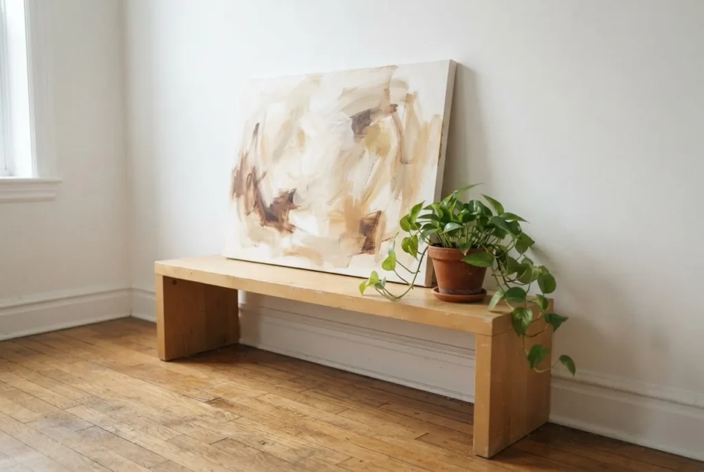
For very large or heavy canvases: If your canvas is too heavy for adhesive strips (most over-24-inch large canvases with thick frames can be), consider leaning the art on a shelf or console table instead. A large canvas leaning casually against a wall looks intentionally styled rather than like a compromise, especially when you add a plant or a stack of books in front of it.
Step Six: Style the Space Around the Art
Once your canvas is up, resist the urge to surround it with other things immediately. Give it twenty-four hours on the wall before you start adding objects around it. This is something I’ve come to believe strongly from years of styling small spaces: you need to let the eye calibrate to the art before you can tell what the space needs next.
After that reset, a few things consistently help abstract canvas art look more expensive and intentional. First, add at least one texture nearby that echoes the feeling of the art. A gestural abstract in warm cream and rust pairs beautifully with a linen throw or a jute rug. A cool minimalist geometric piece feels at home with smooth matte ceramics and a single white cotton throw. The art and the textiles should feel like they came from the same state of mind, even if they came from completely different stores.
Second, lighting makes an enormous difference. A warm Edison bulb in a lamp placed slightly to the side of the canvas, or a simple plug-in picture light clipped to the top of the frame, will do more for how that art looks than almost any styling choice you make. Abstract art in particular responds beautifully to warm directional light, because the light catches the texture of the canvas and adds visual depth that overhead lighting flattens out completely.
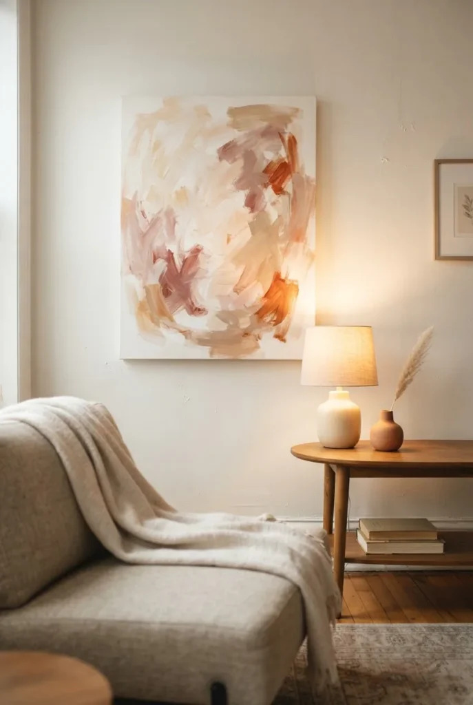
Third, don’t over-surround. Abstract art breathes. One piece of art, a small plant, and good lighting is more effective than one piece of art and twelve small objects competing for the same visual space.
Step Seven: Keep It in Good Shape
This one is simple but worth saying. Canvas prints last a long time if you take basic care of them. Keep them away from direct sunlight. A south-facing window will fade pigments over time, and most canvas prints are not UV-protected enough to resist months of direct sun exposure.
For regular cleaning, a dry soft-bristled brush across the surface is all most canvas prints need. For something dirtier, the approach recommended by experts at Bob Vila is to use a very lightly damp microfiber cloth with a tiny drop of mild dish soap solution, applied gently in a circular motion, then blotted dry and air-dried away from heat. Never soak a canvas or use any harsh cleaning products on it.
Fourteen Abstract Canvas Looks Worth Knowing
Rather than a list of specific products (which change constantly and which I’d rather you choose fresh from your own browsing with the guidance above), here are fourteen abstract canvas art ideas to look for when you shop, each with a note on where they work best.
- Neutral gestural brush strokes in cream and warm white for a calm, any-style living room that needs to feel lighter and more layered.
- Earthy terracotta and rust wash on a vertical canvas for a boho bedroom or a narrow hallway wall.
- Soft sage and warm grey watercolor wash for a bathroom or bedroom where you want a spa-like calm.
- Black and white line art with geometric forms for a modern living room or home office that needs visual structure without color drama.
- Gold leaf detail on a white or cream canvas for a bedroom focal point that looks luxurious at a fraction of what actual gold-leaf originals cost.
- Deep navy and warm brass abstract for above a dining table because the richness of the color combination reads formal without being cold.
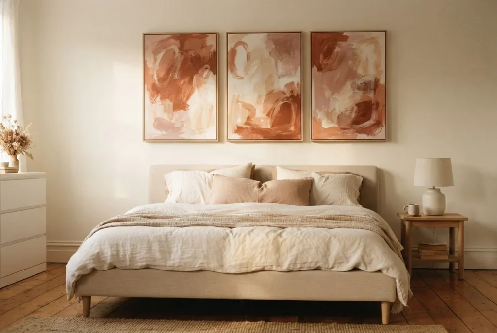
- Triptych in warm neutrals (three canvases hanging side by side) for a long sofa wall where one piece would feel lonely.
- Coastal abstract in misty blues and greens for a bedroom or bathroom that benefits from a sense of water and space.
- Large-scale pink and blush gestural piece for a small bedroom that needs one bold, feminine focal point without busy pattern.
- Organic shapes in olive, rust, and cream for a cottagecore or botanical-style room as the art anchor of a gallery wall.
- Minimalist single-color field canvas in warm greige for a Scandi or Japandi interior where less truly is more.
- Charcoal and white expressive marks on a large canvas for a home office or reading nook that benefits from something visually stimulating but not distracting.
- Abstract floral suggestion (loose, painterly, not literal) for a dining room or entry, where you want something that has the softness of florals without the predictability.
- Pair of small square abstract canvases in complementary earth tones for a small bedroom wall or a tight space between a window and a corner, where a large single piece would overwhelm.
One Last Thing Before You Buy
If you’ve read this far and you’re still feeling hesitant, here’s the simplest possible version of all of this: go with a size larger than your instinct says, choose a palette that already exists somewhere else in your room, hang the center at 57 inches from the floor or 6 to 8 inches above your furniture, and then leave the wall alone for a day before you add anything else around it.
That is genuinely all the method it takes. The rest is just trusting your eye, which is already more reliable than you’re giving it credit for.