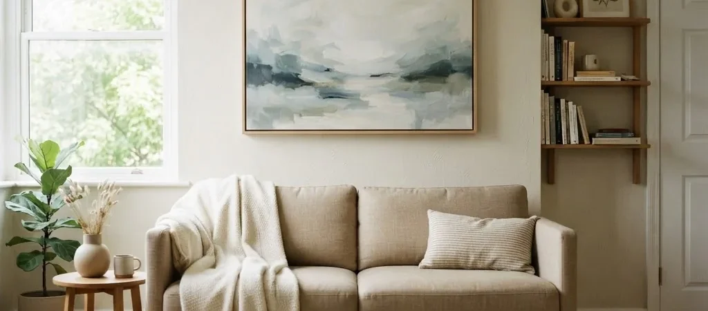
I used to think large wall art was for large rooms. If you have a small living room, the logic seems obvious: big art would crowd it. Big would make small feel smaller. So you buy a little 16×20-inch print, hang it over your couch, and then wonder why the room still feels unfinished, flat, and a little sad.
It took me years of decorating small rentals to understand I had it exactly backwards.
One large canvas print, hung correctly, in the right palette, at the right size relative to your furniture, can make a small living room feel significantly more open. Not dramatically transformed overnight, but genuinely calmer, more settled, and more spacious. The trick is knowing which art works, what size to actually buy, and how to hang it without losing your security deposit.
That is what this guide is. Let’s get into it.
Why Large Art Works Better Than Small in a Cramped Room
This sounds like the kind of design advice that only makes sense in a design magazine, not a real 400-square-foot living room. But there is a real visual explanation behind it, and once you see it, it is hard to unsee.
When you hang several small prints on a wall, your eye stops and starts at every frame edge. Each one creates a visual interruption. The wall feels choppy, busy, and divided. In a small room, all those little pauses add up to a wall that looks cluttered even when each individual piece is simple. One single large canvas removes all those interruptions. Your eye travels smoothly across the image without hitting a frame edge every six inches. The wall reads as continuous, and a continuous wall visually feels wider and calmer.
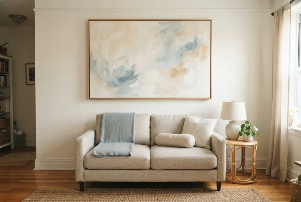
As Edward Martin’s editorial on how large wall art influences spatial perception explains it well: large artwork creates visual continuity that allows the eye to move across a surface without interruption, which helps the room feel more expansive.
That is the key. Not that the art is big, but that it reduces fragmentation.
There is also a proportion principle at work. A small print above a full-length sofa looks like a postage stamp. It makes the furniture look massive and the room feel unresolved, like you ran out of budget halfway through decorating. A properly sized canvas anchors the sofa, connects it to the wall, and makes the whole arrangement read as intentional.
The Single Rule That Changes Everything: Size Your Art to Your Furniture
Before you buy anything, measure your sofa.
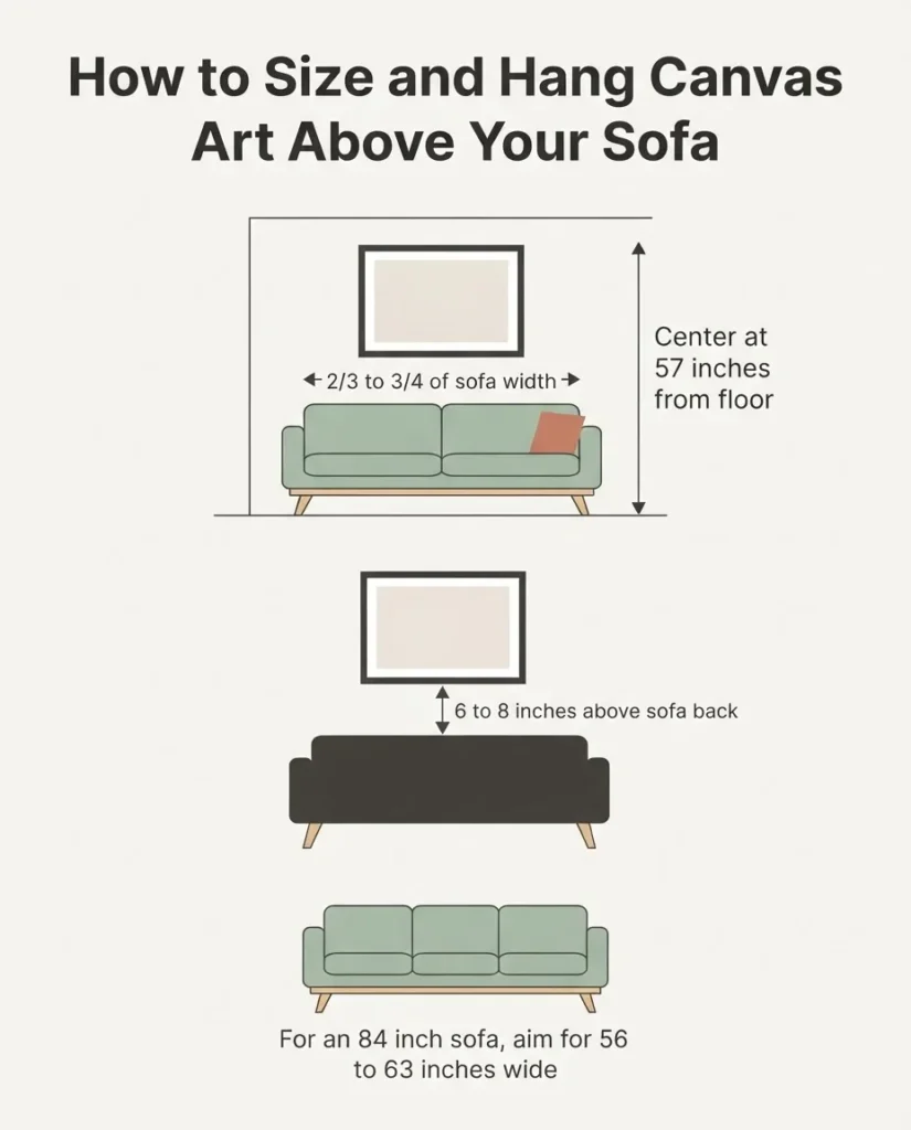
The most reliable sizing guideline in interior design says that art above a sofa should span roughly two-thirds to three-quarters of the sofa’s width. If your sofa is 84 inches wide, your art should be roughly 56 to 63 inches wide. If you have a smaller 72-inch sofa, aim for about 48 to 54 inches wide. This detailed size-to-furniture guide from LaurieAnne Art lays out the math clearly if you want to run the numbers for your exact sofa.
Most people, when they first read this, feel mildly alarmed. A 56-inch-wide canvas sounds enormous. But go get your tape measure right now and hold it up at sofa height. You will see the space pretty quickly. A canvas that felt huge in the store or in a listing photo is probably the right visual size for your wall.
For empty walls with no sofa below, a useful starting rule is that your art should fill about 60 to 75 percent of the wall’s width. On a 100-inch wall, that means something in the 60-to-75-inch range. Nations Photo Lab’s wall art size guide includes a clear chart showing recommended widths for different furniture widths that you can bookmark for reference.
One honest note: going a little larger than feels instinctively comfortable is almost always the right call. The fear is always that big art will overwhelm the room. In practice, it is the undersized art that makes rooms feel cramped and unresolved.
How High to Hang It (and Why You’re Probably Hanging Yours Too High)
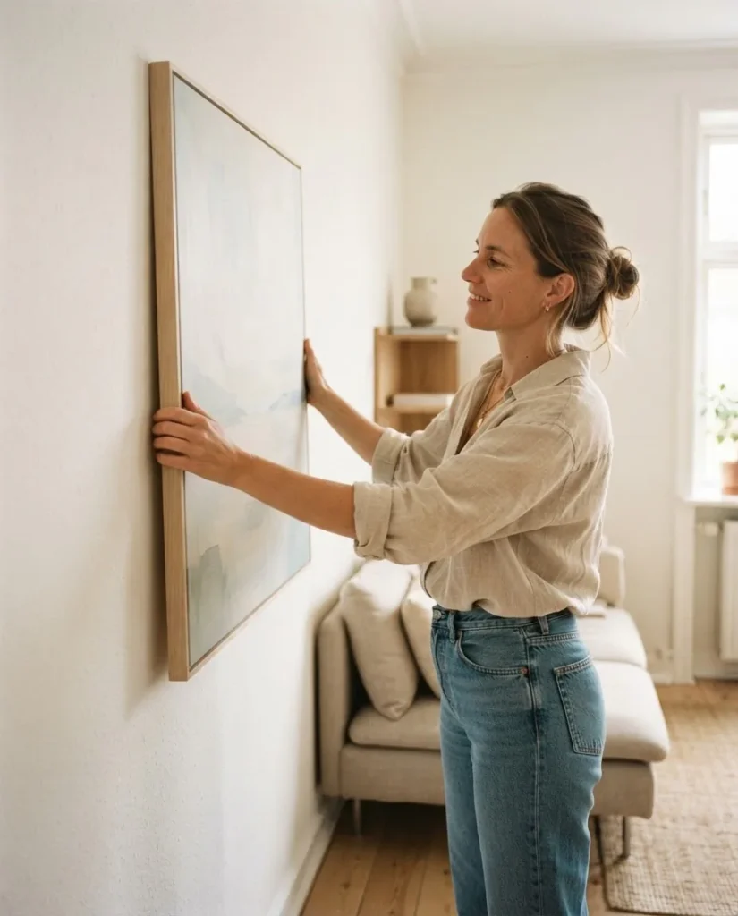
Most people hang their art too high. It is the single most common hanging mistake I have seen in years of decorating and helping friends set up their apartments. Art floats up near the ceiling, disconnected from the furniture below it, and the room never feels put together even when everything else is right.
The standard used by galleries and museums, and picked up by home design pros, is to hang the center of your artwork at 57 inches from the floor. This matches the average human eye level, so art feels like it is part of the room you are standing in, not hanging above it. Apartment Therapy’s how-to on the 57-inch rule walks through the exact math if measuring the center feels confusing.
When you are hanging above a sofa, the math shifts slightly. The bottom of your canvas should sit roughly 6 to 8 inches above the top of the sofa back. This keeps the art visually connected to the furniture rather than floating free. If you push it higher than 8 to 10 inches, it starts to look like it belongs to a different piece of furniture you do not have.
A quick practical check: tape a piece of paper the same size as the canvas to the wall before you commit to a single hole or strip. Step back and look. This one step has saved me from at least a dozen bad decisions over the years.
Orientation Matters: Horizontal vs. Vertical
In a small living room, horizontal (landscape) canvases are usually your best friend. A wide horizontal piece above a sofa mirrors the width of the furniture below it, makes the wall read as wider, and fills the visual space in a way that feels grounded. If your room has a low ceiling and you want it to feel taller, a vertical canvas (especially in a tall portrait format) will draw the eye upward and add the illusion of height.
For truly tiny rooms, a single wide horizontal canvas often does more visual work than a vertical one, because the challenge in most small living rooms is not ceiling height but narrow wall width. A wide painting makes a narrow wall feel like it has more room to breathe.
Color and Subject: What Makes a Room Feel Bigger vs. Smaller
This is where a lot of people get it wrong, not the size of the art but what is in it.
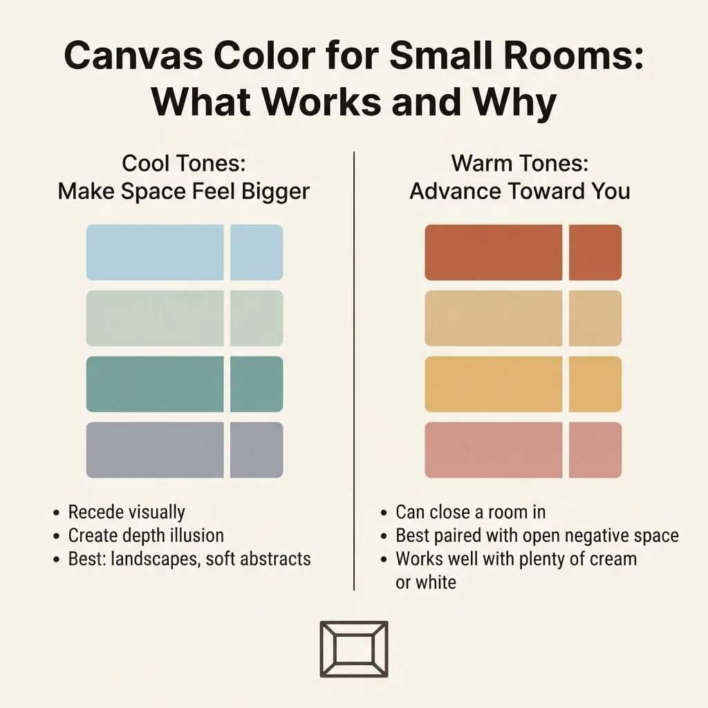
Cool-toned art tends to recede visually. Blues, blue-greens, soft teals, muted sage, pale grey-lavender, and watery aquas all create a sense of depth and visual distance. In a small room, that perceived distance is valuable. Art with these palettes will read as if the wall goes further back than it does.
Warm-toned art (rich terracottas, deep oranges, burnt siennas, heavy reds) tends to advance visually, meaning it pushes toward you rather than away. This is not automatically a problem in a small room, but it does mean you are working against the spaciousness effect. If you love warm tones and want to use them, look for pieces with plenty of open negative space in cooler whites or creams to balance the warmth.
For subject matter, the most reliably space-expanding options are:
- Landscapes with depth. A painting of rolling hills, a misty forest, an ocean horizon, or a wide open field invites your eye to travel into the image. That depth cue signals “more space” to your brain even in a 300-square-foot apartment.
- Abstract pieces with open negative space. Big swaths of light color broken by simple brushwork or line work. The key is that the canvas should not feel visually dense or busy. Open areas of near-white, cream, or pale blue do more for a small room than complex, detailed imagery.
- Minimalist line art. A single line drawing of a face, a botanial sketch, a simple shape. The simplicity reduces visual noise while still giving the wall something intentional.
What tends to close a room in: very dark, heavily saturated imagery, complex detailed patterns edge-to-edge, and portraits that take up the entire canvas without breathing room around the subject.
Single Canvas vs. Diptych vs. Triptych: Which Is Better for Small Rooms?
A diptych (two panels) or triptych (three panels) can look beautiful in a large room where there is plenty of wall to fill. In a small living room, they present a specific challenge: each panel edge creates a visual break that can interrupt the smooth, continuous feel you are trying to create.
If you love the look of a multi-panel set, choose pieces where the image flows continuously from panel to panel with very little break at the seams, and hang the panels close together (2 to 3 inches apart). This keeps the eye moving across the whole composition rather than stopping at each border. If the panels have visible gaps or the image does not flow across them, the effect in a small room is closer to having three separate smaller prints, which brings back the visual fragmentation problem you were trying to solve.
For most small rooms, a single large horizontal canvas is the simplest and most reliable choice.
Hanging Without Nails: The Renter’s Reality
Here is the part most decor articles skip right over, and it is the part that matters most if you rent.
Large canvases feel like they need a nail. Canvas prints, unlike heavy framed glass art, are actually much lighter than they look. A standard gallery-wrap canvas at 24×36 inches might weigh 3 to 5 pounds. A 30×40 or 36×48 might be 6 to 10 pounds depending on the frame depth and material.
3M’s Command Large Picture Hanging Strips, specifically the 4-pair (8-strip) large size, are rated to hold frames up to 15 pounds and sized up to 24×36 inches. For many canvas prints in that size range, this is a fully workable solution. They remove cleanly by stretching slowly toward the floor, leaving no marks or residue on painted walls when used correctly.
For canvases wider or heavier than that, here are the real options renters use:
- Leaning. A very large canvas leaned against the wall on a console table, a low dresser, or even the floor looks intentional and editorial rather than unfinished. This is especially good for oversized pieces (36×48 and above) where adhesive hanging is not reliable.
- Picture rail systems. Some older apartments have picture rails near the ceiling. If yours does, use them. They are literally designed for this.
- Ask your landlord. A single small nail hole for a large canvas that weighs 8 pounds is often negotiable, and the damage is genuinely easy to patch on move-out. It is worth asking.
What I would not rely on: generic off-brand adhesive strips for anything larger than 20×24. The 3M Command ratings are specific to their product and their strip count, and even then, I treat the weight limit as a firm cap, not a suggestion.
What to Look for Before You Buy: Canvas Quality in Plain Language
Not all canvas prints are the same, and the difference is visible in person. Here is what actually matters, in order.
Gallery wrap depth. A true gallery-wrap canvas has a wooden frame (called stretcher bars) that gives the print its rigid structure. Look for 1.5-inch depth bars rather than 0.75-inch. Thicker bars give the canvas a more substantial, professional look and are less likely to warp over time.
Ink type. Budget canvas prints from some mass-market sources use dye-based inkjet printing. Dye-based inks are cheaper and can fade noticeably in 3 to 5 years, especially in rooms with direct sunlight. Pigment-based inks are significantly more fade-resistant. A giclee print, which you will see advertised by higher-quality print houses, specifically refers to archival pigment-based printing on acid-free canvas. As Rossetti Art’s overview of giclee art prints explains, most giclee prints run at 300 DPI or higher and are designed to last decades without significant color shift.
Budget reality. At $30 to $60, you are generally getting a dye-based print on thin stretcher bars. Fine for a rental you will swap out in two years. At $80 to $180, you start seeing 1.5-inch gallery wrap, better ink, and more stable framing. At $200 to $400 and above, you are in giclee/archival territory where the canvas is genuinely worth keeping long term. For renters in a first apartment, the $80 to $150 middle range often hits the best balance of look and longevity without overinvesting in a wall you may not have next year.
Worth it / skip it honest note: Skip the ultra-thin, super-cheap canvas sets (usually sold as 3 or 5-piece sets for $35 total). The frames are often so light that they shift on the wall, the canvas can sag in the center, and the ink looks flat and faded within a year. One good single canvas at $90 will look better and last longer than five cheap ones.
Care and Placement: Keeping Your Canvas Looking Good
Canvas prints are more durable than they might seem, but they have a few specific enemies. Moisture is the main one. Avoid hanging canvas prints on exterior-facing walls in damp climates where condensation can accumulate, and keep them out of bathrooms or kitchens. Direct sunlight is the other concern, because even pigment-based inks will fade with years of daily UV exposure. A room with bright indirect light is ideal. For cleaning, dry dusting with a soft cloth or very gently with a barely-damp cloth around the edges is sufficient. Do not spray anything directly on the canvas surface.
Which Styles Work Best: A Quick Visual Shortcut
If you are shopping by style and feeling a little stuck, here is an honest starting point for common living room aesthetics:
For a minimalist room, look for large canvases with a single subject, heavy negative space, and a near-neutral palette, soft black line art on cream, abstract ink brushwork in charcoal and white, or a simple botanical print.
For a boho or eclectic room, warm-toned abstract landscapes, earthy watercolor botanicals, and canvas prints with soft terracotta, sage, and sand palettes work well. Avoid very sharp, high-contrast imagery since it fights the layered, textural look.
For a coastal room, cool blues and grey-greens are natural here. Sea and sky landscapes, abstract wave compositions, and dune photography in muted tones all work. Go wider rather than taller: horizontal canvases echo the ocean horizon and make the room feel like it opens outward.
For a cottagecore room, soft florals in watercolor or oil-paint style, garden scenes, and pastoral landscapes with muted green and blush tones feel right. Avoid very graphic or geometric imagery since it reads too modern for the aesthetic.
For a modern room, geometric abstracts, bold single-color fields, and large-scale photography in high contrast all work. Dark-ground abstracts can be beautiful here but lean toward ones with intentional open space so the room does not feel dense.
The Leaning Canvas: Underrated and Fully Deposit-Safe
One thing I want to mention because it genuinely works: for oversized canvases (think 36×48 and above), leaning is not a compromise. A large canvas leaned against the wall on a sideboard, console table, or even directly on the floor in a corner reads as intentional and a little editorial in the best way. You can swap it out easily. You can move it to a new wall in minutes. And it skips the damage-free hanging question entirely.
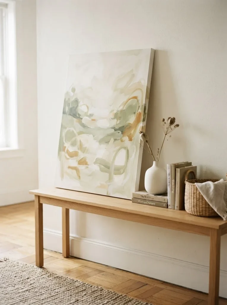
If you have a piece that you love but are not sure is the right permanent placement, lean it first. Live with it for a week. You will know quickly whether it belongs there or whether you want to try a different wall.
A Quick Checklist Before You Buy
Here is the short version for when you are standing at a checkout page:
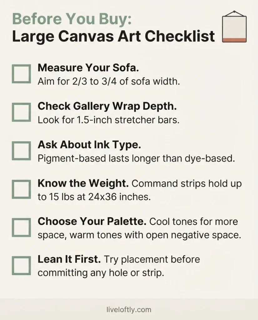
- Measure your sofa. Your canvas should be 2/3 to 3/4 of that width.
- Look for 1.5-inch gallery wrap depth.
- Check whether the listing mentions pigment-based or archival inks if longevity matters.
- Know the weight. Check it against your hanging method. Command Large strips handle up to 15 pounds and 24×36 inches.
- Cool palette if you want the room to feel bigger. Open negative space if the room is small.
- Lean it first if you are not sure where it goes. Commit to the wall later.
A small room with one right canvas on the right wall will always look more finished, calmer, and more like a home than the same room covered in small prints. It does not have to be expensive. It does have to be sized for your space, placed at the right height, and chosen with a little intention.
That part, you can absolutely do.