17 Vintage Framed Wall Art Ideas for Renters on a Budget

I grew up in a house where most of what was on the walls came from someone else’s house first. Mismatched frames, old prints, hand-me-down landscapes that nobody had specifically chosen. For a long time I thought that was embarrassing. Eventually I realized it was actually one of the best decorating educations I could have gotten, because I learned that a room does not need expensive, perfectly matched art to feel warm and personal. It needs art that has a little weight to it. A little story. Something that looks like it was found rather than purchased from a matching set.
That is exactly what vintage framed wall art does. And if you are renting, working with a small space, or trying to make a first apartment feel like more than a temporary stop, vintage framed art is one of the highest-impact, lowest-cost tools available to you. You do not need to spend a lot. You do not need a single nail if your landlord says no. You just need to know a few things that most roundups skip entirely, like how to hang it safely without losing your deposit, what sizing actually works in a small room, and how to make a collected look feel intentional rather than random.
Here are 17 ideas that actually work, along with the practical details to go with them.
Why Vintage Framed Art Works So Well in Rentals and Small Spaces
Before the ideas, a quick note on why this style is so good for the specific situation most of us are in.
Vintage art, whether it is a genuine thrift-store find or a reproduction print in a beautiful old-style frame, carries a sense of history that modern mass-produced prints often lack. It feels personal, even when it was not originally yours. It also tends to be smaller in scale, which is ideal for apartment-sized walls. And because vintage frames come in so many different finishes and styles, they mix easily with whatever furniture you already have, which is important when you are renting and cannot paint the walls or replace the floors.
The other thing vintage framed art does particularly well is add what I think of as visual weight without bulk. A well-chosen framed print anchors a wall and makes a room feel finished, without taking up any floor space at all. In a 400-square-foot apartment, that matters enormously.
The Style Families: Finding Your Vintage
Not all vintage art feels the same, and knowing which style family resonates with you will make sourcing and styling much easier. Here are the main categories to know.
Botanical Prints and Naturalist Engravings
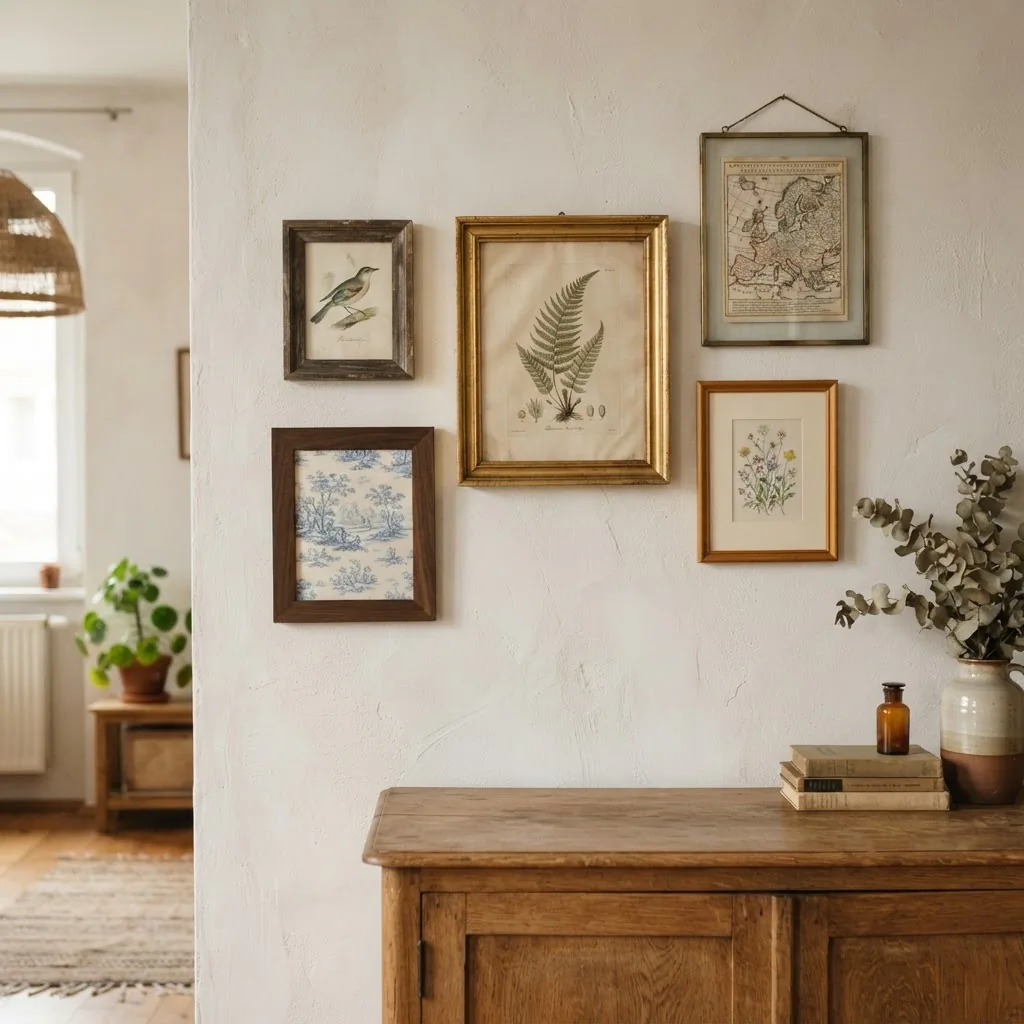
Botanical illustration has a rich history stretching back centuries. Before photography, hand-drawn botanical prints were the scientific record of the plant world, which is part of why the best examples have such extraordinary detail and quiet authority. As My Modern Met explains in their history of botanical illustration, these images were produced with a level of precision and care that makes them genuinely beautiful objects even today. Reproductions are widely available and are among the most affordable vintage-style prints you can find, often from $8 to $25 for a small unframed print. They work in nearly every style of home, from cottagecore to minimalist to coastal.
Antique Maps and Architectural Drawings
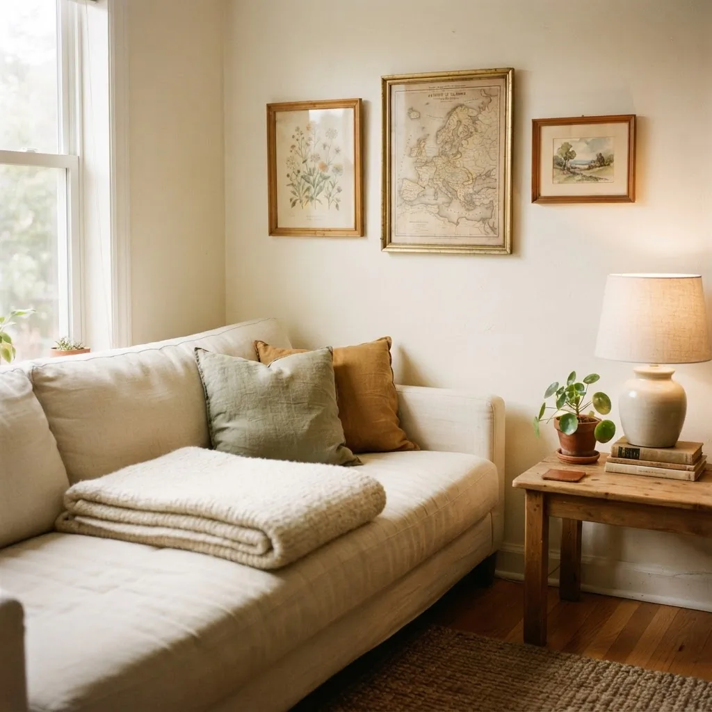
Old maps and architectural engravings add a sense of scholarship and curiosity to a room. A detailed map of a place that means something to you, or an antique diagram of a building, has the same appeal as a travel souvenir but with much more visual interest. These tend to be slightly larger in format, which makes them useful for filling a more prominent wall without needing to build a whole gallery.
Toile and Pastoral Scenes
Classic toile illustrations, usually depicting pastoral European scenes in a single-color line on a cream or pale background, are one of the most versatile vintage print styles because they work with almost any wall color. They lean cottagecore and French country but can read as fairly neutral when framed simply.
Vintage Typography, Labels, and Seed Packets
Old seed catalog covers, vintage apothecary labels, botanical taxonomy charts, and antique type specimens are all highly sought-after in the current decor market. They feel curated and specific without being expensive. Most are available as public domain downloads, which means you can print them at home for the cost of paper and ink.
Portraits, Figures, and Fashion Plates
Vintage portrait engravings and Georgian-era fashion plates add a layer of elegance and a little personality to a room. These are the pieces that make people stop and ask where you got them. They pair especially well with gold or dark wood frames.
Idea 1: The Single Statement Piece on an Awkward Wall
Every rental has that one wall that is too small for furniture and too large to leave bare. A single vintage framed piece in a generous size, say 18 by 24 inches or larger, solves this almost immediately. The key is proportion: the frame should fill roughly two-thirds of the wall width to feel intentional rather than lost.
Idea 2: A Tight Three-Piece Botanical Cluster
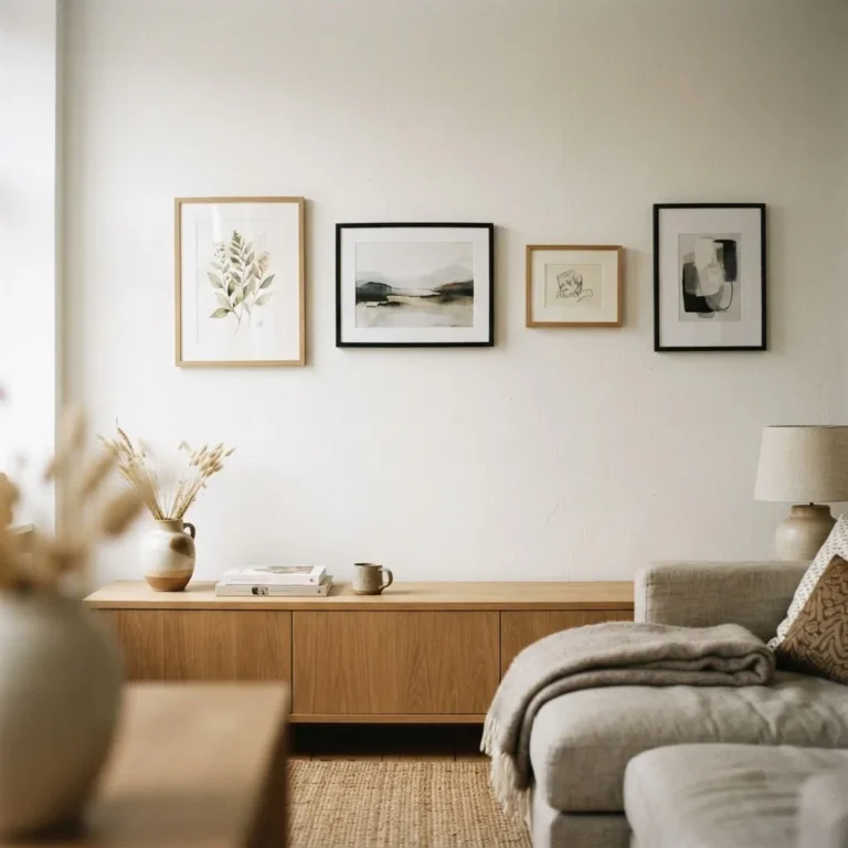
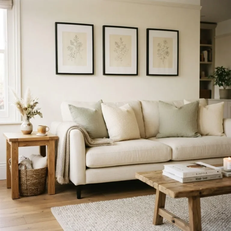
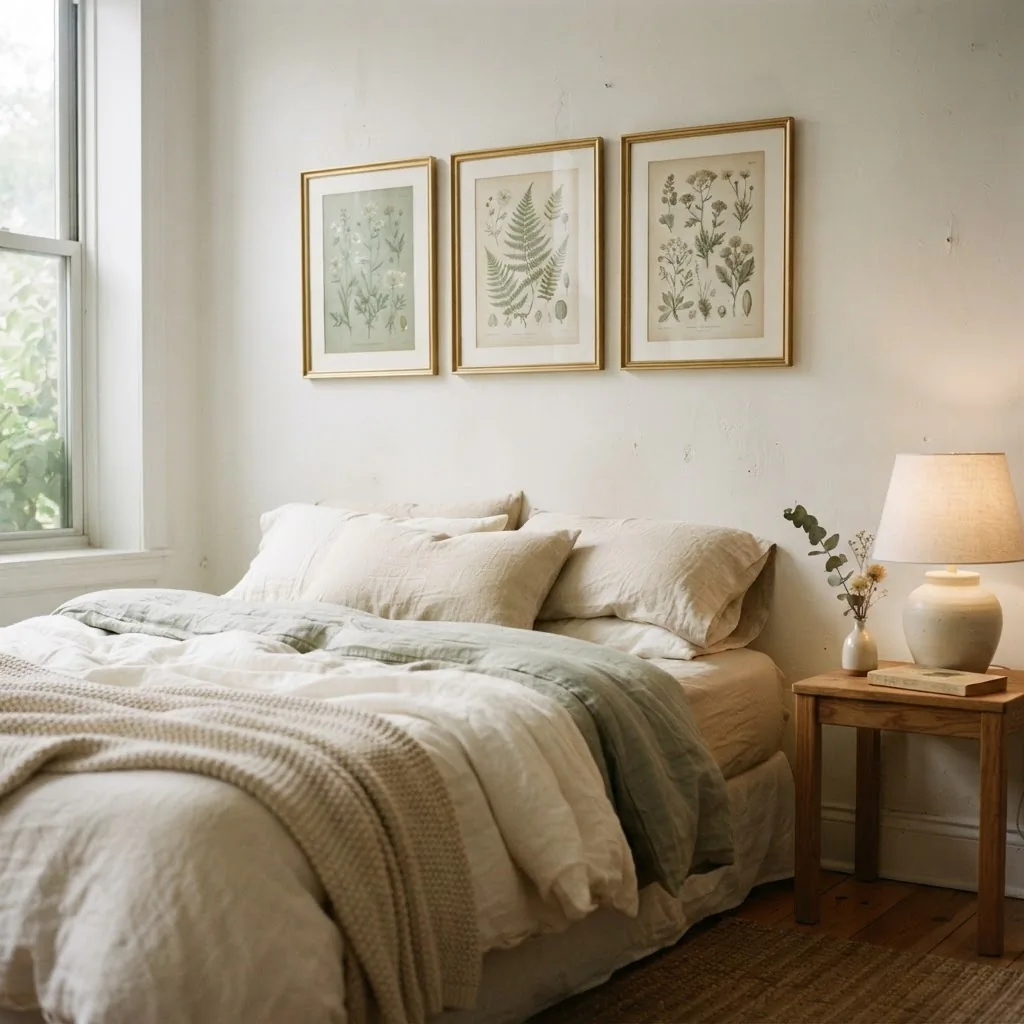
Three botanical prints in matching simple frames, hung as a tight horizontal row with 2 to 3 inches between each, are one of the cleanest and most satisfying arrangements in vintage decor. Use the same mat color across all three to tie them together visually even if the prints themselves differ. This works especially well above a console table, a nightstand grouping, or along a hallway wall.
Idea 3: Mix Frame Finishes, Not Frame Styles
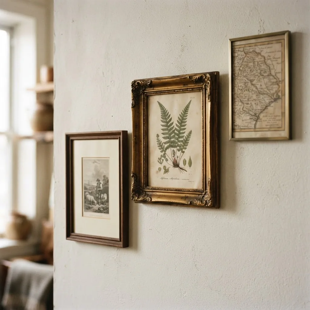
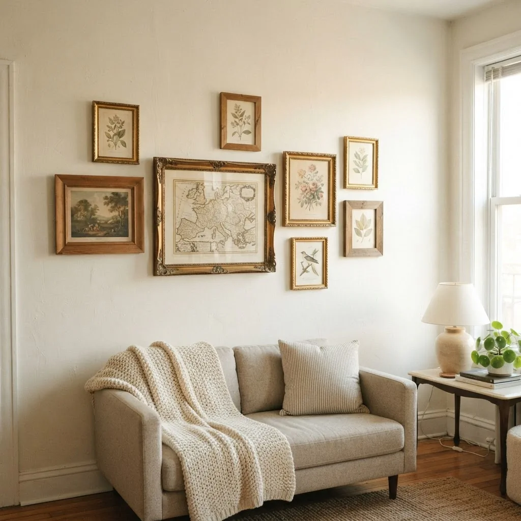
One of the things that makes a vintage collection feel genuinely collected rather than bought-as-a-set is slight variation in frame finish. Try pairing a warm gold ornate frame with a simple dark walnut frame and a thinner brushed brass frame. The variation creates visual interest, but if you stick to the same general color family (all warm metals, or all dark woods), the grouping stays cohesive. What you want to avoid is mixing wildly different style families, like a sleek modern black frame next to a heavily ornate Victorian gold one, because the contrast reads as accidental rather than curated.
Idea 4: The Oversized Thrift-Store Landscape
Thrift stores reliably carry large oil or print landscapes in heavy frames for very little money, often $5 to $15. Even if the art itself is not your style, a large gilded frame holding a moody pastoral scene brings an enormous amount of warmth and character to a living room or bedroom wall. Lean it against the baseboard if you cannot hang it, or use a large format adhesive strip set rated for heavier loads. This is one of the highest-impact, lowest-cost moves in rental decorating.
Idea 5: Public Domain Prints, Self-Printed and Framed
This is the approach I recommend most often to people who want the look but are genuinely stretched thin on budget. The Smithsonian, the Biodiversity Heritage Library, the New York Public Library Digital Collections, and many museum archives offer thousands of high-resolution vintage illustrations, engravings, and prints available for free download. Print them at a local print shop for a few dollars, drop them in a simple frame from a thrift store or discount retailer, and the result is genuinely beautiful. Nobody can tell. This is how you get a $3 vintage botanical print that looks like it belongs in a farmhouse inn.
Hanging Vintage Framed Art Without Losing Your Deposit
This is the section most decorating articles skip entirely, and it is the one that matters most if you are renting.
The first thing to understand is that most lightweight to medium-weight vintage frames can be hung completely damage-free. The 3M Command picture hanging strip system is the most widely used option, and the official Command weight limits guide shows that large strips with four pairs can hold up to 16 pounds, which covers the vast majority of standard framed prints and lighter vintage pieces. For heavier ornate frames with thick glass, you may need to use an actual nail (one small nail leaves one small hole, which most landlords consider normal wear) or simply lean the piece.
The second thing to understand is the hanging height question, which trips up a lot of beginners. The gallery standard, used consistently by professional installers and design schools alike, is to hang the center of the artwork at 57 to 60 inches from the floor.
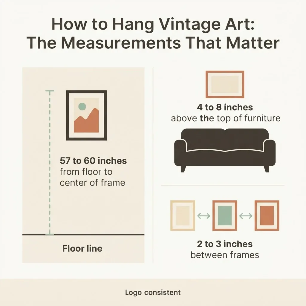
Park West Gallery’s guide to the three rules of hanging art explains this clearly: the logic is that 57 inches approximates average eye level for a standing adult, which is why it feels comfortable to most viewers. Above furniture, the rule adjusts slightly: the bottom of the frame should sit 4 to 8 inches above the top of the sofa, shelf, or headboard beneath it.
Idea 6: Lean Instead of Hang
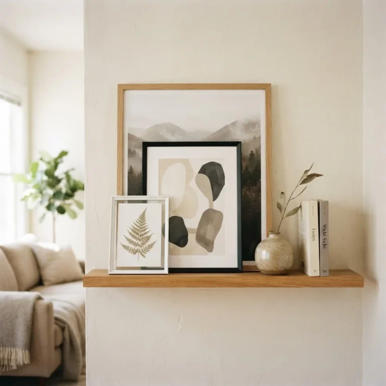
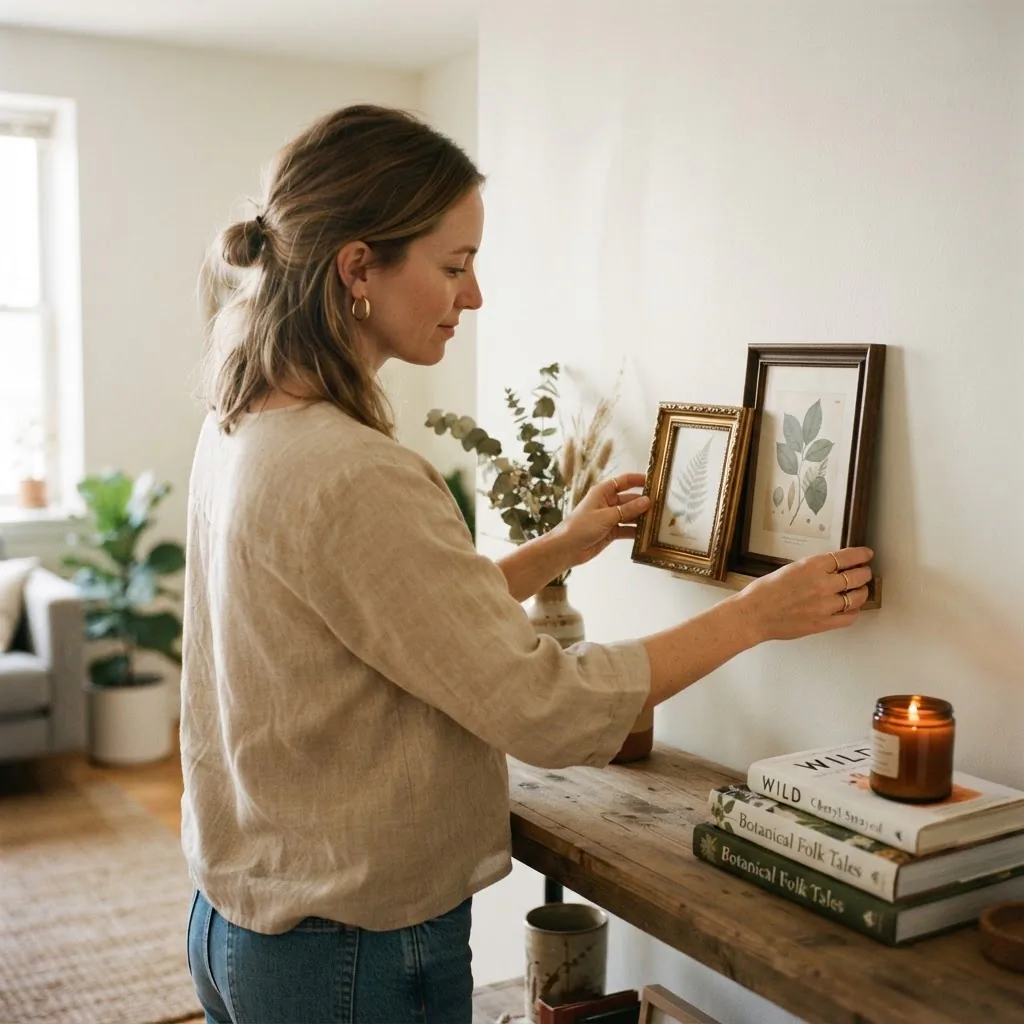
Leaning vintage frames against a wall, on a shelf, on a mantel, or propped on a console table is not a compromise. It is a legitimate styling choice that also happens to be entirely deposit-safe. Leaned frames have a relaxed, collected feeling that hung frames sometimes lack, and you can rearrange them as often as you like without a single hole.
Idea 7: The Mantel or Shelf Stack
If you have a fireplace mantel, a floating shelf, or a deep windowsill, stack two or three vintage frames of different sizes leaning against the wall at the back of the shelf. This creates depth and layering without hanging anything. Mix in a small object or two, a candleholder, a small vase, a stack of books, and the arrangement looks genuinely styled rather than just placed.
Idea 8: The Bathroom Gallery Wall
Bathrooms are often overlooked for gallery walls, but they are one of the best rooms for vintage framed art in a rental because the walls are usually small, the scale is intimate, and even two or three frames make a real impact. Botanical prints, antique map fragments, and vintage typography all work beautifully here. Just keep glass-fronted frames away from direct shower steam if possible.
Building a Vintage Gallery Wall That Feels Intentional
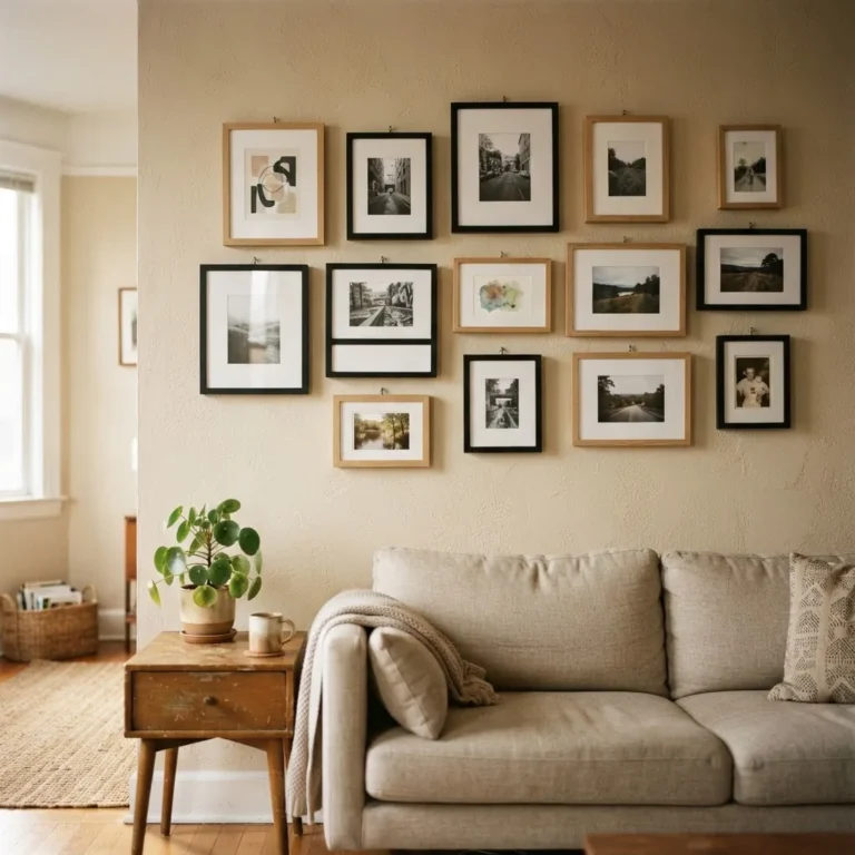
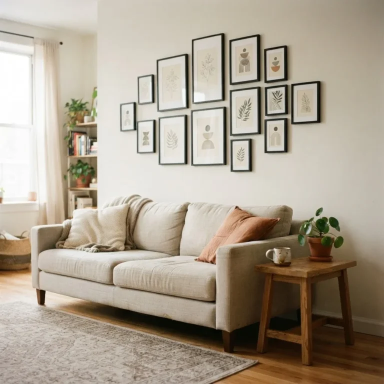
A vintage gallery wall has the potential to be one of the most characterful things in a rental apartment, but it can also look like a pile of random objects if it is not approached with a little structure. Here is the framework I find most reliable.
Idea 9: Establish an Anchor Piece First
Start with one larger piece, the piece you love most, and build around it. This becomes the visual anchor that everything else relates to. Place it slightly left or right of center for a more organic feel, or dead center for a more formal, symmetrical arrangement.
Idea 10: Use Consistent Spacing Across the Group
The most common thing that makes a gallery wall look unfinished is inconsistent spacing between frames. Frameology’s gallery wall spacing guide recommends 2 to 3 inches between frames as the reliable standard, with 2.5 inches being the most practical default for a vintage cluster. You do not need special tools for this: cut small pieces of cardboard to your chosen gap size and use them as spacers while you arrange.
Idea 11: Mix Sizes but Respect the Visual Weight
A gallery wall made up of all small frames looks scattered. One made up of all large frames can feel heavy. The sweet spot is a mix: one or two larger anchor pieces, a few medium frames, and one or two small frames tucked into the gaps. Think of it less like hanging pictures and more like arranging a sentence, where some words are short and some are long, but together they make a coherent thought.
Idea 12: Use Paper Templates Before You Commit
Before you stick or hammer anything, trace the outline of each frame onto craft paper, cut out the shapes, and arrange them on the wall with painter’s tape. This lets you audition the layout without committing to it. Move the templates around until the arrangement feels right, then mark your hanging points through the paper. This step takes maybe 20 minutes and saves enormous frustration.
Framing and Preservation: What to Know When You Are Working with Real Vintage Pieces
If you are buying genuine vintage prints, old engravings, or antique paper art (as opposed to modern reproductions printed in a vintage style), a little care goes a long way toward keeping them beautiful for years.
Idea 13: Choose UV-Protective Glazing for Pieces You Care About
Sunlight and ambient UV light are the main causes of fading in vintage prints and paper-based art. Standard picture frame glass offers almost no UV protection. UV-protective acrylic or glass, available as an upgrade or replacement for most standard frames, can block up to 99% of UV rays, which dramatically slows fading. Harten Frameworks’ guide to UV protection in picture framing is a thorough and practical read if you want to go deeper on this. For prints you genuinely love, the upgrade is usually worth it.
Idea 14: Use Acid-Free Matting for Any Paper-Based Vintage Art
If you are framing or reframing a vintage print, the mat and backing board matter as much as the glass. Regular cardboard and standard matting materials are acidic, and over time that acid migrates into the paper and causes yellowing, brittleness, and staining. The Library of Congress preservation guidelines for matting and framing are the authoritative reference here, and they are clear: acid-free, lignin-free materials are the standard for preserving works on paper. Acid-free mat board is available at most craft stores and is not expensive, usually a few dollars more than standard matting.
Sourcing on a Budget: Where to Actually Find Vintage Framed Art
Most roundups tell you to “shop vintage” without any real detail about how. Here is where the good things actually are.
Idea 15: The Thrift Store Walk
Thrift stores are the single best source for genuine vintage frames and legitimately old art. A Saturday-morning pass through a Goodwill or Salvation Army will often turn up several framed prints, old landscapes, and interesting ornate frames for a few dollars each. The art inside does not need to be your forever art; you can always remove it and replace it with a print you love. The frame is usually the thing worth buying.
One note worth knowing: if a frame is genuinely old, painted before 1978, there is a small chance the paint contains lead. The EPA’s guidance on reducing lead exposure at home notes that intact lead paint on surfaces that are not being disturbed poses a low everyday risk, but it is worth being thoughtful about sanding or stripping old frames, especially in homes with young children. If in doubt, seal the surface rather than sanding it.
Idea 16: Public Domain and Free Download Sources
For renters on a genuinely tight budget, the public domain is extraordinary. The Smithsonian Open Access collection, the Biodiversity Heritage Library, the NYPL Digital Collections, and Europeana all offer high-resolution vintage images at no cost. Many vintage Etsy sellers also offer digital downloads for a few dollars. Print at a local print shop (many offer large format printing for under $10), frame it, and you have original-feeling vintage art for very little money.
Idea 17: Reframe What You Already Have
This is the idea most people overlook entirely. If you have a print, a photo, or even a piece of fabric or paper you love, putting it in a beautiful vintage-style frame changes everything about how it reads. A simple black-and-white family photo in a warm gold ornate frame feels like a heritage portrait. A watercolor postcard in a dark wood frame with a cream mat looks like a considered art find. The frame is doing more work than you think. Invest in a good frame and let the art follow.
Style Pairings: Which Vintage Art Works in Which Room
The right vintage art in the wrong room can feel incongruous, so here is a quick guide to matching style to space.
In a bedroom, soft and intimate images work best: florals, portrait miniatures, gentle landscapes, and anything with a quiet, calming quality. Frames in warm tones (gold, brass, honey wood) add to the feeling of coziness.
In a living room, you have more freedom. A bold antique map, a large pastoral landscape, or a well-built gallery wall of mixed vintage prints all work. This is also the room where scale matters most: do not go too small here. A print that looks right in a bedroom can disappear entirely against a living room wall.
In a kitchen or dining area, vintage labels, seed catalog covers, and botanical kitchen prints (herbs, fruits, vegetables) feel both decorative and appropriate to the room’s purpose. They tend to be small in format, which fits well in the tighter wall spaces common in apartment kitchens.
In an entryway or hallway, single pieces hung in a vertical column work well with the narrow proportions. A tall antique map, a pair of matched botanicals stacked vertically, or a set of three small frames in a column all read clearly without overwhelming a tight passage.
A Few Honest Notes Before You Start
Vintage framed art does not require perfect taste, a large budget, or even a lot of wall space. It requires choosing things that have a little weight and meaning to you, hanging them at the right height, and giving them enough room to breathe. Most of the rules are just starting points. A gallery wall with 2.5-inch spacing that you love is better than a perfectly measured arrangement that feels forced.
The one thing I would tell every renter or first-apartment dweller who feels unsure: start with one piece. Find one thing you genuinely like, frame it well, hang it at 57 to 60 inches from the floor, and see how the room changes. It is a remarkably large shift for one small decision. From there, the next piece is easier, and the one after that easier still. That is how a home actually gets made: one small good choice at a time.