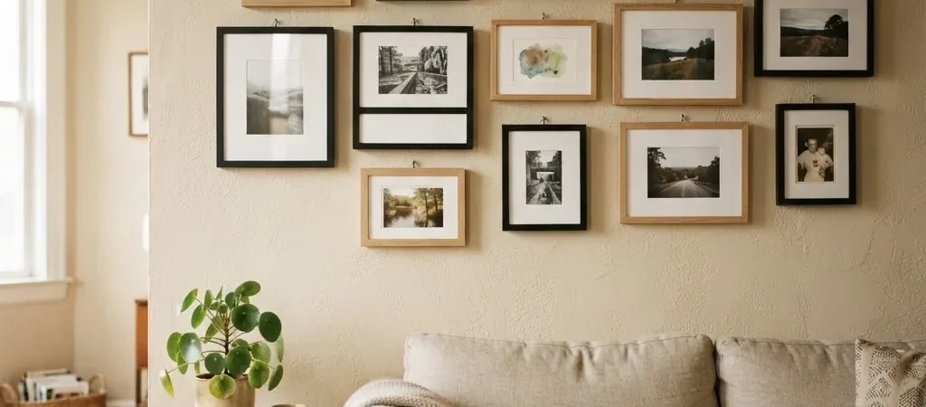
The best frame color for your wall depends on one thing more than anything else: your wall’s undertone, not just its surface color. Warm walls (creamy whites, beige, tan, warm gray) pair best with gold, warm wood, or off-white frames. Cool walls (true white, blue-gray, navy, sage green) work best with black, silver, crisp white, or cool-toned wood. That’s the short answer. Everything below helps you figure out which camp your walls fall into, and then pick the right frame without second-guessing yourself.
I want to be upfront about something before we go further. This is a buying guide. I’m going to tell you which frame colors work, why they work, and give you real products to consider. I am not going to tell you how to style your gallery wall or which art to hang, because that is genuinely Maren’s territory, and she is much better at it than I am. My job is to help you buy the right frame so you’re not staring at something that looks off on the wall and wondering where you went wrong.
Why Undertone Is the Real Answer (and What That Word Actually Means)
Almost every wall color is a mix of pigments, which means your wall has a surface color you register immediately, and a hidden undertone underneath it. That undertone is what determines whether your gray wall reads as blue-gray or purple-gray, whether your white feels crisp or creamy, and whether your beige leans warm honey or cool greige. Picking a frame that fights your undertone is the single most common reason people end up with frames that look “a little off” even when the color seems right on paper.
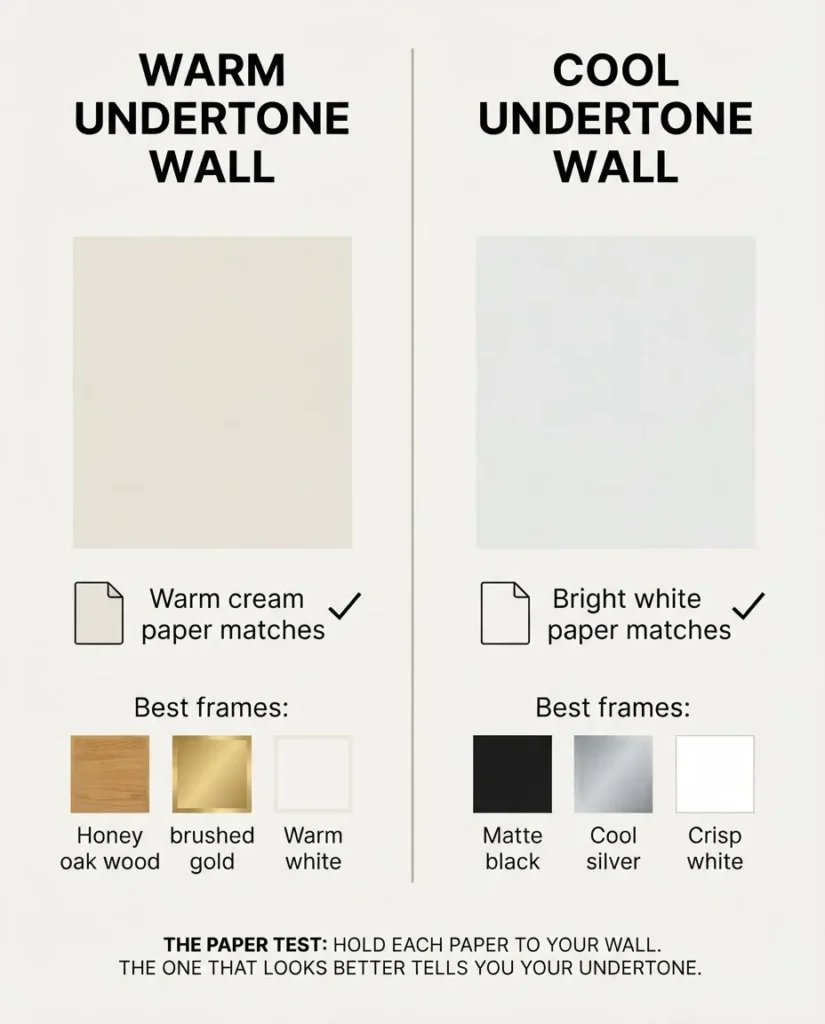
The practical way to check your undertone without owning a color wheel: hold a piece of pure white paper and a piece of warm cream paper next to your wall, one at a time. Whichever one makes the wall look better and more cohesive is telling you something. If the cream paper looks right, your wall has warm undertones. If the bright white paper looks right, your wall leans cool. Benjamin Moore’s guide to warm and cool paint colors explains the science behind this well if you want to dig deeper, but for buying purposes, the paper test is good enough.
Once you know your undertone, the rest of the decisions get a lot simpler. Warm walls want warm frames. Cool walls want cool or neutral frames. And a handful of finishes (matte black especially) are versatile enough to work almost anywhere.
The Four Frame Colors That Actually Work on Most Walls
Black Frames: The Most Versatile Pick, with One Caveat
Matte black is the safest, most broadly useful frame color you can buy right now, and the bestselling finish across every major frame retailer and Amazon’s own picture frame category. It works on white walls, gray walls, beige walls, greige walls, and even darker walls because it creates contrast without clashing with undertones. The caveat: gloss black is a different animal. High-gloss black frames reflect light and can look cheap or industrial in a home setting. When you’re shopping, read the listing description carefully. Matte black is what you want for most living rooms, bedrooms, and hallways.
Black frames also hold up well on dark walls. A matte black frame on a navy or dark green wall might sound like it will disappear, but it actually works in a tone-on-tone way that reads as intentional and slightly sophisticated. The frame still defines the art; it just does it quietly.
Natural Wood and Warm Wood Tones: The Best Choice for Warm Walls
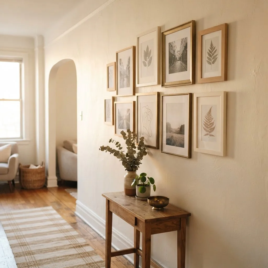
Light natural wood, honey oak, and warm walnut frames are the go-to for any wall with warm undertones, which covers most beige, cream, tan, warm white, and warm gray walls. Wood frames have a softness that painted metal or MDF frames can’t quite replicate, and they tend to age better too. A natural oak or light pine frame pulls the warmth out of a cream-colored wall in a way that feels organic rather than matched.
Dark walnut is a different tone within the same family. It works on warm neutral walls but also bridges into cooler greige or gray environments because it reads more as neutral than warm. If you’re unsure whether your walls lean warm or cool, a dark walnut frame is a lower-risk pick than a bright gold or a honey oak.
Framebridge’s guide on choosing frame color for your wall color explains the warm/cool metallic pairing in useful detail: warm undertone walls pair naturally with gold and warm-toned wood, while cool undertone walls call for silver or black.
Gold Frames: Worth It on the Right Wall, a Skip on the Wrong One
Gold frames are polarizing, and I think that’s because people buy them without checking their wall undertone first. On a warm wall (creamy white, warm beige, warm gray, sage green with warm yellow undertones), a brushed or antique gold frame looks genuinely good. It adds warmth without trying too hard. On a cool wall (blue-gray, true white, cool greige), gold can clash in a way that’s hard to pin down but immediately visible. It just looks wrong, even if you can’t explain why.
The other thing to know: not all gold frames are the same finish. Brushed gold and antique gold are warm and matte-ish, which is more forgiving. Shiny bright gold is a harder look to pull off in everyday rooms. If you want gold, aim for brushed or antiqued finishes.
White Frames: Only If You Match the Undertone
White frames are trickier than they look. A bright white frame on an off-white or cream wall looks stark and disconnected. An off-white frame on a true bright white wall looks dingy. The fix is to match your frame’s white tone to your wall’s white tone. If your walls are a warm cream or off-white, look for frames described as “distressed white,” “antique white,” or “warm white.” If your walls are a true white (bright, clean, no yellow), a crisp bright white frame works. When in doubt, choose a white frame with a slightly warm bias, because rooms almost always have warm light from fixtures and natural sun that flatters warmer whites.
Wall Color, Frame Color: A Quick Reference
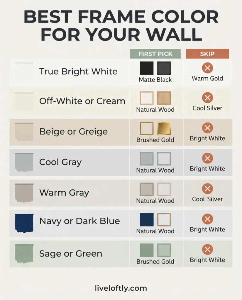
This is a practical decision table, not a design prescription. Use it as a starting point and adjust for your specific undertone.
| Wall Color | First Pick | Second Pick | Skip |
| True bright white | Matte black, crisp white | Natural light wood | Warm gold, off-white |
| Off-white / cream / warm white | Natural wood, brushed gold | Warm white / antique white | Cool silver, bright white |
| Beige / tan / greige (warm) | Natural wood, brushed gold | Matte black | Cool silver |
| Gray (cool-leaning) | Matte black, silver | Crisp white | Warm gold |
| Gray (warm-leaning) | Natural wood, brushed gold | Matte black | Cool silver |
| Navy / dark blue | Matte black, gold | Natural wood | Bright white (too stark) |
| Sage / olive green | Natural wood, warm gold | Matte black | Cool silver |
| Dark green / forest green | Matte black, dark walnut | Brushed gold | Cool silver |
| Warm earth tones (terracotta, rust) | Natural wood, brushed gold | Matte black | Cool silver, bright white |
What About Renters Stuck with Landlord Beige?
This deserves its own section because landlord beige, off-white, or apartment-standard “Swiss Coffee” type walls are the most common real-world starting point for renters and first-time apartment dwellers. The good news: those walls almost universally have warm undertones (cream, tan, greige). That means natural wood frames work extremely well, warm gold frames are a safe bet, and matte black gives a nice contrast without clashing. Crisp bright white frames are the only real risk on landlord beige, because the undertone contrast makes both colors look a little off.
If your rental has those generic smooth off-white walls and you want a gallery wall, a natural light wood frame set is probably your easiest, most forgiving choice. It doesn’t fight the wall. It just sits there looking good and letting the art do the work.
Can You Mix Frame Colors? Yes, Here’s How to Do It Without a Mess
The short answer is yes, and it often looks better than all-matching frames. The key is a limit of two or three frame colors maximum, and those colors need to share either a tone family (all warm: gold, wood, warm white) or a contrast family (all cool-neutral: black, silver, cool white). Mixing a brushed gold, a dark walnut, and a warm white frame on the same wall works because all three have warm undertones. Mixing a matte black frame with a cool silver and a crisp white also works because all three are cool or neutral. What doesn’t work is mixing across temperature lines on the same wall: gold frames next to silver frames, or warm wood next to cool white next to black. That combination usually reads as “random” rather than “collected.”
This guide from Buy Wall Art on whether picture frames should all be the same color does a good job of walking through when matching works and when mixing works, and is worth a quick read if you want more on this. For most practical gallery walls, I’d say: pick one anchor color (usually matte black or natural wood) and let a second color be an accent.
Standard gallery wall practice is to keep frames about 2 to 3 inches apart.
This gallery wall spacing and rules cheat sheet from Southern Yankee DIY is useful if you’re planning the layout at the same time as you’re choosing frame colors.
Frame Material and Finish: What to Look for in a Listing
The frame color is one thing. The quality of the frame that holds that color is another, and this is where budget sets often disappoint. Here’s what to actually check before you buy:
Frame material: Engineered wood (MDF) is fine for most budget and mid-range sets. It holds paint finishes and color consistently and is stable in normal indoor conditions. Solid wood (oak, pine, walnut) is more durable long-term and less prone to warping in humid rooms. If you’re buying a large multi-pack set and want to keep costs reasonable, engineered wood is acceptable. If you’re buying individual larger frames or something that will see years of use, solid wood is worth the step up.
Glass vs. acrylic: Real glass gives the clearest, most distortion-free view of your art. It’s heavier and breakable, so it’s not always practical for large gallery walls with lots of small frames. Shatter-resistant acrylic or plexiglass is lighter and safer, and is the standard in most budget gallery wall sets. It works fine for most uses but can scratch over time and has very slight visual distortion compared to real glass. For large individual frames (24×36 art prints, for example), I’d look for real glass or high-quality acrylic. For a 10-piece mixed-size gallery set, acrylic is perfectly reasonable.
Frame finish: Matte finishes hide fingerprints and dust better than gloss and generally look more considered on a wall. Gloss or lacquered finishes look sharp in photos but can appear cheap in certain lighting. When a listing says “black woodgrain finish,” that typically means a matte black finish over engineered wood, which is what most mid-range black frames are. It’s not a problem, just manage expectations: it won’t look like cast aluminum.

Frame Destination’s guide to standard picture frame sizes is a helpful reference for double-checking that the frame set you’re considering matches the print sizes you own or plan to buy. Getting this wrong is an easy, frustrating mistake.
Recommended Frame Sets to Buy (By Color)
Here are three solid, real-product picks organized by frame color category. These are sets I’d point a first-timer toward in each color family. I’ve researched them based on consistent buyer feedback, material specs, and what they offer per dollar in their respective price ranges.
Best Matte Black Gallery Frame Set
The Americanflat Gallery Wall Frame Set of 10 in Black includes two 8×10, four 5×7, and four 4×6 frames. Constructed from engineered wood with shatter-resistant glass, it comes with hanging hardware included. From what buyers consistently report, assembly is straightforward and the finish holds up well in normal living room conditions. The set covers the three most common photo and print sizes in one purchase, which is useful for a first gallery wall.

- Includes total of 17 black picture frames of sizes – two 8×10 inches, six 5×7 inches, eight 4×6 inches along with necess…
- Frames can be used for wall mounting or for desktop display. Easy to open tabs allow quick loading of pictures which fit…
- Set includes protective packaging specifically designed to enable safe delivery of fragile items.
Best Natural Wood Gallery Frame Set
HAUS AND HUES offers a solid natural oak wood frame set that covers the key sizes for a gallery wall. The oak construction is a step up from painted MDF in terms of durability, and the natural wood finish has warm, organic undertones that complement cream, beige, and warm-gray walls well. Buyers consistently call out the real glass fronts and the clean finish on the wood grain. If your walls are warm-toned, this is the set worth considering.

- GALLERY WOOD FRAME SET: Frame your favorite prints and photographs with Haus and Hues wall gallery frame set. Mixing and…
- VARIETY PICTURE FRAME PACK: Whether you place the frames along your staircase, in your office, living room, or bedroom, …
- PREMIUM QUALITY: Our Pennsylvania solid wood oak frames will add the finishing touch to your art. The gallery wall set i…
Best Gold Frame Set
The Giftgarden 14-Pack Gold Picture Frames Set is one of the more complete gold frame multipacks available. With 14 frames across three sizes (11×14, 8×10, and 5×7), it gives you enough variety to build a full gallery wall without buying individually. Buyers note the warm, brushed-gold finish reads more antique than garish, which is what you want on a warm-toned wall. Worth checking the listing for current sizing and mat configuration before purchasing.

- [Abundant Frame Set] This product is a comprehensive set of 14 gold photo frames designed to cater to your diverse frami…
- [Lightweight Durability] Constructed from lightweight plastic and plexiglass front, these photo frames are simultaneousl…
- [Matting Advantage] Each gallery wall frame in this versatile picture frame set comes with a mat, allowing two sizing op…
Best Pick for Large Format Prints and Posters
If you’re framing art prints, concert posters, or large photos (24×36 is the most common large print size), the MCS Original Poster Frame 6-Pack in Black is the one to look at. Buyers consistently call it out for being lightweight enough to hang easily while still looking clean on the wall. MCS is one of the more reliable names in this category for budget-friendly poster frames that don’t look flimsy.

- MODERN DESIGN: This set of lightweight hanging picture frames are the ideal choice to display your favorite photos, art …
- DIMENSIONS: This set of six frames will each accommodate one 24×36 inch photograph, artwork or art print; This hanging f…
- LIGHTWEIGHT FRAME: With a thin black profile and corrugated backing, each lightweight plastic picture frame includes a c…
The Quick Comparison: Black vs. Wood vs. Gold
If you’re still not sure which direction to go and want one side-by-side look:
- Includes total of 17 black picture frames of sizes – two 8×10 inches, six 5×7 inches, eight 4×6 inches along with necess…
- Frames can be used for wall mounting or for desktop display. Easy to open tabs allow quick loading of pictures which fit…
- Set includes protective packaging specifically designed to enable safe delivery of fragile items.
- GALLERY WOOD FRAME SET: Frame your favorite prints and photographs with Haus and Hues wall gallery frame set. Mixing and…
- VARIETY PICTURE FRAME PACK: Whether you place the frames along your staircase, in your office, living room, or bedroom, …
- PREMIUM QUALITY: Our Pennsylvania solid wood oak frames will add the finishing touch to your art. The gallery wall set i…

- ONE-TOUCH AUTOMATIC SEALING: This smart compact vacuum sealer is super easy to operate. Simply press the button to start…
- POWERFUL 60KPA SUCTION & FAST SEALING: This food vacuum sealer delivers powerful 60kPa suction, quickly removing air fro…
- HANDHELD VACUUM SEALER WITH 2 MODES: Auto Mode provides simple one-touch sealing for dry foods, while Manual/Pulse Mode …
Honest Skip-It Notes
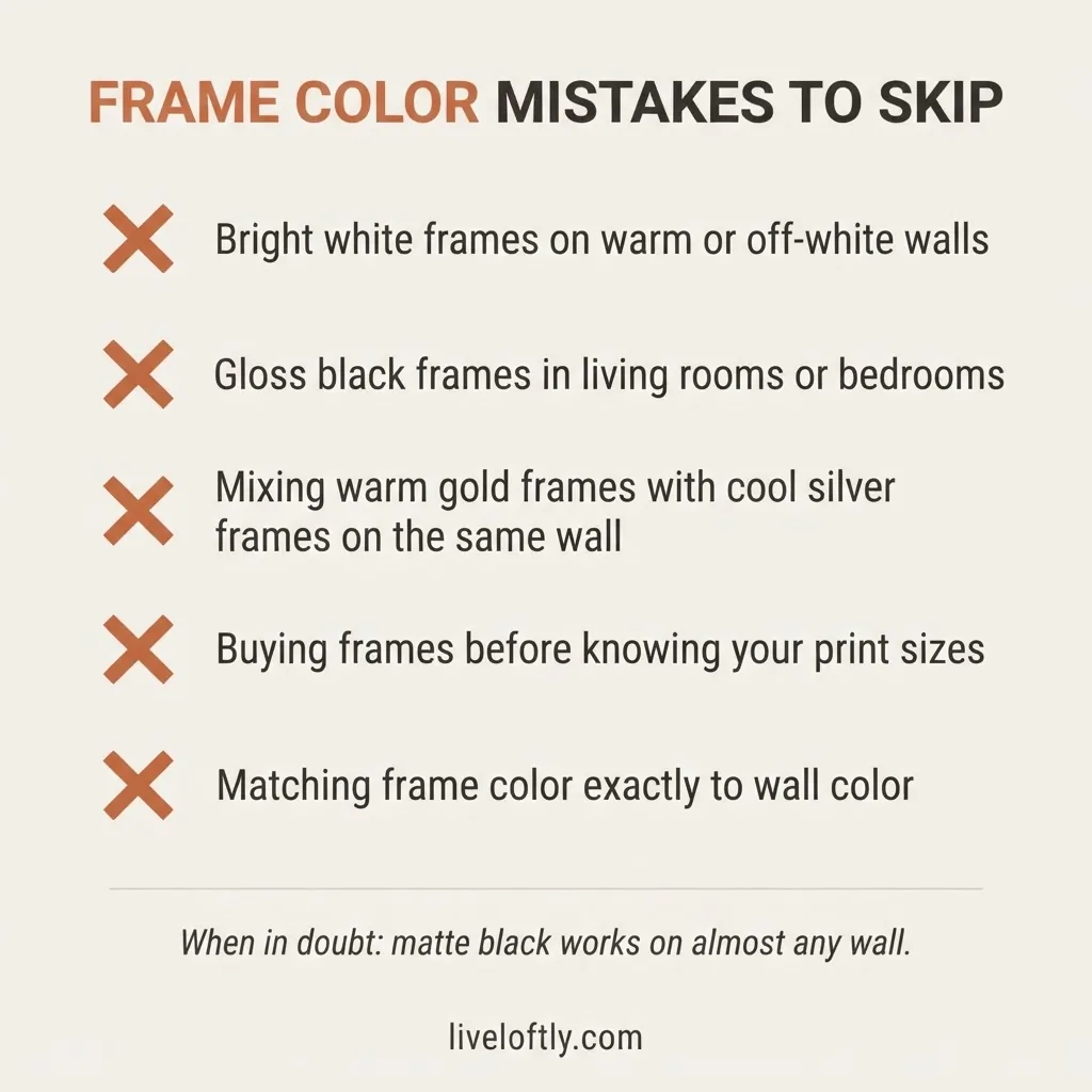
Skip bright white frames on warm or off-white walls. The undertone mismatch is subtle but real, and once you see it, you can’t unsee it.
Skip glossy black frames in most home settings. Matte black is nearly always a better call for actual walls in real rooms.
Skip mixing warm and cool frame colors on the same wall. A warm wood frame sitting next to a cool silver frame will look accidental, not curated.
Skip buying individual frames before you know your print sizes. Frame USA’s standard frame size reference is a useful sanity check before you commit to a set. Getting the size wrong means a return, and returning bulky frame sets is one of those headaches I’d very much like to save you from.
FAQ
What is the best frame color for gray walls?
For cool-leaning gray walls, matte black or crisp white frames are the safest choices. For warm-leaning gray (gray with yellow or brown undertones), natural wood or brushed gold frames work well. The key is checking whether your gray leans cool or warm before committing to a frame color.
Should picture frames match the wall color?
Picture frames do not need to match your wall color. Frames that contrast or complement the wall’s undertone almost always look better than an exact match. A tone-on-tone look (dark frames on dark walls, white frames on white walls) can work, but it requires careful undertone matching to avoid the frame blending into the wall entirely.
Can you mix different frame colors on one wall?
Yes. On a gallery wall, sticking to two or three frame colors in coordinating tones keeps the look cohesive without requiring every frame to be identical. The important rule is to keep all the frame colors within the same temperature family: all warm tones together, or all cool and neutral tones together.
What frame color works best for white walls?
For true bright white walls, matte black or crisp white frames are the cleanest choices. For off-white or cream walls, natural wood or warm white/antique white frames work better. Using a bright white frame on an off-white wall creates an undertone clash that most people notice but can’t explain.
What frame color is most versatile if I’m not sure?
Matte black is the single most versatile frame color for most home walls. It works on white, gray, beige, greige, and dark walls, and it doesn’t require undertone matching the way gold, silver, or white frames do. If you’re shopping on a budget and you genuinely don’t know your wall’s undertone, matte black is the lowest-risk starting point. LevelFrames’ color theory guide for framing covers this in more depth if you want a fuller picture.