How to Do a Staircase Gallery Wall (Without the Stress)

There is a specific kind of guilt that comes with a blank staircase wall. You walk past it ten times a day. You know it should have something on it. You have probably pinned forty-seven photos of beautiful staircase gallery walls at 11pm. And yet, months later, the wall is still bare.
I hear this all the time, and I want to tell you directly: that wall is not blank because you are bad at decorating. It is blank because the staircase wall is genuinely one of the trickier spots in a home to style. It goes on a diagonal. It is tall and narrow in some places and wide and open in others. It is hard to stand in front of to measure. And for anyone renting, the fear of putting holes in the wrong spot and then multiplying them across an entire staircase is very real.
But here is what I have figured out over years of decorating rental after rental on a tight budget: the staircase gallery wall is actually one of the most forgiving walls in your home once you know a few simple rules. You do not need a contractor, a design background, or a big frame budget to pull it off. You need a plan, a roll of painter’s tape, some kraft paper, and a clear idea of what you are going for before a single nail goes in.
This guide walks you through the whole thing, from picking your layout and your frames to getting everything level on that diagonal wall, damage-free if you need it to be.
Why the Staircase Wall Feels So Hard (and Why It Is Actually Not)
The thing that trips most people up is the angle. On a flat wall, you hang things at eye level and call it a day. On a staircase wall, the floor is literally moving as you go up, which means your eye level changes with every step. That diagonal line creates a sense that there is no “right” answer, and so people freeze.
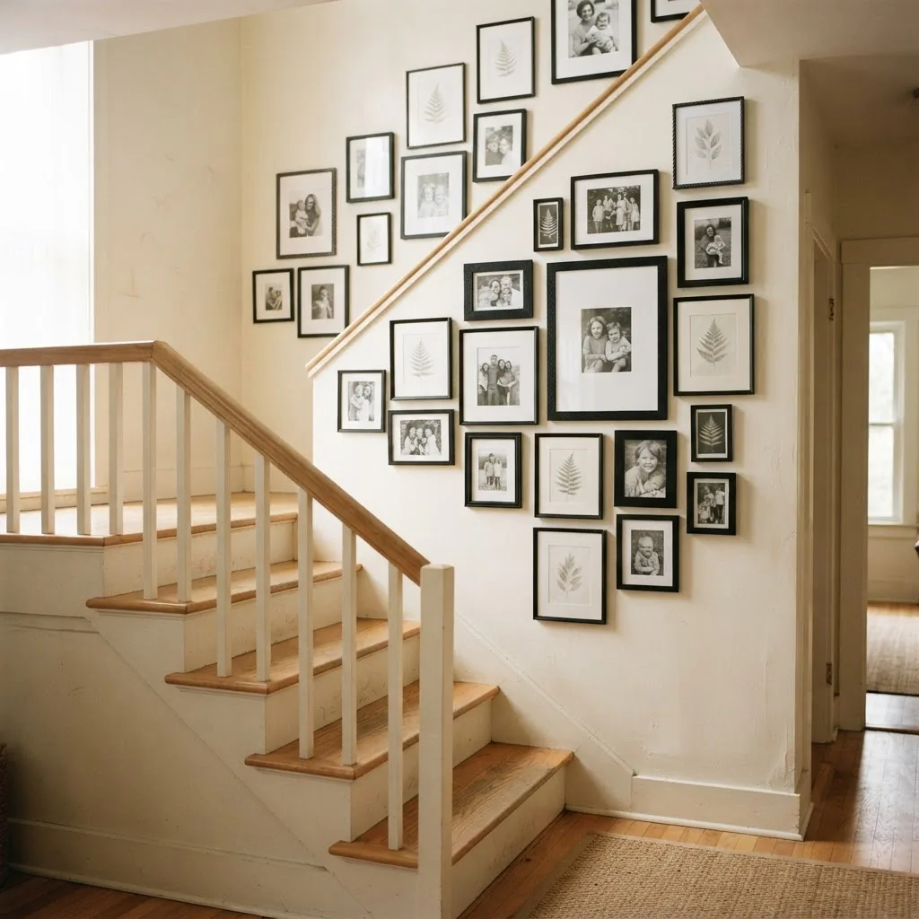
But here is the secret: the staircase’s diagonal is not the enemy. It is actually the design element. When you hang frames so they follow and echo that rising diagonal line, the whole wall comes alive. It moves with you. Your eye travels up the stairs naturally, pulled along by the arrangement. That feeling, when it lands right, is one of the best things a wall can do in a home.
The other reason people freeze is frame size. A staircase wall is usually tall and spans a lot of vertical territory. Small frames get swallowed alive. This is a wall that can handle real size, and that is actually great news for your wallet because you only need a handful of medium-to-large frames to fill it, not twenty tiny ones.
Start Here: The Three Layout Styles That Work Best
Before you buy a single frame, decide which layout approach fits your wall and your style. Not every staircase gallery wall has to be the same shape.
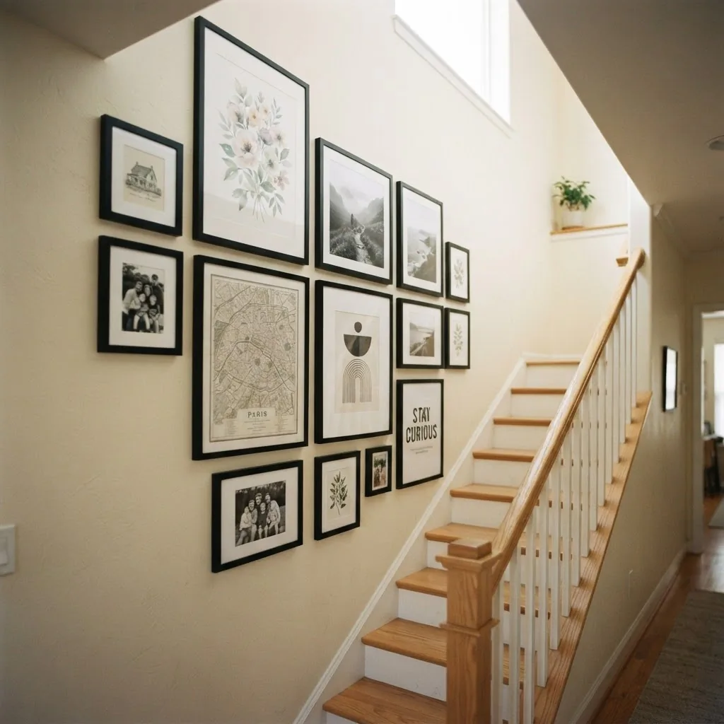
The Diagonal Staircase Line is the most classic approach and works on almost any staircase wall. Frames are arranged so their centers follow an imaginary diagonal line that roughly parallels the angle of your stair railing. The whole arrangement rises as the stairs rise. This is the approach you have seen in every Pinterest image of a staircase gallery wall, and it works because it is natural. It mirrors the architecture instead of fighting it.
The Clustered Arrangement works better on shorter walls or walls where the staircase makes a landing. Instead of a long diagonal run, you group frames in a more organic cluster, usually starting from a landing or a mid-wall anchor point. This feels less formal and more collected, and it is great for eclectic or boho styles.
The Grid is the clean, modern option. Uniform frames in uniform rows, all perfectly level. This takes more precision because a level grid on a slanted wall means each row has to be deliberately horizontal even as the wall angles away. It looks striking when done right, especially in black frames on a white wall, but it requires careful measuring.
For most people, especially beginners, the diagonal line approach is the most forgiving and the most natural-looking. That is what most of this guide focuses on.
The Planning Method That Saves You From Fifteen Regrettable Nail Holes
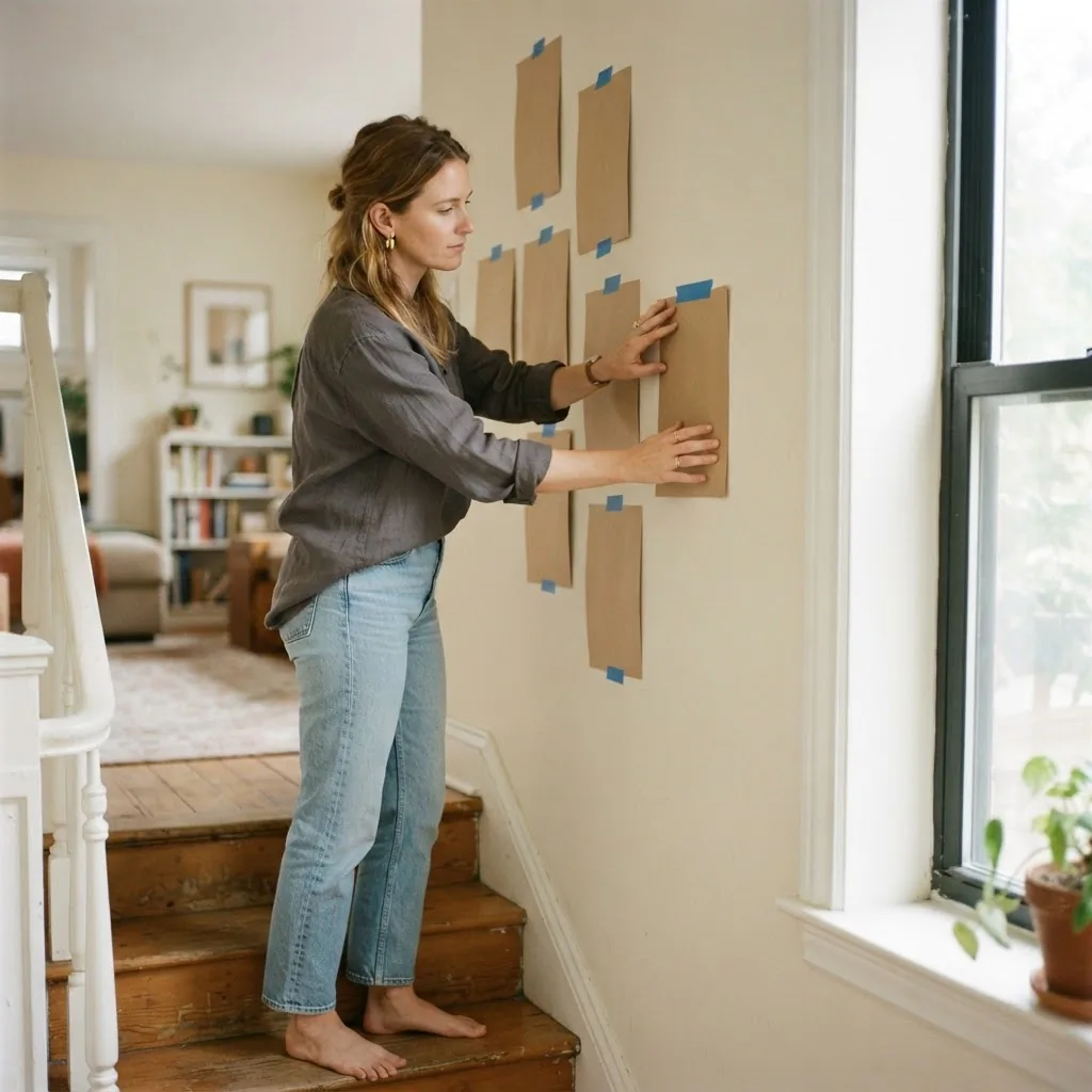
Here is the single best thing you can do before hanging anything: map the whole layout on kraft paper or butcher paper first.
Roll out your paper on a flat floor and trace each frame you plan to use. Cut them out so you have paper versions of each frame at full size. Then bring those paper cutouts to the wall and tape them up with painter’s tape. Move them around. Adjust. Step back to the bottom of the stairs, look up, and see whether the arrangement feels right at actual scale. You will be surprised how often a layout that looked perfect on paper looks completely off once it is on the wall, and how easy it is to fix when everything is still paper and tape rather than frames and nails.
This method also makes it easy to mark your nail or strip placement directly on the paper templates before removing them, so you know exactly where each hanger needs to go. It is the approach most professional stylists use, and it costs nothing.
Once your paper layout is taped up and you are happy with it, I would suggest leaving it up for a day or two and walking past it at different times. The staircase is a space you experience in motion, so test it in motion before you commit.
The 57-Inch Rule, and What It Actually Means on a Staircase
On a flat wall, the standard is to hang artwork so its center sits at 57 to 60 inches from the floor. This is the museum standard, and Apartment Therapy has a clear breakdown of exactly why 57 inches on center is the rule that most galleries use, because it aligns roughly with average adult eye level when standing.
On a staircase, this rule still applies, but you measure from the tread of the step nearest to each frame, not from the ground floor. So as you work your way up the staircase, each frame’s center is still at approximately 57-60 inches from the step it is most closely aligned with. In practice, this means that if you laid a measuring tape horizontally at each step and measured up, every frame’s center point would land around the same height above its own “local floor.” This is what creates the parallel-to-the-railing diagonal visual, everything rising together at a consistent height relative to the step it corresponds to.
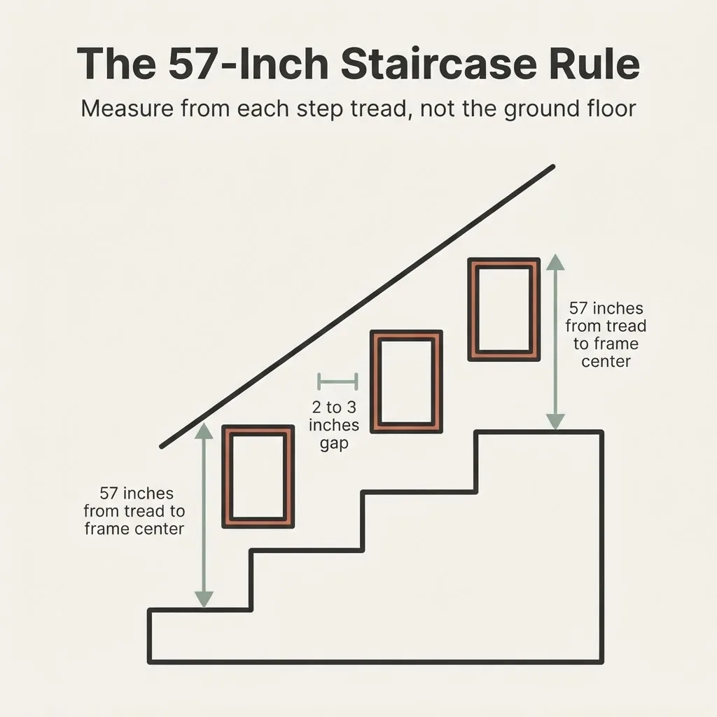
For hallways and staircases specifically, some stylists prefer using 60 inches rather than 57, since viewers are in motion and tend to look slightly higher when walking. Either measurement works. What matters most is consistency: all the frames should share the same center height relative to their nearest tread.
Frame Sizing: What Actually Fits a Staircase Wall
This is where most staircase gallery walls go wrong. People pull out all the 4×6 and 5×7 frames they have sitting in a drawer and wonder why the wall looks sparse and accidental. Those sizes are too small for a staircase wall in almost every case.
For a staircase gallery wall, the sweet spot is generally frames between 11×14 and 20×24. A mix of sizes in that range works well. You can fill in a few gaps with 8×10 frames, but they should be the minority, not the foundation. The larger pieces, in the 16×20 and 18×24 range, should anchor the arrangement.
A good working range for most average staircases (running about 12 to 15 feet in length):
- 2-3 larger anchor frames (16×20 or 18×24)
- 3-4 medium frames (11×14 or 12×16)
- 2-3 smaller fill frames (8×10)
That gives you roughly 7-10 frames for a typical staircase run, which feels full without looking cluttered. If your staircase is longer, scale up. If it is a short wall above a landing, you might do as few as 5.
Spacing between frames should stay consistent across the whole arrangement. The standard is 2-3 inches between frames. For smaller frames, 1.5-2 inches works well. For larger pieces, you can go up to 3-4 inches. Frameology’s spacing guide is one of the clearest breakdowns of how frame size should affect your gap choice, and I find it genuinely useful as a quick reference any time I am planning a new arrangement.
The 13 Framed Ideas: Styles, Themes, and What Actually Goes in the Frames
This is the part most guides skip, and it is the part that actually makes your staircase gallery wall yours. The layout and the spacing are the structure. The content and the style are the soul.
1. All Black Frames, Black-and-White Photos. This is the cleanest, calmest look available. Black frames in mixed sizes, all holding black-and-white photos, family portraits, travel shots, or architectural images. It reads as intentional and sophisticated even on a very tight budget, because the consistency of the frame color unifies everything regardless of frame price. This is a minimalist win.
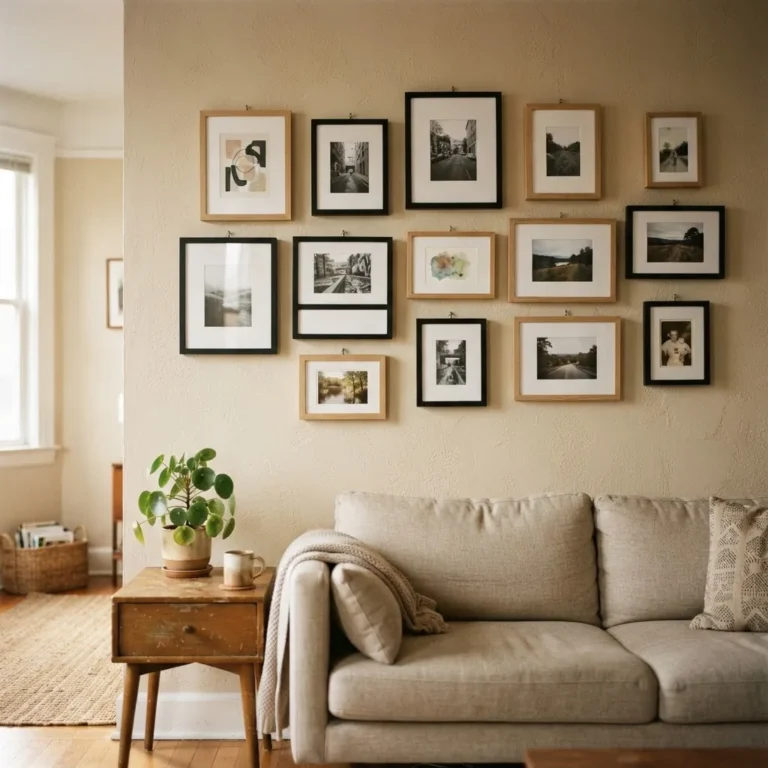
2. Natural Wood Frames, Warm Botanicals. Light wood or bamboo frames holding botanical prints or pressed-plant illustrations. This is the quiet-cottage, cozy-Midwestern version of a gallery wall, and it works beautifully in homes with warm neutrals. The botanical content is widely available as free or very low-cost printable art online.
3. Gallery-White Frames, Mixed Art Styles. White or cream frames let you mix content freely without visual chaos. A watercolor landscape next to a typographic print next to a family photo all feel cohesive because the frames are doing the unifying work. This is the most beginner-friendly approach because you can add frames over time as you find pieces you love.
4. Mixed Metals and Warm Tones: The Eclectic Boho Look. Gold, bronze, and brass frames mixing with natural wood, with art content ranging from abstract prints to portraits to travel photography. This feels collected and personal. The key is keeping the color palette of the art warm (creams, terracotta, ochre, rust) so the frames and content are working in the same register.
5. All-White Frames, Color Photography. White frames make color photos pop in a way black frames do not. If your photos are vibrant, travel images, or bright family candids, white frames showcase the color instead of competing with it.
6. The Black-and-White Plus One Color Accent. Predominantly black-and-white photos with one or two color prints as deliberate accents. The ratio matters here: mostly black-and-white with a couple of color pieces feels edited and intentional. Even halves feels accidental.
7. Quote Prints and Typography. One or two simple quote or typography prints anchoring the arrangement, surrounded by photos or botanical art. A single meaningful quote in a 16×20 frame can serve as the visual centerpiece the eye lands on first.
8. Kids’ Artwork Framed and Mixed In. Nothing makes a home feel more like a home than a child’s drawing in a real frame, hung seriously alongside other art. Mixed with prints and photos, it is personal and touching. A consistent frame finish keeps it from looking chaotic.
9. Travel Photography Series. A cohesive set of photos from a trip or a set of places you love. Black and white or a consistent editing style keeps them unified. This is the easiest way to create a “collection” feeling without having to curate from multiple sources.
10. Architectural Prints and Maps. Vintage maps, architectural line drawings, or city prints. These read as collected and worldly even when bought cheaply. Antique-style maps in particular are widely available as affordable prints and they print beautifully on standard home photo paper.
11. Abstract Art Prints, Minimalist Style. Simple abstract prints in a limited palette, two or three colors max. These work especially well in modern or Scandinavian-style homes. The content is calm, the frames can be thin and minimal, and the whole arrangement reads as designed.
12. A Mirror or Two Mixed In. One small circular or rectangular mirror mixed into the gallery wall arrangement adds light and dimension. It is not a frame, but it plays the same visual role, and it does something no print can: it reflects light back into the staircase, which is often one of the darker spots in a home.
13. The Seasonal Swap Wall. A gallery wall where a few frames hold seasonal art or photos that you swap out a couple of times a year. The structure stays fixed. The content changes. This is the budget decorator’s secret weapon, because you are only ever buying prints, not new frames.
Hanging It Without Wrecking Your Walls: The Renter’s Section
If you own your home, use proper nails and a stud finder for larger frames, and enjoy the confidence that comes with it.
If you rent, the staircase gallery wall is not off the table. It just requires more intentional planning.
Adhesive strips are the standard renter solution. The most important thing to understand is that weight limits are real, and on a staircase they matter more than elsewhere because stairs generate vibration. Every time someone walks up and down those stairs, the wall experiences tiny movements. Adhesive strips hold well under this but only up to their rated weight.
Per the official weight guide on the 3M Command website, small Command Picture Hanging Strips hold up to 1 pound per set. Medium strips hold up to 3 pounds. Large strips hold up to 4 pounds per set, and four pairs of large strips together can hold up to 16 pounds with a maximum frame size of 24×36 inches. Before hanging anything with adhesive strips, weigh the frame (including the glass and art) on a kitchen scale and match it to the appropriate strip size. Never guess on this.
For lighter frames, 8×10 and under in a thin frame, medium strips are usually fine. For anything 11×14 or larger, go to large strips. For very heavy frames, framed canvas pieces with glass, or frames over about 8 pounds, nails into studs are the safer option. If your lease allows small nail holes, a single small nail in a stud is much more secure than any adhesive system for heavier pieces, and a 1/16 inch nail hole is easy to fill with a dab of spackle when you move out.
Surface prep matters. Adhesive strips bond best to smooth, clean, painted walls.
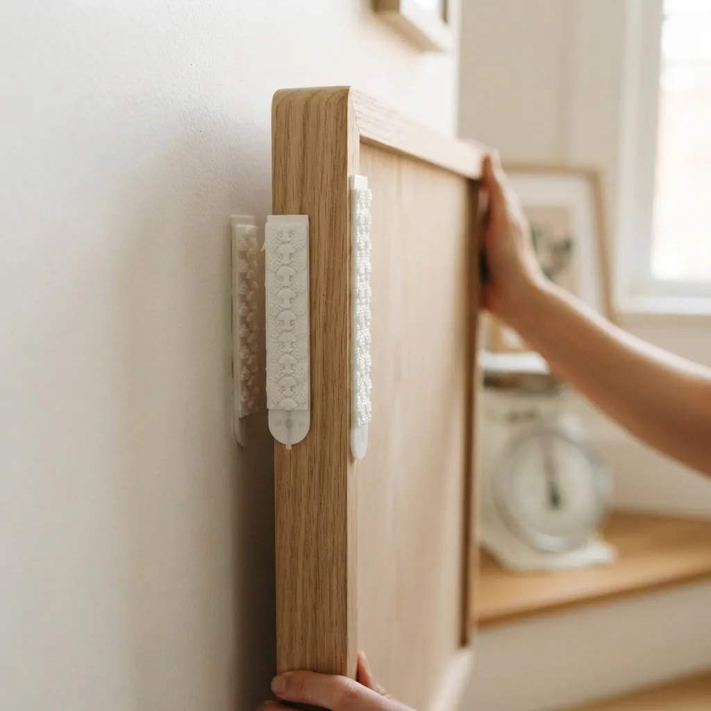
Wipe the wall with a clean cloth before application and let it dry. Follow the manufacturer’s bonding instructions and press firmly for thirty seconds. On textured or uneven surfaces, adhesive strips are much less reliable.
One more renter tip: decide on your exact layout before you open a single strip package, because adhesive strips are one-time use. The kraft paper template method described earlier is especially valuable for renters for this reason. Plan perfectly before you touch the wall.
Frame Finishes and the “Do They Need to Match?” Question
This is one of the most common questions I hear, and the honest answer is: it depends on what you want the wall to feel like.
Matching frame finishes (all black, all white, all natural wood) create a polished, curated, intentional look. It is quieter and calmer. This is the approach I lean toward personally, because I find that a gallery wall where the frames fight each other for attention starts to feel noisy.
Mixed frame finishes (some black, some gold, some wood) can look beautiful in an eclectic or boho-style home. The key is that the mix should feel collected, not random. Usually this means two or three finishes at most, not five. An anchor finish (say, mostly black frames) with one or two accent finishes (some gold, some wood) reads as intentional. Equal parts of everything reads as unsorted.

For budget buyers, IKEA’s RIBBA frames are a widely loved choice because they come in a consistent white or black finish in multiple sizes, and they are very affordable. Target’s Threshold line offers similar consistency. Buying all your frames from one brand’s basic range is actually a cheat code for a cohesive look, even on a very small budget.
Practical Checklist Before You Start
A few things to have ready before your first frame goes up:
A level is non-negotiable. Even on a diagonal wall, each individual frame needs to be level. A small spirit level costs a few dollars and saves you the headache of frames that look slightly tilted, which will bother you every single day.
A pencil for marking. Pencil marks wipe off or paint over easily. Do not use pen.
Painter’s tape for your paper template. Easy to remove, no residue.
Kraft paper or wrapping paper for tracing frames.
A measuring tape. You will use it constantly.
If you are using adhesive strips, read the package instructions fully before opening anything, and check the Command weight limits guide for your specific strip size against your frame weight before you buy.
Common Mistakes (and How to Skip Them)
Hanging everything too high is the single most common gallery wall mistake, and it is amplified on staircases because the wall is already tall and people instinctively hang things near the top of it. Stick to the 57-60 inch center-from-tread measurement and resist the urge to push everything up.
Using frames that are all the same size creates a flat, grid-like look that lacks the visual interest a staircase wall deserves. Mix sizes, with a clear range from medium to large.
Starting without a paper template almost always leads to extra holes and a layout you are not fully happy with. The template step feels like extra work but saves time overall.
Spacing frames too far apart is a subtler mistake. Gaps of 6 inches or more start to make a gallery wall read as a scattered collection rather than an arrangement. Keep gaps in the 2-3 inch range and the wall will feel cohesive.
Choosing frames that are too small is common and unfortunate. A staircase wall can take a 20×24 anchor frame. Do not fill it with 4×6 snapshots.
A Quiet Note on Budget
You do not need to spend much to do this well. A staircase gallery wall of 8-10 frames in the 11×14 to 18×24 size range, all from IKEA, Target, or Walmart, is very achievable for under $100-$150 if you are strategic about it. The art inside the frames can be free or nearly free: botanical prints from free art sites, digital downloads from Etsy printed at a local print shop, family photos printed at a drugstore, or a mix of all three.
The wall space itself is doing most of the work. Your job is just to give it something to frame.
If you are on an extremely tight budget, here is a working approach: buy five or six frames now in one consistent finish, hang them, and add more over time as you find pieces you love. A gallery wall that grows slowly is often more personal and interesting than one assembled all at once.
The Last Step: Live With It for a Week
Once everything is up, live with it for a few days before making any adjustments. Your eye will tell you if something feels off. Sometimes a single frame is slightly too high or a gap needs to close a little. Those are quick fixes when you know where to look.
But more often, what happens after a week is that you walk past your staircase and feel something you did not feel when the wall was blank. Something small and warm and settled. That is the whole point of this, not a perfect Pinterest wall, just a home that feels a little more like yours every time you pass through it.