Styling Framed Prints on a Shelf: 15 Ways to Make It Work

I have stood in front of a shelf with a handful of frames, moved them around for ten minutes, and ended up putting everything back exactly where it started because nothing looked quite right. If you have done the same thing, you are not bad at decorating. You are just missing a few specific things that nobody ever spelled out.
Shelf styling with framed art is genuinely one of those tasks that looks effortless once you know the logic behind it, and feels completely arbitrary until you do. This post is my attempt to spell it out, step by step, without the design-school language and without pretending you need to buy a whole new collection of prints to make it work. Most of these ideas work with frames you already have.
Why Framed Art on a Shelf Works So Well (Especially for Renters)
Before we get into the fifteen ways, let me say this: styling framed art on a shelf is one of the best moves for anyone who rents, lives in a small space, or just moves around a lot. You are not driving nails. You are not measuring walls. You are not committing to a gallery arrangement you will want to change in six months. A shelf full of leaning prints is flexible, damage-free, and looks collected in the best possible way.
According to Printique’s picture ledge display guide, standard picture ledges are typically 3.5 to 4.75 inches deep and come in lengths ranging from 24 to 60 inches. That narrow depth is exactly why they work so well for leaning frames: there is just enough room for a frame to rest safely without needing any hardware at all. A deeper floating shelf, meanwhile, gives you room to mix frames with books, plants, and objects, which opens up a whole different world of styling options.
Both work beautifully. The tricks below apply to both.
Start Here: The Two Things That Make or Break Every Shelf Display
Before any of the fifteen ideas, two things matter more than everything else combined.
The first is scale. A single small 5×7 frame on a long shelf will look accidental, like something you set down and forgot to move. The second is negative space. Filling every inch of a shelf makes the eye feel anxious. A calm shelf has breathing room, and that breathing room is doing actual styling work.
Keep those two things in your head and the rest will make a lot more sense.
The 15 Ways
1. Lead With One Anchor Piece
Every good shelf arrangement starts with one main frame or print that is noticeably larger than everything else. This is your anchor. On a shorter ledge, that might be a single 11×14 or 16×20 frame. On a longer shelf, it could be a 20×24 or even larger piece leaning at the back. Everything else you add should feel like it is in conversation with that anchor, not competing with it.
Place it slightly off-center rather than dead-center. Dead-center arrangements look rigid and can feel more like a mantlepiece display than a shelf.
2. Layer Front to Back, Not Side to Side
The most common mistake I see on picture ledges and shelves is treating frames like a row of books, all standing at the same depth in a neat line. That approach flattens everything.
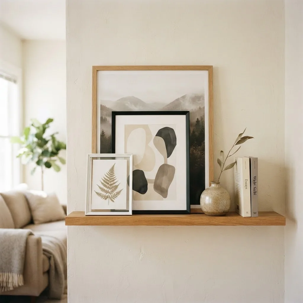
Instead, think in layers. The largest frame goes at the back, touching the wall. Smaller frames lean in front of it, overlapping at the edges but keeping the main image of the back piece visible. The overlap itself is what creates depth and makes the whole thing look styled rather than arranged.
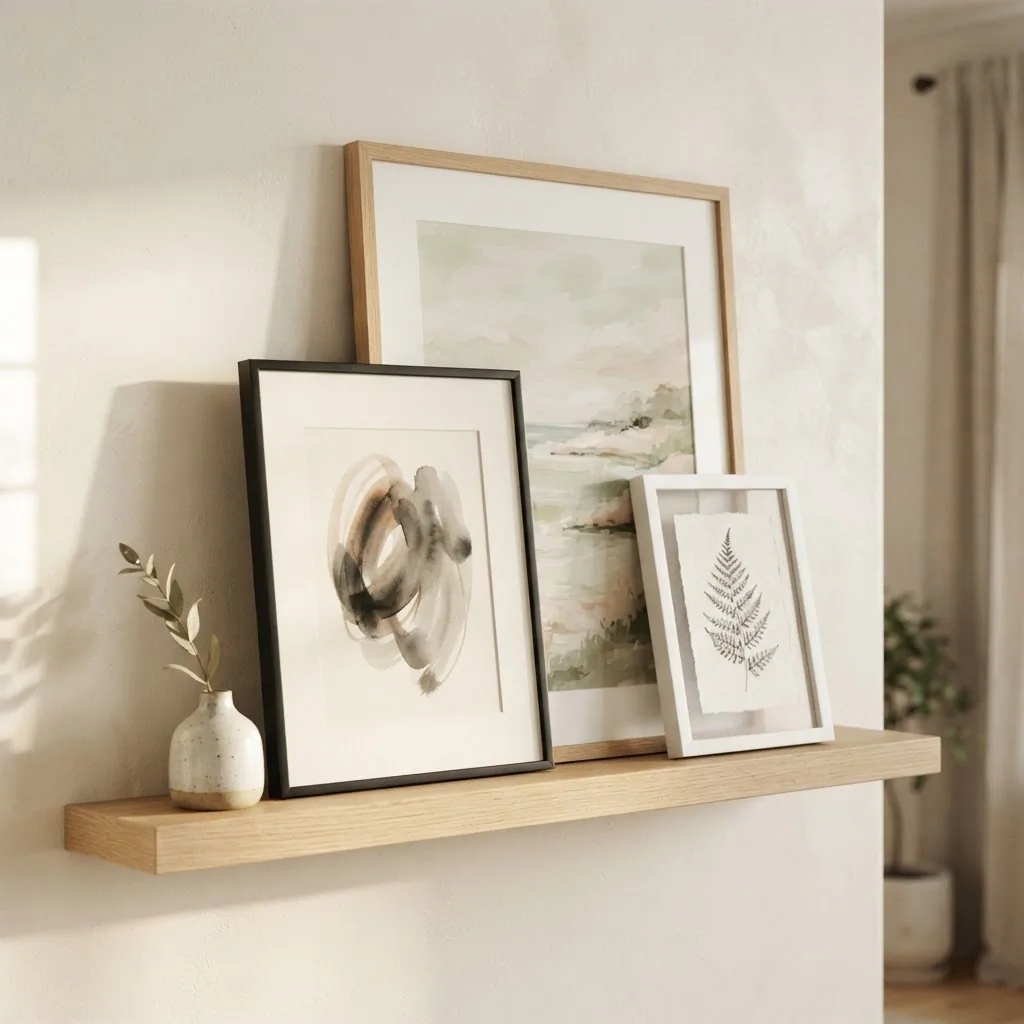
A useful reference on this technique from Atelier Lumin’s shelf styling guide puts it simply: place larger frames at the back, then overlap smaller ones in front, keeping horizons, faces, and any text visible.
3. Use the Rule of Odds
There is a well-documented principle in interior design called the rule of odds, and it is one of the most genuinely useful things I know. The idea is straightforward: groupings of three, five, or seven items look more balanced and feel more natural than even-numbered groupings, because odd numbers always create a center point for the eye to rest on. Tidbits and Twine has a good explanation of why this works visually, if you want to go deeper.
Applied to shelf art: instead of two frames flanking a vase, try three frames in a cluster, or a frame plus two small objects plus another frame. Count your visual groupings and aim for odd numbers.
4. Mix Frame Sizes Intentionally
Using all the same size frames looks deliberately uniform, which can be beautiful in a very spare, modern look. But most of us have an assortment of sizes, and that actually works in our favor. The key is to mix with intention.
For standard art prints, the most common US frame sizes are 4×6, 5×7, 8×10, 11×14, and 16×20 inches. A 5×7 print fits neatly into an 8×10 frame with a mat; an 8×10 print fits into an 11×14 frame with a mat. If you are buying new frames for prints you already have, Frame Destination’s mat and frame dimension guide is the clearest reference I have found for getting the sizing right without guessing.
On a shelf, aim to have at least two different frame sizes in any grouping. Having a tall frame alongside a wide horizontal one adds variety without feeling chaotic.
5. Don’t Force All Frames to Match
This is a question I hear constantly: do all the frames need to be the same color? The short answer is no, but you need some kind of thread connecting them.
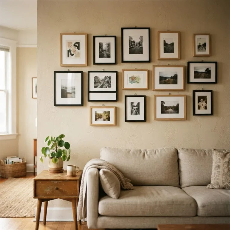
Two finishes work better together than three or four. Classic pairings that feel calm and collected: black and white, wood and black, natural wood and brass, white and warm wood. If you want to mix more, make sure the frames share at least one quality: all matte, all natural material, all similar weight. When frames clash it is usually because they vary in too many ways at once (shiny gold next to bright white next to dark walnut can read as jumbled).
A simple trick: limit yourself to two frame finishes on a single shelf, and use one of those finishes consistently across multiple shelves in a room to tie the whole thing together.
6. Add a Mat to Small Prints
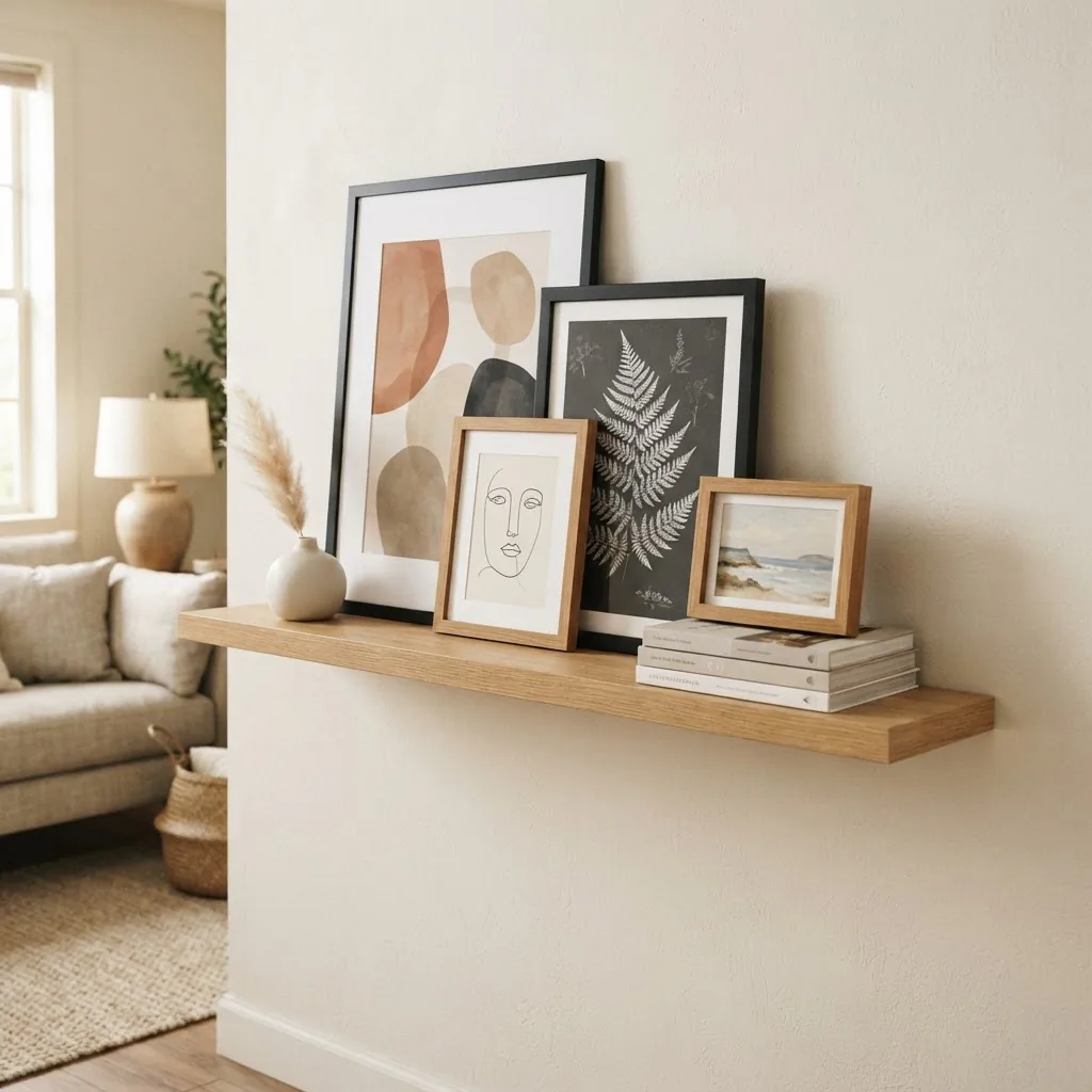
If you have a small print that feels a little lost in its frame, adding a mat (the thick border inside the frame) is the fastest way to make it look more intentional and more like a real piece of art. A wide white mat around a small botanical print suddenly looks gallery-quality.
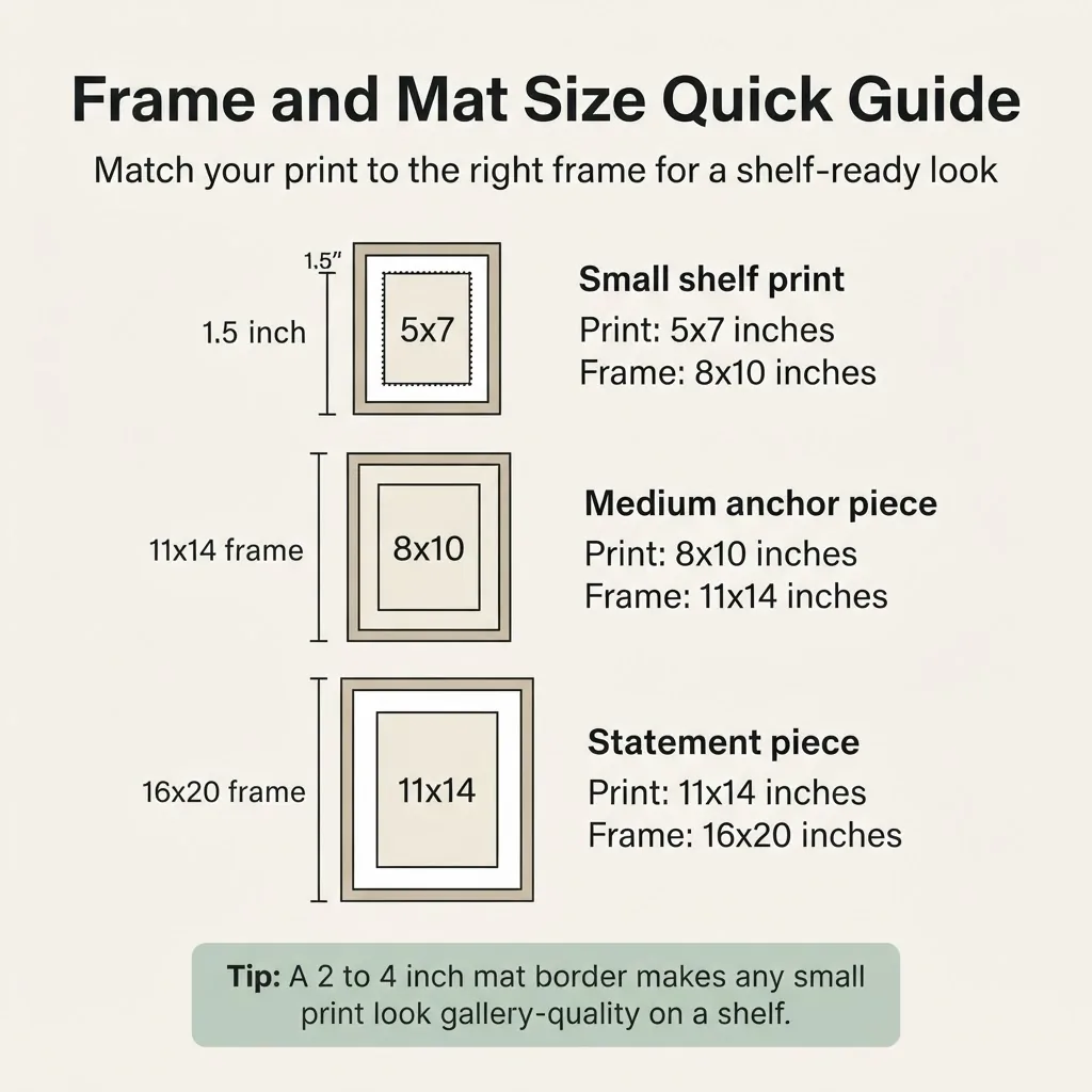
It also gives the print visual weight, which means it can hold its own next to a larger frame on the shelf.
Most professional framers recommend a mat border of 2 to 4 inches for standard work. This is one of the areas where paying a small amount for a mat makes the cheap frame look worth it.
7. Keep the Depth of Your Shelf in Mind
This matters more than people realize. A standard picture ledge at 3.5 to 4.75 inches deep can hold most frames, but only up to a certain size. Very large frames (16×20 and above) may feel precarious on a narrow ledge and need stabilizing. A deeper floating shelf at 8 to 10 inches gives you room to add accessories in front of or beside the frames, but you have to work a little harder to make it feel intentional rather than cluttered.
On a narrow ledge: keep frames lean, keep layering tight, and let negative space do the work. On a deeper shelf: treat the space in zones (a back zone for taller frames, a front zone for small objects and plants) so it reads as arranged rather than accumulated.
8. Stabilize Your Leaning Frames Properly
One thing nobody tells you when they show you those beautiful shelf art photos: leaning frames slide. Especially on smooth painted wood or laminate shelves. And a frame that slides and tips is a broken frame, a damaged shelf, and a lost deposit.
The easiest fix is a strip of rubber shelf liner cut to the width of the frame’s base.
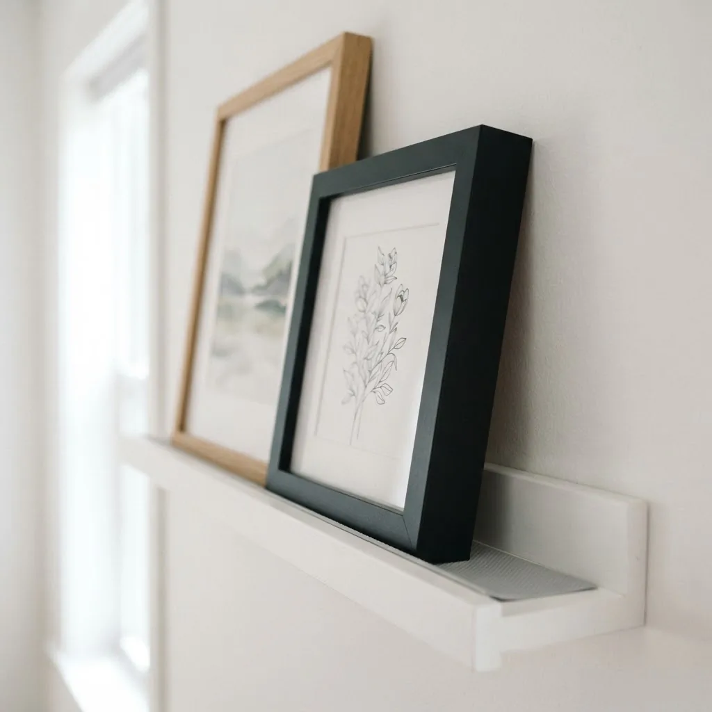
It costs almost nothing, is invisible once the frame is in place, and leaves zero marks on the shelf. Hope Miriam Designs shares this exact trick, along with two other reliable options: a small amount of mounting putty under the frame (which works but can sometimes pull finish from a delicate frame), or placing a slightly heavier decorative object right in front of the frame’s base to anchor it. That third option is actually a great styling move too, since it adds variety of form to the shelf.
9. Lean Art Intentionally, Not Lazily
There is a real difference between leaning art that looks styled and leaning art that looks like you ran out of wall space. The distinction is almost entirely about whether the piece is part of a vignette or just sitting there alone.
Apartment Therapy puts it well: leaning art looks intentional when it is clustered with other frames or objects at different heights, and when the scale of the leaning piece is appropriate to whatever surface it is resting on. A small 4×6 frame leaning alone on a wide shelf looks forgotten. That same frame leaning among two or three other pieces at different heights and accompanied by a small plant or a couple of stacked books looks collected.
The lean itself signals flexibility and confidence. It says: I styled this, and I can restyle it whenever I feel like it.
10. Use Complementary Colors to Pick Art That Works Together
This one sounds more complicated than it is. In color theory, complementary colors are those that sit directly opposite each other on the color wheel, things like blue and orange, yellow and purple, red and green. When placed next to each other, they make each other look brighter and more vivid, which is why a warm terracotta print next to a dusty blue one can feel so satisfying. The Tate’s color glossary explains the science behind this clearly if you want to see it in context.
For shelf styling, you do not need to go full complementary contrast. But if the prints you are choosing feel a little flat together, look at the dominant colors in each piece and ask whether any of them sit opposite on a rough color wheel. Even a warm neutral next to a cool neutral creates more visual interest than two prints in the same temperature tone.
11. Treat the Two-Thirds Rule as Your Shelf Anchor
If you have a shelf sitting above furniture (a dresser, a sideboard, a console table), a useful proportion to remember is that the whole display, frames plus accessories, should span roughly two-thirds of the width of the furniture below it. Wider than that and it starts to feel like the shelf is fighting the furniture. Narrower and the furniture looks neglected.
This is not a hard law, but it is a reliable starting point when you cannot figure out why something feels off.
12. Leave Some Shelves Quiet
If you have multiple shelves on a single unit or wall, resist the urge to style every single one equally. A shelf that is mostly books with just one small leaning frame can make the shelf above it, the more decorated one, look even better by contrast. Negative space on one shelf gives the eye somewhere to rest, which makes the styled shelves feel more considered and less desperate.
This is the “editing beats adding” principle in action. When in doubt, take something off. You can always add it back, but you will usually find the shelf looks calmer and more intentional with less on it.
13. Mix Subjects, Connect With Color
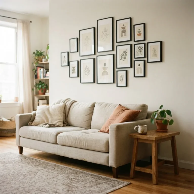
You do not need all your prints to be the same subject or style to make them work together. A botanical print next to an abstract piece can look beautiful if they share a color. What you want to avoid is a completely random mix where nothing connects. The connection can be color (both pieces have warm rust tones), mood (both are calm, muted, quiet in energy), or even frame finish.
Think about one simple thread: what do these prints have in common? If you can answer that question, the shelf will feel curated rather than random.
14. Bring In One Non-Frame Element per Grouping
A shelf that is all frames can feel a little flat, even when the frames are beautiful. One non-frame element per grouping (not five, just one) adds variety of form without tipping into clutter. Good options: a small ceramic vase, a single stem in a bud vase, a stack of two or three books, a small trailing plant, a smooth stone, or a tiny sculpture. The object should be smaller than the anchor frame in the group and should not block the art.
Keep the object close to the base of a frame, not floating in open space. Proximity is what makes the relationship between the frame and the object look intentional.
15. Plan for Seasonal Swaps
One of the best things about shelf art (versus nailing things into a wall) is how easy it is to refresh. Nothing is permanent. In late summer, a coastal or landscape print might feel perfect. In October, the same spot might want something warmer, a forest scene, something with copper tones. You can change the whole feeling of a shelf in five minutes by swapping one print and one small accessory.
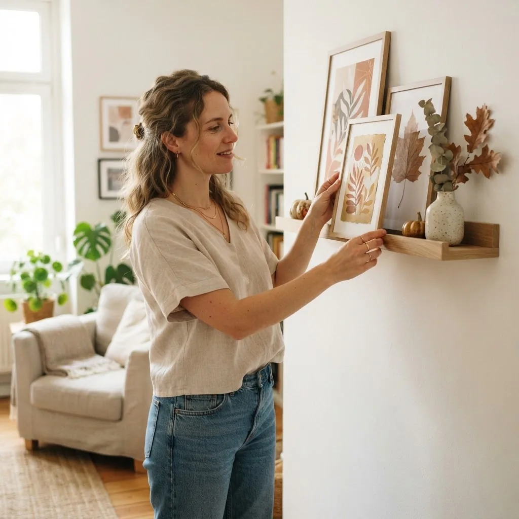
This is especially useful for renters who want the space to feel seasonal without committing to removable wallpaper or peel-and-stick borders. Your shelf is your lowest-stakes, highest-impact refresh spot in any room.
The Honest Skip-It List
A few things that consistently make shelf art styling worse, not better:
Too many small frames in a line with no anchor and no layering. Frames in six or seven different finishes on the same shelf. Accessories that are too similar in height to everything else (every element at the same level reads as flat). Overcrowded shelves where nothing has breathing room. And that one frame you kept because you feel guilty getting rid of it even though you genuinely do not like what is in it. That one especially.
You do not need a gallery wall or a big budget. You need one good anchor frame, a couple of supporting pieces, one small accessory, a strip of rubber liner to keep things from sliding, and enough restraint to leave some of the shelf empty on purpose.
That combination works every single time.
A Note on Budget
This whole approach is designed to work on whatever you already have. But if you are buying frames specifically for shelf styling, here is where it makes sense to spend and where it does not.
The frame itself: it is fine to go cheap on the frame if the finish is consistent with your other frames and the quality looks solid. Mass-market black frames from big-box stores photograph beautifully and hold up well. Where a mat genuinely makes a difference is on prints that need presence, because a wide mat adds the visual weight that makes a small print feel considered. If you are framing something you love, the mat is worth paying for.
The print: this is where it is worth spending a little, because a beautiful print in a cheap frame still looks good. The reverse is rarely true.