Neutral Canvas Wall Art: What to Buy and What to Skip

There is a version of a canvas print you have definitely seen before. It hangs slightly too high on the wall, it is about four inches too small for the furniture below it, and the colors have faded into something that looks more taupe-gray-beige blur than anything intentional. It does not look calm. It looks like a placeholder someone forgot to replace.
And then there is the other version. One print, the right size, hung at the right height, in a color that sits quietly with everything around it. The room feels finished. Nothing shouts. You notice the space before you notice the art, and that is exactly the point.
Neutral canvas wall art is one of the best tools I know for making a space feel calm without spending a lot of money or drilling a single permanent hole. But there is a real gap between the canvas prints that work and the ones that land on a clearance rack two years later. This guide is about learning to tell them apart before you buy.
What “Neutral” Actually Means in Canvas Art (and Why It Matters)
“Neutral” is a word that gets used loosely in decor, so it is worth being specific. In canvas art, neutral does not simply mean beige or gray. It means any palette that is low-saturation enough to coexist peacefully with other things in a room without competing for attention.
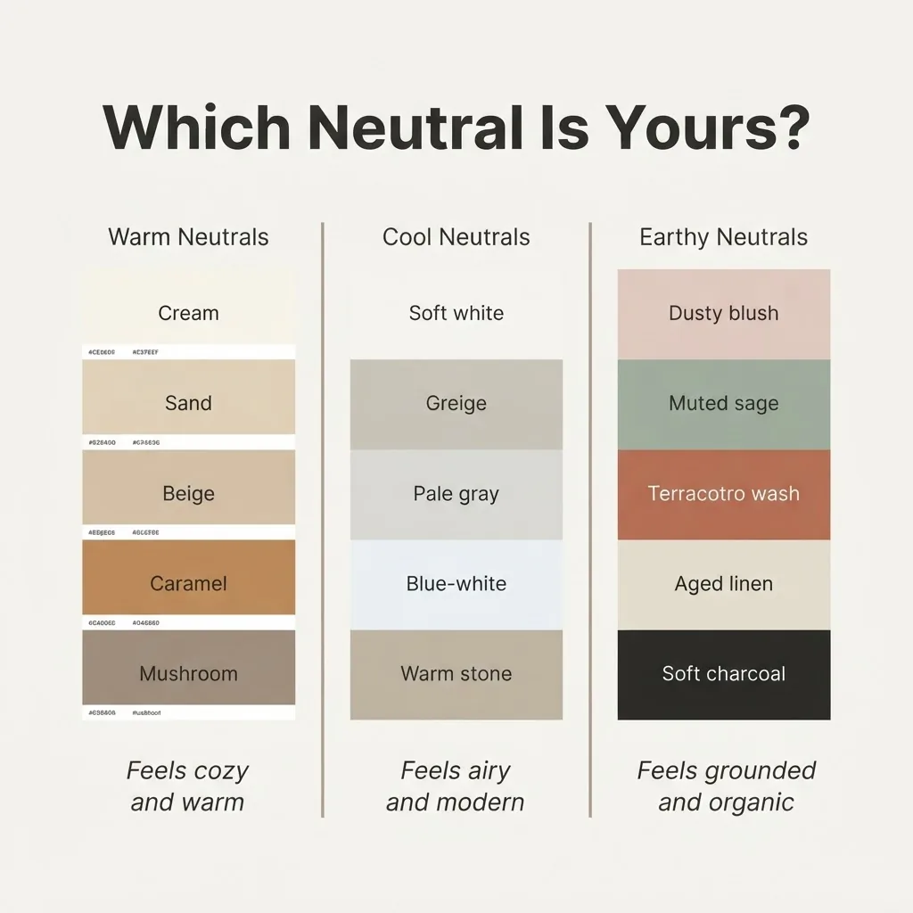
True neutrals are your creams, warm whites, and soft off-whites. Warm neutrals lean toward beige, sand, caramel, mushroom, and taupe. Cool neutrals move toward greige, soft gray, and blue-tinted white. Earthy neutrals stretch into muted terracotta, sage, and dusty blush, still low enough in saturation to read as calm rather than colorful.
Knowing which neutral you are working with matters because a canvas with warm undertones on a cool gray wall can look slightly off, like two colors that are trying to match but not quite managing it. As a loose rule, warm-toned rooms (yellow oak floors, warm white walls, brass fixtures) look best with warm neutrals in their art. Cool-toned rooms (bright white walls, silver hardware, gray undertones) work better with cooler neutrals or true whites.
If your walls are a standard apartment white, the good news is that almost any neutral palette will sit fine. Warm neutrals tend to feel cozier; cool neutrals tend to feel a bit more airy.
The Styles Worth Knowing
Neutral canvas art shows up in several recurring styles, and each one has a different personality. Understanding which one fits your space is more useful than hunting by color alone.
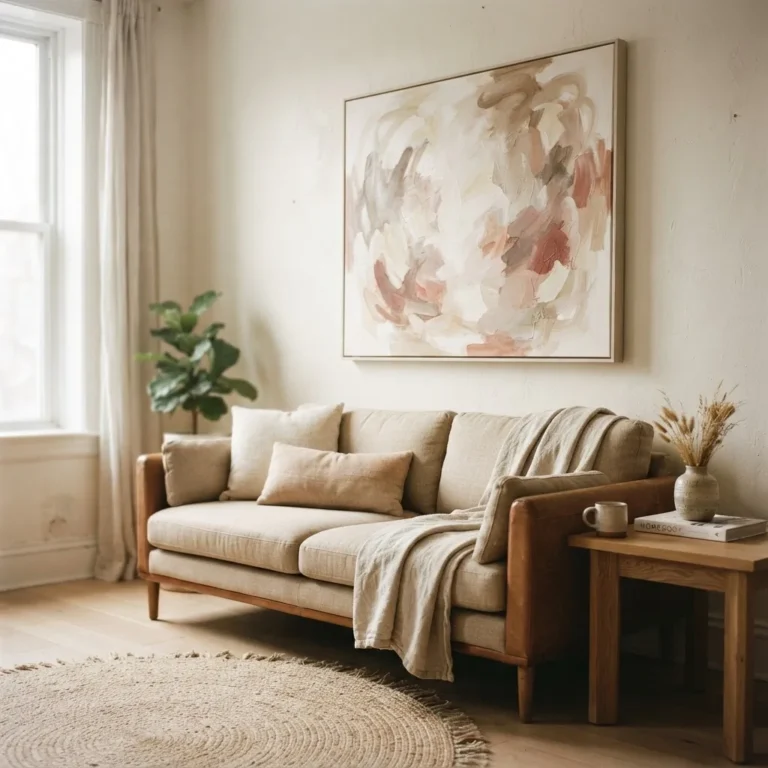
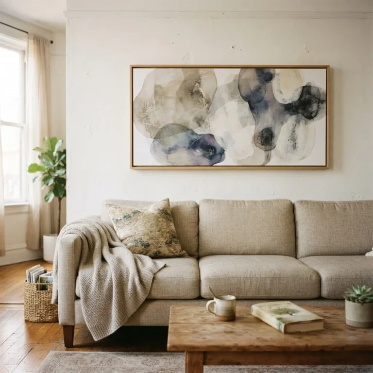
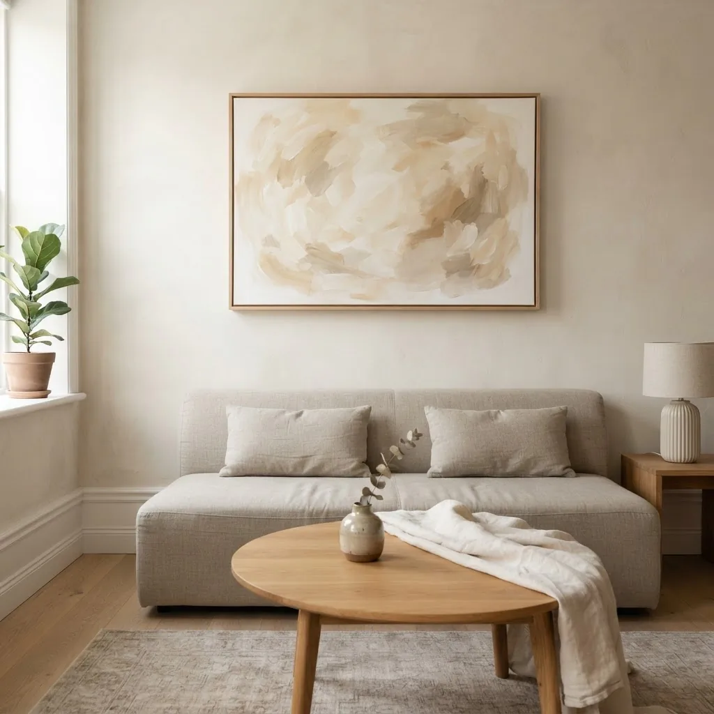
Abstract: This is probably the most common category, and for good reason. A neutral abstract with soft brushstroke movement, layered washes of beige and cream, or gentle tonal contrast can read as sophisticated without being specific. It does not date the way a trend print does. It works above a sofa, a bed, a console, a dining sideboard. The risk is that not all abstract art is created equal; more on quality in a minute.
Textured or impasto-style: These are prints or hand-painted canvases where the surface has visible dimension, raised paint marks, and sculptural quality. In a neutral palette (white, cream, sand, greige), textured art adds the kind of sensory warmth that a flat print simply cannot. If your room is already fairly neutral in its furniture and textiles, a textured canvas is one of the best ways to add depth without adding color. These are often more expensive than flat prints, but they tend to look significantly more intentional.
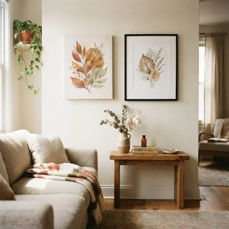
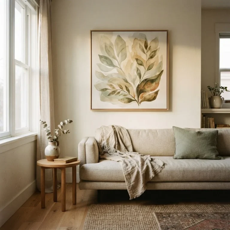
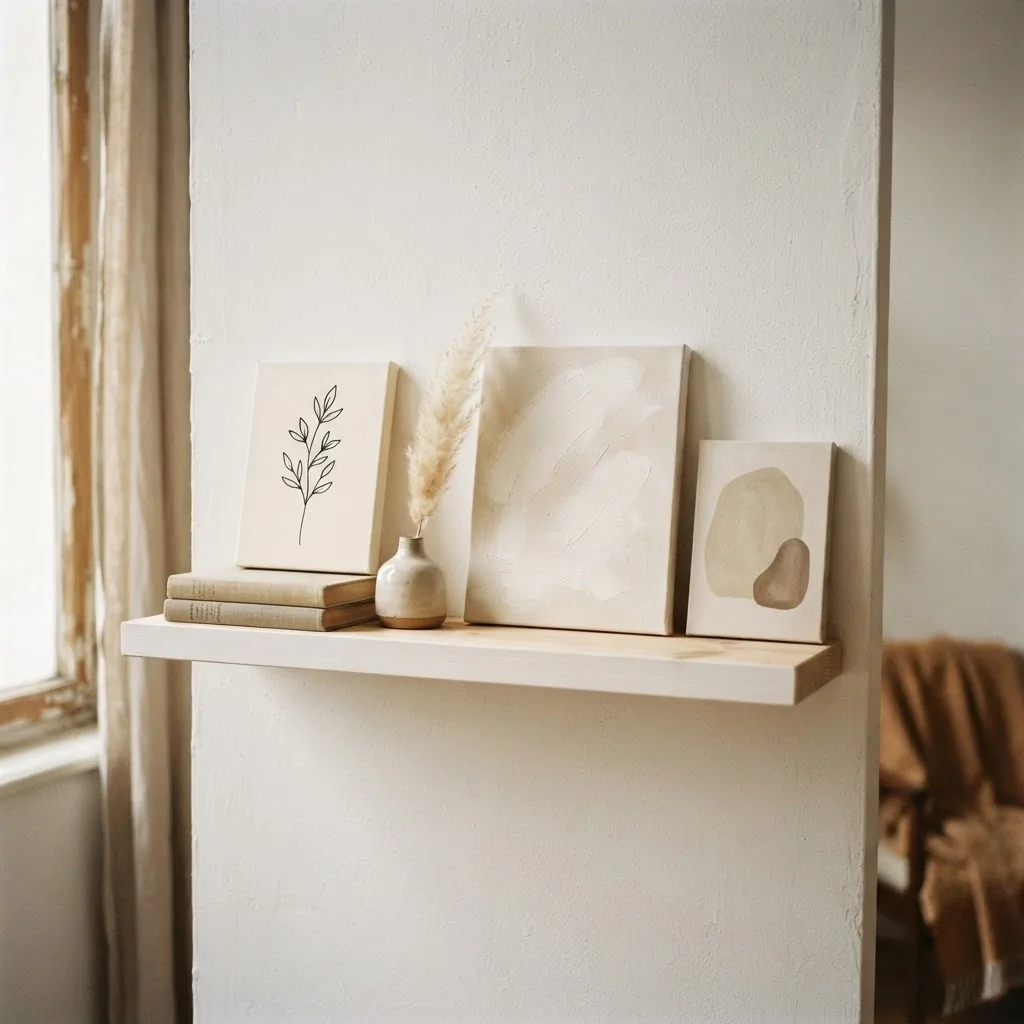
Botanical line art: Single-stem drawings, leaf outlines, and simple plant forms in black on cream or warm white are everywhere right now, and for renters and beginners they are an excellent starting point. They are affordable, they fit almost any style, and they scale well from a single 16×20 in a small hallway to a set of three in a larger living room.
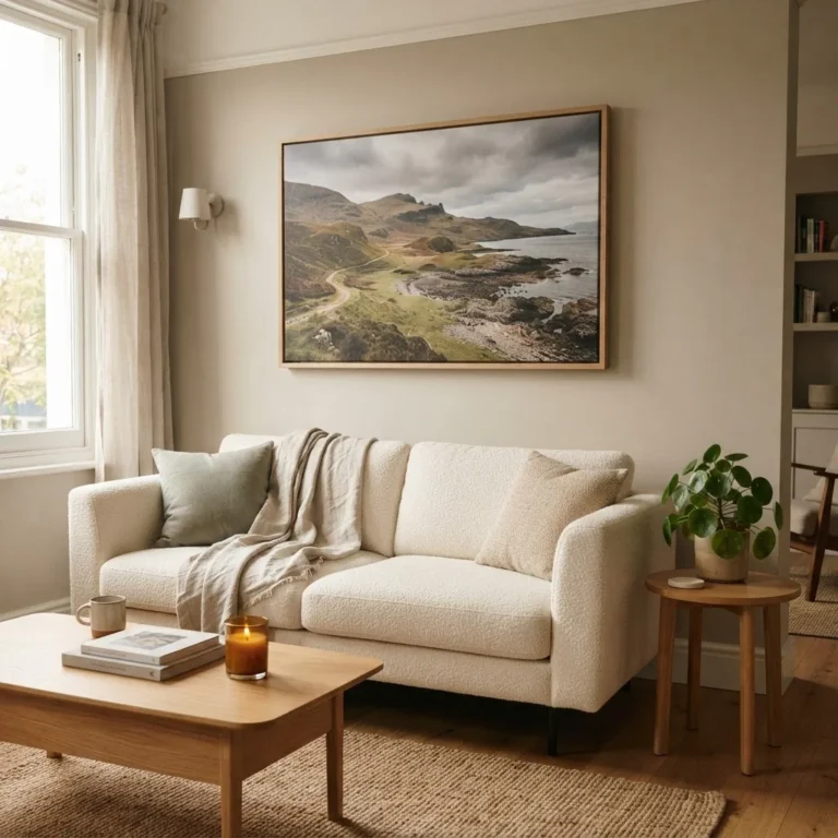
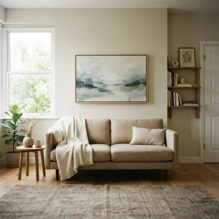
Landscape and horizon: Muted landscapes, soft coastal horizon lines, and abstract field studies in neutral earthy tones bring a quality of stillness that is hard to replicate with any other subject. They work especially well in rooms you want to feel calm and grounded, like bedrooms and reading corners.
Minimalist geometric: Soft arcs, single lines, divided planes of cream and warm white. These are the most pared-back option and work well in cleaner, more modern spaces. The danger is that very small geometric prints can look almost invisible on a wall, so sizing matters more here than with busier compositions.
Wabi-sabi and Japandi: This is a newer category that has moved from trend to mainstay because it touches something genuine. Imperfect forms, quiet organic shapes, muted earthy tones. In canvas art, this looks like asymmetric compositions, soft irregular brushwork, and palettes of warm mushroom, aged linen, and muted charcoal. It layers beautifully with natural materials, rattan, linen throws, and wood furniture.
The Size Question (This Is Where Most People Go Wrong)
The single most common mistake with canvas art is buying too small. It is understandable: a large canvas looks enormous in a product photo or on a white background. In person, in a room with furniture and ceiling height and surrounding objects, it reads much more quietly.
A good sizing rule used by designers is the two-thirds guideline: your artwork (or the total width of an arrangement) should span roughly two-thirds of the width of the furniture below it. Artfully Walls has a clear breakdown of how the 2/3 rule works in practice that is worth bookmarking if you plan to hang anything above a sofa or bed.
In practice, that means if your sofa is 84 inches wide, you are looking for art around 50 to 63 inches wide. For a 72-inch sofa, target roughly 43 to 54 inches. For a queen bed (60 inches wide), something in the 30 to 42-inch range works in a smaller bedroom, while larger rooms often feel better with 48 inches or more. For a king bed (76 inches wide), 45 to 57 inches is a good starting range.
For standard canvas sizes, the general landscape runs from small (8×10, 11×14, 16×20) through medium (18×24, 24×32) to large (24×36, 30×40) and oversized (36×72 and wider). Wonder Artwork’s standard canvas sizes guide has a useful room-by-room breakdown if you want to cross-reference specific furniture and wall dimensions before committing to a size.
Small canvases (8×10 to 16×20) work for shelf styling, gallery walls, small hallways, and powder rooms. They rarely hold their own as a single piece above large furniture. Medium sizes (18×24 to 24×36) are the sweet spot for compact apartments, narrow walls, and above smaller furniture. Large and oversized formats are what you want for a living room or bedroom focal wall, and they almost always look better than you expect once they are on the wall.
Hanging Height: The 57-Inch Rule
Hanging art too high is almost as common as buying it too small, and it creates a similar problem: the piece looks unmoored, floating up near the ceiling instead of connected to the room.
For an open wall, the standard practice is to center the artwork at 57 to 60 inches from the floor, which is approximately average eye level. Park West Gallery’s guide to hanging art walks through the exact math for applying this in practice, including how to account for the wire or hanger position on the back of your canvas.
Above furniture, the rule adjusts. Here, you want the bottom edge of the canvas to sit roughly 6 to 10 inches above the furniture top. This keeps the art visually connected to the sofa, bed, or console below it rather than floating away from it on the wall. In rooms with very low furniture or very high ceilings, you can push that gap to 10 to 12 inches, but I would not go much further without the arrangement starting to feel disconnected.
The Renter Section: Hanging Canvas Without a Single Nail
This is the part most decor guides completely skip, and it is also the part that makes the most difference if you rent.
Gallery-wrapped canvas (the kind where the print wraps around the sides of a wooden frame) can be hung with adhesive picture-hanging strips when the canvas is light enough. The 3M Command strips are the most reliable option I know of for this. Their small strips hold 1 pound per set, medium hold up to 4 pounds, large up to 5 pounds, and the XL Heavyweight strips handle up to 20 pounds. The official 3M Command weight limit guide lists every product with its exact capacity, which is worth checking before you commit to a strip for a heavier piece.
The important thing is to follow the instructions exactly, including the 1-hour wait time after pressing the strips before hanging anything. Surface temperature, humidity, and wall texture all affect adhesion. On textured walls like orange peel drywall, adhesion is reduced and you may need extra strips or a different approach.
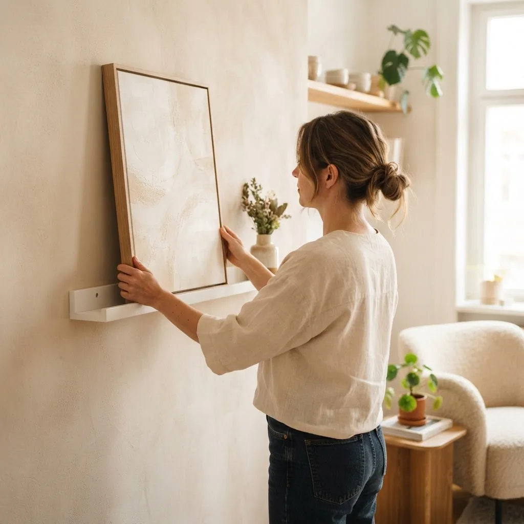
For heavier canvases, or when you are not confident in the strip hold, leaning works beautifully. A large canvas leaned on a wide console, a picture ledge, or even directly on the floor against a wall has a relaxed, intentional quality that photograph studios use all the time. It also means you can move and swap it without any wall contact at all.
Picture ledges (the kind with a small lip) are one of my favorite renter tools. You can layer multiple smaller neutral canvases on a ledge, swap them seasonally, and never touch the wall. They are also useful for propping art on a shelf without requiring any hardware behind the canvas itself.
One honest note on Command strips and canvas: they work very well for lighter gallery-wrapped prints. For a thin canvas with only a hanging wire on the back, you will need the Command adhesive hook version rather than the picture strip version, since strips require a flat back surface to adhere to both the wall and the frame. Always read the weight rating on the specific product before hanging.
What to Look for in a Canvas Print (Before You Buy)
Here is where the gap between a canvas that looks good for ten years and one that looks tired in three comes down to a few specific things.
Ink type: This is the most important variable. Budget canvas prints often use dye-based inks, which can begin fading noticeably within 5 to 10 years, especially in rooms with natural light. Archival pigment inks, the standard used by quality-focused print brands, are rated fade-resistant for 75 years or more. Any brand confident in its materials will state this explicitly in the product description. If a listing does not mention ink type at all, treat that as a flag. Rossetti Art’s canvas print quality guide breaks down exactly what the five quality markers are, which I found genuinely useful as a reference for knowing what questions to ask before ordering.
Canvas material: Pure polyester canvas has a slightly plastic-looking surface and is the budget option. Poly-cotton (typically 70-75% polyester, 25-30% cotton) is the professional standard, combining stability with the warmer texture of cotton. Cotton canvas is the most premium and most natural-looking but can sag slightly in humid environments.
Stretcher bars: The wooden frame inside the canvas should ideally be kiln-dried pine. Undried or green wood warps over time, especially in rooms with humidity changes. This is one of the reasons cheap canvases from big-box marketplaces sometimes bow or ripple within a couple of years.
UV-resistant coating: A protective varnish or laminate over the print surface reduces fading from ambient UV light. Quality brands include this as standard. Budget prints often skip it.
Gallery wrap vs. framed: A gallery-wrapped canvas (where the image wraps around the wooden sides) hangs without any frame and has a clean, contemporary look. A framed canvas has a separate frame around the print, which adds visual weight and definition. For minimal, Japandi, or Scandi aesthetics, gallery wrap tends to feel more at home. For rooms with more traditional furniture or when the art is pale and low-contrast, a frame adds the definition that helps the piece read clearly on the wall.
Price as a signal: In renters’ experience, a high-quality 24×36 canvas print costs a certain minimum to produce. Prices significantly below $60 to $80 for large formats usually mean a materials compromise somewhere, either cheaper inks, machine-only stretching, or pure polyester canvas. For small prints (8×10 to 16×20) in low-light rooms, a budget print in the $20 to $40 range is often perfectly acceptable and will last well without heavy UV exposure. Know where you are placing it before you decide how much to spend.
Room by Room: How to Use Neutral Canvas Art Well
Living room above the sofa: This is the most common placement and the one where size mistakes hurt the most. One large horizontal piece or a pair of canvases that together span two-thirds of your sofa width is almost always better than three or four small pieces scattered on the wall. Neutral abstract, textured art, and landscape canvases all work well here. Hang the bottom edge 6 to 8 inches above the sofa cushions.
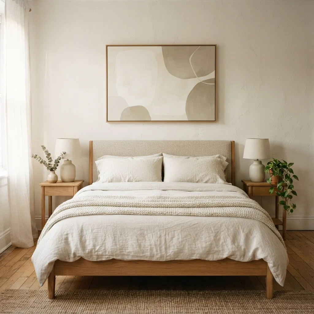
Bedroom above the headboard: The bedroom wants something calm, not stimulating. A single horizontal canvas in soft neutrals (cream, warm white, greige, soft sage) placed 6 to 10 inches above the headboard is the cleanest solution. Avoid canvases that hang down too close to where someone sitting up would knock into them. Above a queen bed, a 30×40 or a pair of 18×24 pieces works well. Above a king, consider 40×30 or wider, or a diptych (set of two) to cover the width gracefully.
Hallway and entryway: These narrow spaces are where vertical canvases work best. A single 18×24 or 20×30 vertical piece at eye level in the hallway creates a moment of calm in a transitional space. If your hallway is long, a small series of same-size prints in matching frames at consistent spacing creates rhythm without clutter.
Small apartment walls: If you are working with a compact space where the wall sections are short, one well-chosen medium piece (16×20 to 24×30) will always look more intentional than a cluster of small ones. Neutral art in a small room benefits from having real breathing room around it, so resist the urge to fill every bit of wall. The empty space is working as hard as the art is.
Styling Neutral Canvas Art With Non-Neutral Rooms
One of the most common worries I hear from readers is that they already have colorful furniture, bold rugs, or dark accent walls, and they are not sure neutral art will read at all.
The short answer is that neutral canvas art is often at its most useful in non-neutral rooms, precisely because it gives the eye somewhere to rest. A cream and beige abstract above a deep emerald sofa is calming without being boring. A warm white textured canvas on a dark navy accent wall pops beautifully because the contrast does all the work.
The key is scale. If your room is already visually busy, a small neutral canvas will disappear. Go bigger than you think you need. A large, quiet piece of art is often the best thing you can do for a busy, colorful room.
Taking Care of Your Canvas (So It Actually Lasts)
Canvas prints are easy to maintain but easy to damage if you clean them wrong. The basic routine is a dry microfiber cloth for regular dusting, running gently across the surface in one direction. For more stubborn grime, a barely damp cloth (wring it out completely, then wring it again) in gentle circular motions is safe for most quality canvas prints. CanvasPop’s canvas cleaning and care guide has specific advice for tougher stains.
What you should never use: cleaning sprays, household cleaners, anything with alcohol or bleach, or a soaking-wet cloth. Canvas can warp or bubble when exposed to excessive moisture, and some cleaning agents will lift or streak the ink surface.
Keep canvas prints away from direct sunlight where possible. Even archival inks will fade faster with direct UV exposure than they will in diffused natural light. Avoid hanging canvas in bathrooms, steamy kitchen areas directly above the stove, or on exterior walls in very humid climates, all of which accelerate the deterioration of the stretcher bars and canvas fabric.
If your canvas develops a sag or a slight ripple over time, this is usually the result of humidity loosening the fabric. Some gallery-wrapped canvases have corner wedges on the inner frame that can be gently tapped in to retension the fabric. A small cross-head screwdriver or the flat of a butter knife works for this.
The Honest Worth-It / Skip-It Summary
Worth it: One large, well-made piece in archival pigment inks with a quality stretcher bar, in a neutral palette that actually suits your wall undertones, hung at the right height and the right size for your furniture. This is the version that makes a room feel calm, finished, and intentional.
Worth it: Botanical line art prints in smaller sizes for hallways, gallery walls, and shelf styling. Affordable, versatile, hard to get wrong.
Worth it: Textured canvas or impasto-style pieces if your budget allows. The added dimension is genuinely noticeable in person in a way that flat photography cannot capture.
Skip it: Very cheap large-format canvas prints (under $30 for anything above 20×24) unless you know you are placing it in a low-light room and plan to replace it. The fade and warp risk is real.
Skip it: Buying small to “play it safe.” The safe choice is almost always bigger than you think, and a correctly sized piece never looks as dramatic in person as it does in your imagination.
Skip it: Hanging multiple tiny neutral canvases in a scattered arrangement when one medium-to-large piece would do better. Calm beats busy in a neutral room, and editing is almost always the right answer.