20 Black Framed Wall Art Ideas for a Clean Modern Look

There is something almost unfairly easy about a black frame. It pulls a room together. It makes a cheap print look considered. It works on a white wall, a warm greige wall, a dark charcoal wall, a sage wall, a rental-beige wall you were not allowed to paint. And yet a lot of people overthink it, or underbuy it, or hang it too high, or pick the wrong size, or end up with a gallery wall that looks like it happened by accident instead of on purpose.
I have been hanging art in rentals for years, which means I have also made most of these mistakes. This guide is what I wish I had at the beginning: real styling ideas, actual measurements, honest budget notes, and the renter-friendly workarounds that keep your deposit safe. We will get into all of it.
Why Black Frames Work So Well
The short answer is that black is a neutral that functions like punctuation. It stops the eye in a good way. It gives artwork a clear boundary, which makes even a simple digital print or a torn page from a calendar look intentional. In a room that already has dark furniture, black frames create continuity. In a room full of light wood tones and creamy linens, they add the quiet contrast that keeps everything from feeling too soft.
Matte black is generally the more versatile finish right now. It reads as modern and calm without the reflection or the slightly dated quality that a high-gloss black can carry. If you are building a gallery wall or buying multiple frames and you want them to feel cohesive, matte black is the safer choice. Gloss black is not wrong, it just requires a bit more intentional pairing to not feel like it wandered in from the 1990s.
One thing worth saying at the start: you do not need expensive frames for this to look good. The frame is doing less work than you think. What makes a black frame look expensive is not the frame itself. It is the mat, the print quality, the size you chose, and how it is hung.
The Sizing Conversation Nobody Has
Most people either buy art that is too small for their wall, or they frame a print without thinking about whether they need a mat. Both of these are easy fixes once you know the logic.
Standard US frame sizes that are widely available and affordable are 5×7, 8×10, 11×14, 16×20, 18×24, and 24×36 inches. Sticking to standard sizes is one of the most useful budget moves you can make in decor.
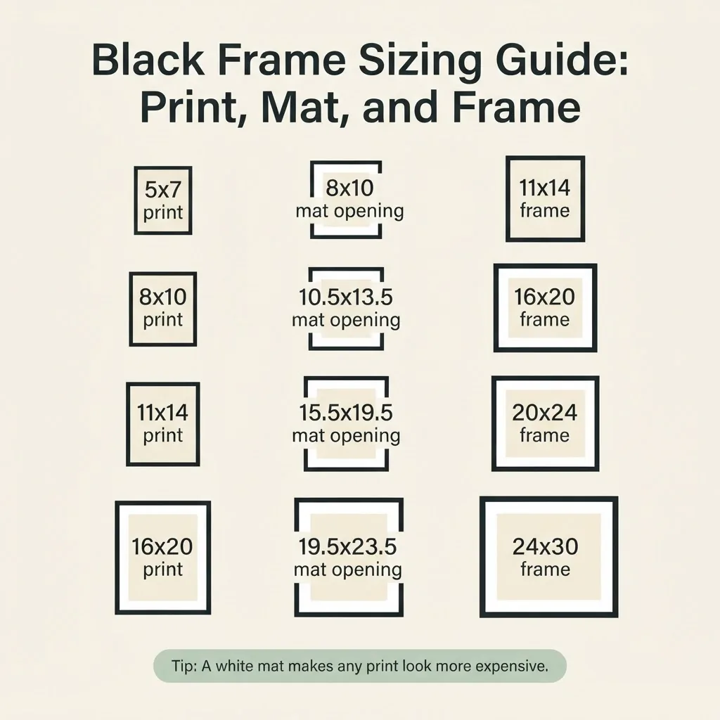
A non-standard print size means a custom frame, and custom frames are expensive.
When you add a white mat inside a black frame, two things happen: the print looks more polished, and you can buy a larger frame for a smaller, cheaper print. An 8×10 print sitting in an 11×14 frame with a white mat looks like it belongs in a gallery. The same print crammed edge-to-edge in an 8×10 frame just looks like a print. The mat gives breathing room, and breathing room reads as quality. For reference on standard mat opening sizes relative to frame sizes, Frame Destination’s guide to mat and frame dimensions is one of the clearest resources out there.
For a statement piece above a sofa or bed, size matters more than most people realize. A piece that is too small will float and look forgotten. As a general rule, art above a sofa should span roughly two-thirds to three-quarters of the sofa’s width. On a standard 84-inch sofa, that means your art or gallery arrangement should be somewhere in the range of 55 to 63 inches wide. A single frame is rarely wide enough to pull this off on its own, which is why a horizontal diptych or a wider gallery cluster works so well over a couch.
What to Put in a Black Frame
This is where a lot of people stall. The frame is easy. The art is the part that feels risky.
Here is what consistently works well inside a black frame: black and white photography, botanical or plant line drawings, architectural sketches, simple abstract art with high contrast, vintage maps, typography prints with clean fonts, and any print where the art itself has a graphic quality.
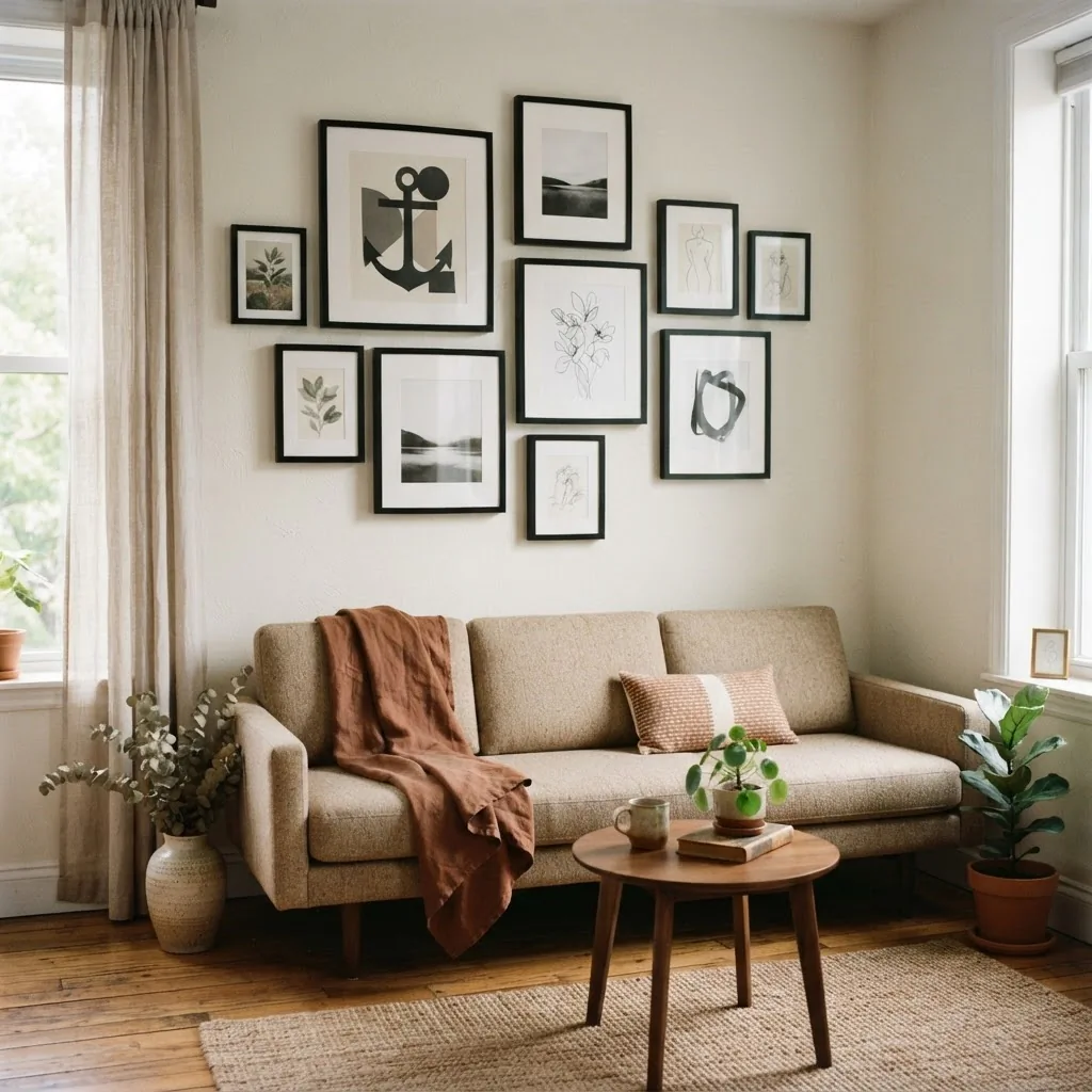
Black frames want content that is confident in its own lines.
What tends to look less happy in a black frame: muddy, dark-toned paintings with no clear focal point, heavily saturated color prints (the frame can compete rather than contain), and anything with a lot of noise in it. Black frames work best with art that has some breath in it, negative space, clean edges, or a clear graphic quality.
For print styles by room, think about this as a starting point. Living rooms can handle anything from abstract to photography to architectural prints. Bedrooms tend to feel better with softer subject matter: loose botanical drawings, landscapes with open sky, simple line art. Bathrooms are where small black-framed sets of three or four matching prints work really well, since the space is small and a cohesive set provides impact without requiring a big statement piece.
20 Black Framed Wall Art Ideas Worth Trying
1. The Classic Three-Print Set Above the Sofa
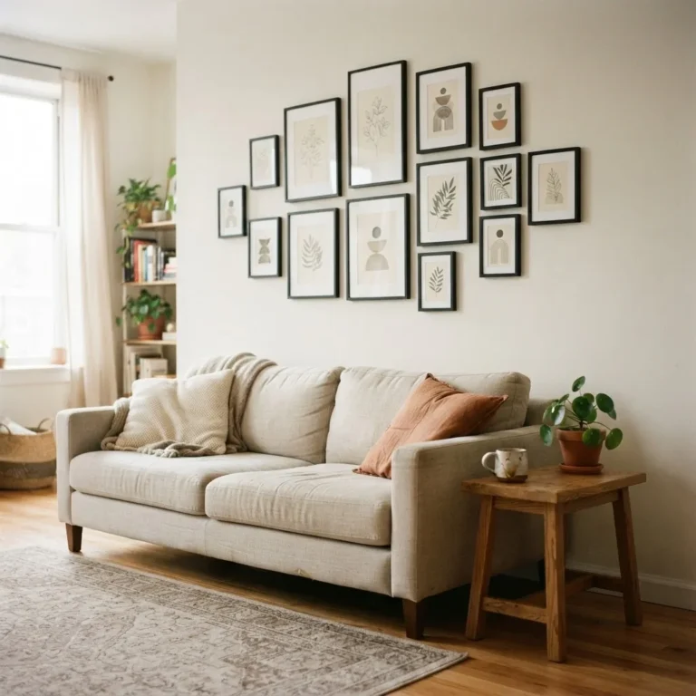
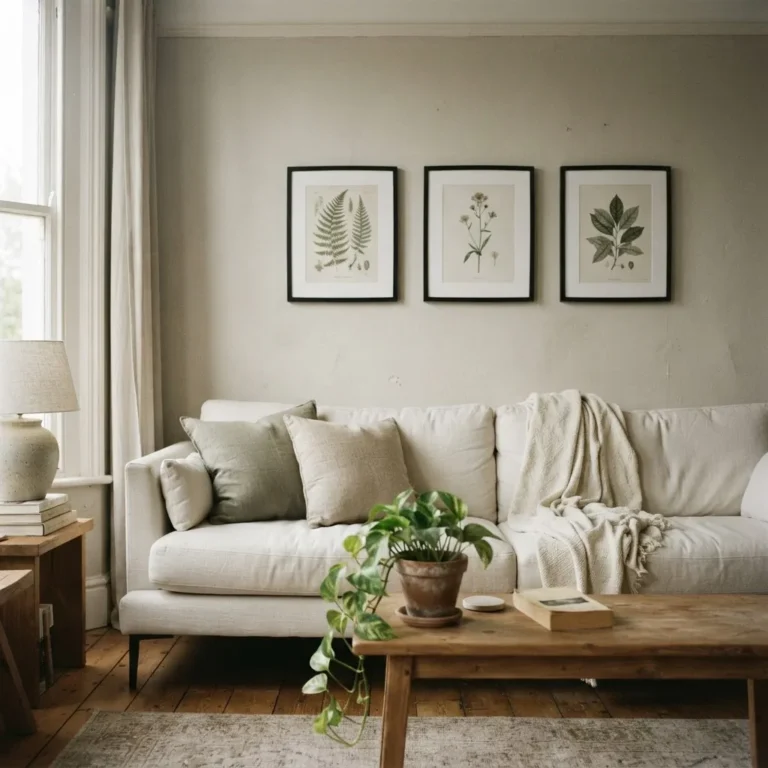
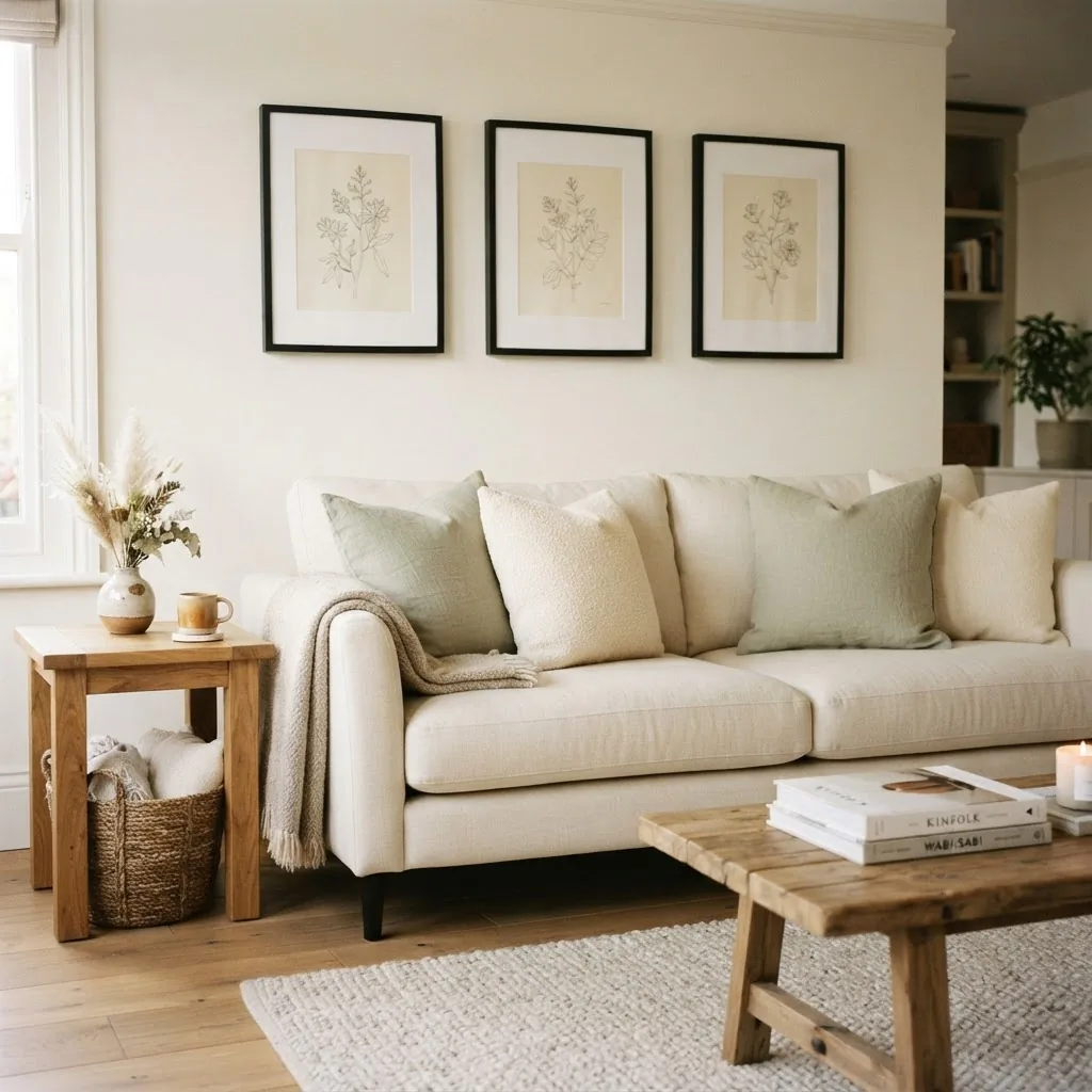
Three matching black frames in the same size, hung in a horizontal line above a sofa. Use the same art family (three botanicals, three architectural prints, three abstract shapes) so the grouping reads as a set. Keep the spacing between frames at 2 to 3 inches, and hang the whole arrangement so the center of the group sits at about 57 inches from the floor.
2. A Grid Gallery Wall of Six
Six frames in a 2×3 or 3×2 grid, all the same size, all with the same white mat. This is one of the most forgiving gallery wall layouts because the math is simple and the result looks deliberate. Nine-frame grids also work well for larger walls.
3. One Large Statement Frame
A single 24×36 or 18×24 black frame with a bold print (a large botanical, a clean abstract, a black and white photograph with a strong focal point). Propped on a picture ledge or hung as a solo piece, this reads as effortlessly intentional and requires zero gallery-wall math.
4. Staggered Heights in a Hallway
Narrow hallways are perfect for a row of black frames at slightly staggered heights, which creates movement without feeling random. Use frames of two or three different sizes and alternate them along the wall. Keep the general centerline close to 57 inches even as the individual pieces vary.
5. Leaning on a Shelf or Ledge
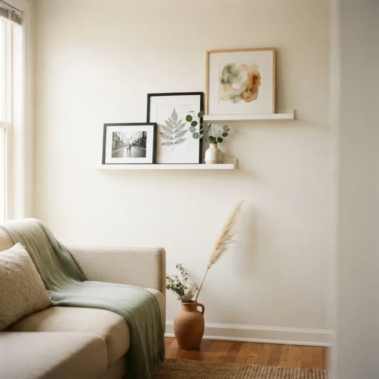
This is one of my favorite renter moves. A black frame leaned against a wall on a picture ledge or a console table shelf requires zero drilling. You can swap the art whenever you want. It looks casually intentional in a way that a hung frame cannot always manage.
6. A Mix of Sizes in an Organic Arrangement
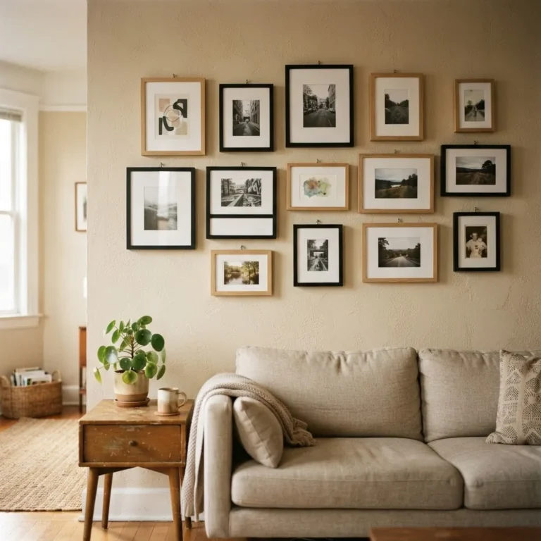
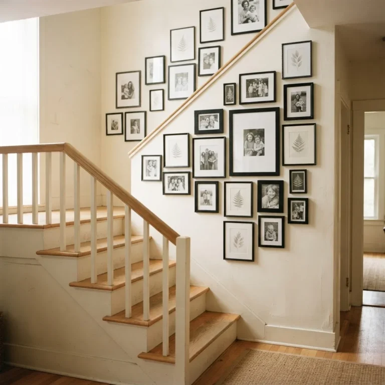
This is the gallery wall that most people associate with Pinterest. Different-sized frames arranged so they feel like a collection that grew naturally. The key is to start with your largest piece first and build outward, keeping the gaps between frames consistent at 2 to 3 inches even as the shapes and sizes vary.
7. Black Frames with Colored Mats
White mats are the safe and versatile choice, but a soft blush, warm cream, or sage green mat inside a black frame can make a room feel more layered. This works especially well in bedrooms where you want the art to feel soft rather than sharp.
8. Three Vertical Frames in a Column
Three black frames stacked vertically on a narrow wall section or beside a doorframe. This draws the eye up and makes ceilings feel higher, which is one of the easiest small-space tricks there is.
9. A Single Black Frame in the Bathroom
One 8×10 or 11×14 black frame with a simple print in a bathroom pulls the whole room together for almost no money. Botanical prints and vintage-style illustrations work especially well in bathrooms.
10. Black Frames on a Dark Wall
This sounds counterintuitive, but a black frame against a deep navy, charcoal, or forest green wall creates a tonal, layered look that feels very considered. The frame recedes slightly and lets the art float, which can be beautiful. Use prints with enough contrast (white or cream backgrounds) so the art is still visible.
11. A Diptych Above the Bed
Two matching frames, hung side by side with a 2-inch gap between them, centered above the headboard. This is one of the simplest arrangements that always reads as intentional. Use two prints from the same series or two photographs with the same tonal quality.
12. Mixed Frame Widths in the Same Color
All black, but some frames are narrow profile and some are wider. The consistency of color holds the arrangement together while the varied widths add visual interest. This works especially well in a large gallery wall where identical frames can feel too rigid.
13. Black Frames with Natural Wood Shelves
A picture ledge in warm wood with black frames propped on it is one of the warmest versions of the modern look. The black/warm wood combination feels balanced rather than cold.
14. A Single Large Print in a Thin Black Frame
A thin, narrow-profile black frame around a large print has a graphic quality that works really well in modern and minimalist spaces. The thin frame keeps the focus entirely on the art.
15. A Gallery Wall That Includes a Mirror
Adding a black-framed mirror into a gallery wall arrangement adds depth and light to the arrangement. In a small room, a mirror in the gallery wall does double duty.
16. Art on a Picture Ledge With Other Objects
A black frame on a picture ledge alongside a small plant, a candle, and a couple of books creates a styled vignette rather than just a displayed piece of art. This is one of the most renter-friendly, no-drill ideas that consistently photographs well.
17. Three Different Art Styles in Matching Frames
A black and white photo, a simple botanical drawing, and a typographic print, all in matching black frames with white mats. The variety in subject matter is held together by the consistent frame and mat. This is a good way to display a personal collection without it looking random.
18. Oversized Floor Lean
A large 24×36 or 30×40 frame leaned against the wall on the floor, behind a console or sideboard, looks deliberately editorial. No drilling, no measuring, fully renter-safe.
19. A Repeating Single Print in Multiple Sizes
The same print, framed in three sizes (say, 5×7, 8×10, and 11×14), arranged in a small cluster. This creates a deliberate, curated feel from very little content.
20. Seasonal Swap Frames
Buy two or three larger black frames and treat them as permanent fixtures. Swap the art inside them seasonally: botanical prints in spring, warmer abstract washes in autumn, something spare and graphic in winter. With the ledge propping method, you never re-drill. The frames stay. The art rotates.
The Hanging Rules That Actually Matter
I want to spend a real minute on this because hanging art correctly is honestly the thing that separates a wall that looks finished from a wall that looks like someone just put some stuff up.
The 57-inch center rule is the most useful single piece of advice in decorating.
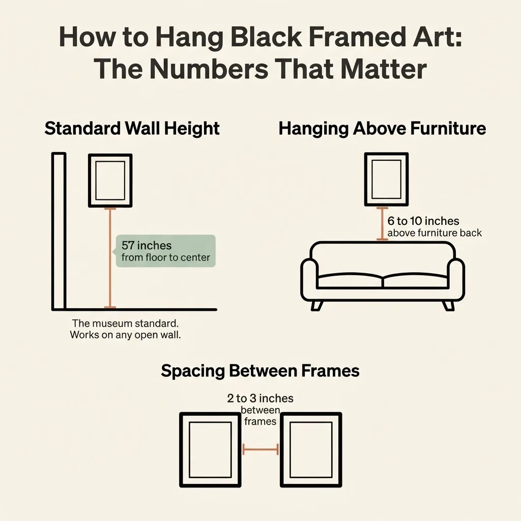
Measure 57 inches from the floor and mark it lightly. That point is where the center of your artwork should sit. This is the standard used in galleries and museums, because 57 inches is roughly average human eye level. Apartment Therapy has a thorough walkthrough of the full calculation if you want to follow the step-by-step math for finding exactly where your hook goes, which involves measuring your frame height, dividing by two, accounting for where the wire sits when taut, and doing a small subtraction. It sounds complicated but takes about three minutes once you have done it once.
For art hung above furniture like a sofa or headboard, the rule shifts slightly. Keep the bottom of the frame 6 to 10 inches above the top of the furniture. You do not want a gap so large that the art and furniture feel like they belong to different rooms. The piece should feel related to what is below it. For spacing details on multiple pieces, Apartment Therapy’s guide to the three key art-hanging measurements covers the 57-inch height, the above-furniture gap, and the spacing between grouped pieces all in one place.
For gallery walls specifically, aim for 2 to 3 inches between frames. Consistent spacing is what makes a collection read as intentional rather than scattered. Framebridge’s gallery wall hanging guide walks through the paper-template trick, which involves cutting paper to the size of each frame, taping the templates to your wall with painter’s tape, and arranging everything before committing a single nail. It is the most forgiving method I know of for anyone who wants to get the layout right before making holes.
Renter-Friendly Hanging: Keeping Your Deposit
This deserves its own section because it is the thing I heard most often from people decorating their first rentals: I want to hang art but I am afraid of the wall damage.
The most reliable damage-free option for frames up to about 5 pounds is Command picture hanging strips. Heavier frames can work with the large or XL strips. According to the official Command weight limit guide, their large strips hold up to 5 pounds per set, medium strips hold up to 3 pounds, and their XL picture hanging strips (when used in a set of four pairs) hold up to 20 pounds with a maximum frame size of 24×36 inches. The key things renters need to know: the surface must be clean and dry before application, the strips need a full hour to bond before you hang anything, and you must follow the removal instructions exactly (slow, steady, horizontal pull rather than yanking) to get a clean release. Following those steps is what keeps your deposit safe. Skipping them is what leaves a chunk of drywall on the wall.
The other renter-friendly option that gets underused is the picture ledge.
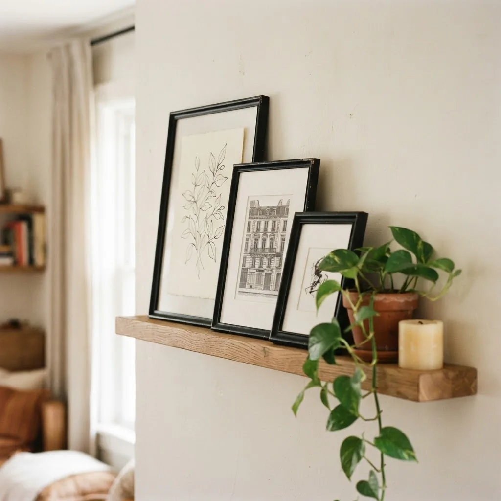
IKEA’s MOSSLANDA picture ledge (available in black for $19.99 and white for around $9.99 to $19.99 depending on size) mounts with just two screws and lets you prop frames without hanging them. Two small screw holes are far easier to patch and repaint than a gallery of individual picture hooks, and with a ledge you can rearrange your art as often as you want without touching the wall again. I find this is the single most practical suggestion I can give a renter who wants a styled, changeable art wall.
Budget Breakdown: Where to Spend, Where to Save
Frames: Save here. A $10 to $20 black frame from IKEA or Target looks nearly identical to a $60 frame once art is inside it. The frame is the container, not the statement.
Prints: This is flexible. Free printables from sites like Etsy (search “black and white printable art”) look excellent at standard sizes when printed at a local print shop on card stock or matte photo paper, usually for $1 to $5 per print. Society6, Minted, and Artifact Uprising all offer higher-end print quality when you want something more personal or original. Original art from local markets or small artists on Etsy can be a genuine worth-it investment in a piece you will love for years.
Mats: Worth it if you are going the DIY-frame route. A white archival mat from a framing supply shop or a pre-cut mat from a craft store runs $3 to $10 and makes a $5 print look gallery-quality.
Glass vs. acrylic: Acrylic (Plexiglas) glazing in a frame is lighter and shatter-resistant, which matters if you are using adhesive strips or propping on a ledge. Real glass is heavier. For hanging strips in particular, lighter is better since you are working within weight limits.
Common Mistakes and the Easy Fixes
Hanging too high is the most universal decorating mistake. Almost everyone does it the first time. The fix is the 57-inch rule, and if you follow it your walls will immediately look more intentional.
Frames that are too small for the wall create a lonely, floating quality. If you are hanging a single piece on a large wall, it needs to be large enough to anchor itself to the space. One small frame on a big wall is almost always worse than no frame.
A gallery wall where every frame is identical in size tends to look rigid. Varying at least one dimension (size, orientation horizontal vs. vertical) breaks that rigidity.
Skipping the mat makes cheap prints look cheap. The mat is doing more work than the frame in many cases.
Buying art online without checking the file resolution first is how you end up with a beautiful-looking digital file that prints as a blurry smear at 18×24. Check that the file is at least 300 DPI at the print size you want. Most Etsy sellers who sell printable files will specify this.
Style Pairings: Black Frames by Room Aesthetic
In a minimalist space, go with thin-profile matte black frames, white mats, and very spare art. Black and white photography, single-line drawings, or clean typography. Less is significantly more.
In a boho or eclectic space, mix black frames with natural textures (rattan, linen, dried botanicals in the art itself).
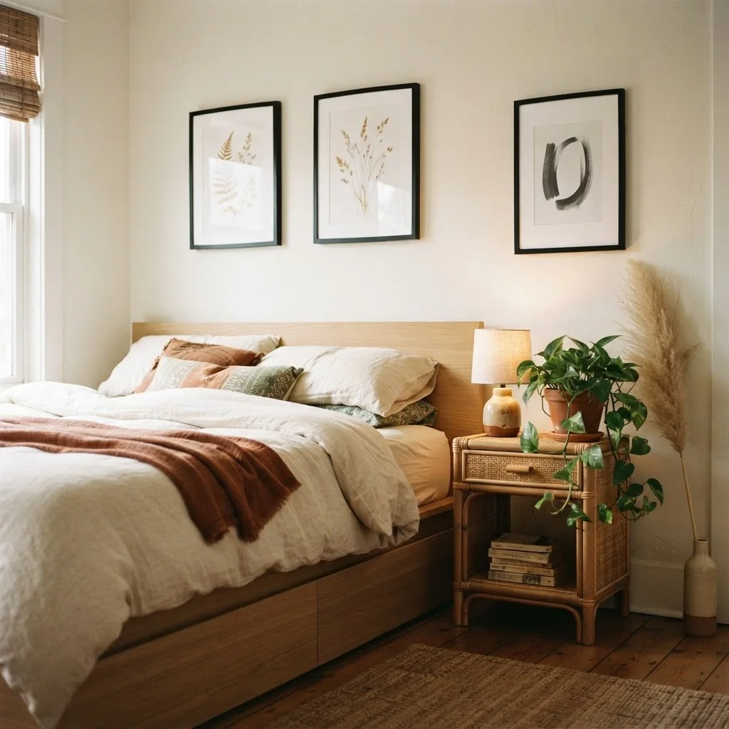
The black frame acts as an anchor in an otherwise layered room.
In a coastal or light-and-airy room, black frames create a graphic contrast that keeps the space from feeling too washed out. Pair with prints that have open, airy subjects: seascapes, loose botanical sketches, simple horizon lines.
In a warm, cottagecore space, the matte black frame can feel a little sharp. If you want black frames in a warm, cozy room, the art needs to do the work of softening. Loose watercolor botanicals, vintage-style illustrations, or anything with warmth in the palette will bridge the gap.
A Few Honest Notes Before You Buy
Not every room needs a gallery wall. Sometimes one large, well-chosen piece hung correctly does more for a room than fifteen small frames. If a gallery wall feels like too much, start with a single statement frame and see how the room breathes.
Black frames are not inherently more expensive than gold or natural wood frames. In the $10 to $30 range, you can find solid black frame options at IKEA, Target, Walmart, TJ Maxx, and Amazon that will hold up fine for everyday use. You do not need to spend more unless you are framing something you care deeply about preserving, in which case an archival-quality frame with UV-protective glass is worth looking into.
Propping art instead of hanging it is not a compromise. It is a legitimate styling choice that also happens to be renter-friendly, easy to change, and looks genuinely good.
And finally: you do not need to do all twenty of these ideas. Pick one that fits your wall, your budget, and your room. Do that one thing. See how it feels. The best decor decision you can make is the one that actually happens, not the one that lives on your Pinterest board for two more years.