Framed Botanical Prints: How to Pick, Hang, and Style Them

There is something about a framed botanical print that just works. It does not matter if your space is a studio apartment, a rental bedroom with builder-beige walls, or a living room you have been trying to figure out for two years. A few well-chosen botanical prints, hung right and framed right, can make a room feel intentional in a way that is genuinely hard to explain until you see it happen.
I have been decorating rentals for most of my adult life, which means I have spent a lot of time figuring out how to make walls look good without owning them. Botanical prints kept coming up as one of the most reliable tools I had because they work across so many styles, they scale from nearly free to as expensive as you want, and they stay calm on a wall instead of demanding attention. That calm quality is exactly what I look for.
This is a full walkthrough: where to find them, how to pick a frame, how to hang them without damage, and how to style them room by room. Let’s go through it from the beginning.
What Makes Botanical Prints So Reliably Good
Before the sourcing and the tape measures, it helps to understand why botanical prints tend to work when a lot of other wall art does not.
The subject matter is naturally ordered and detailed, which means your eye has something interesting to land on without the image being loud or chaotic. A vintage fern illustration or a carefully drawn rose study has a quiet specificity to it. It feels researched, considered, like someone once cared enough to document this plant precisely. That quality reads as substance on a wall, even when the print itself cost you nothing.
They also play well with almost every style. A black-framed botanical with a white mat looks clean and modern. The same print in a warm wood frame looks cottagecore or farmhouse. A loose watercolor eucalyptus in a simple white frame goes full coastal. Because the imagery itself is grounded in nature, it tends to not fight with the other things in a room.
For renters especially, botanical prints have another advantage: they are lightweight. Most paper or card-stock prints in standard frame sizes weigh only one to three pounds total. That is workable with even basic damage-free hanging strips, which means you can put them up and take them down without touching your security deposit.
Where to Find Botanical Prints (From Free to Worth It)
The completely free route, and why it works
This is the first thing I tell anyone who asks, and it genuinely surprises people. You do not need to spend a single dollar on the artwork itself if your budget is tight right now.
The Biodiversity Heritage Library is a Smithsonian-partnered open-access archive with over 250,000 free botanical and nature illustrations available to download and reuse. These are historic scientific illustrations from the 16th through 20th centuries: detailed engravings, hand-colored plates, fern studies, orchid illustrations, fruit and seed diagrams. The quality is extraordinary and all of it is free because the works are in the public domain. You can browse their full collection on Flickr, download the image files, and have them printed at a local print shop or through an online service.
For an even more browseable experience, The Graphics Fairy has over 350 curated vintage botanical prints formatted and ready to download for personal use. The site has done a lot of the sorting work for you, pulling the clearest, most printable images into one place. It is one of my favorite resources to send people to when they want the look of an antique botanical print but do not want to spend $80 on a reproduction.
Once you have your image files, print shops like Staples, Office Depot, or local copy centers can print an 8×10 on cardstock for under two dollars. An 11×14 engineering print runs about the same. It is not archival quality, but for a seasonal refresh or a first attempt at a gallery wall, it works beautifully.
Digital downloads on Etsy
If you want something a little more polished than a public domain scan, Etsy is full of botanical print downloads in the $2 to $8 range. You pay once and can print at multiple sizes. Look for sellers offering high-resolution files (at least 300 DPI) and check that the listing specifies whether the files are sized for standard frame dimensions like 5×7, 8×10, 11×14, or 16×20 inches. That detail saves you from guessing and trimming.
Budget pre-printed options
IKEA carries a small but reliable selection of botanical-themed art prints at genuinely low prices. The BILD fig plant poster in a 16×20 inch size is a good example of what you can find there for under $10. Pair it with an IKEA RIBBA frame (which runs roughly $5 to $13 depending on size) and you have a complete, finished piece on the wall for well under $25.
Amazon carries a huge variety of pre-framed botanical sets, ranging from about $20 to $40 for a set of three on the lower end and $50 to $120 for mid-range sets with better frames and mats. Read the dimensions carefully before ordering. Many budget sets come in very small sizes (4×6 or 5×7), which can look underwhelming on a larger wall unless you are intentionally building a dense cluster of small pieces.
Mid-range and worth-it picks
Once you get into the $30 to $80 per print range, you start seeing better paper quality, more interesting compositions, and pre-matted frames that look genuinely polished. Sites like Desenio, Society6, and Chartingnature.com offer framed and unframed botanical sets in this range. For handmade or truly vintage originals, Etsy is still the best place to look, with original vintage botanical prints (actually from old books and periodicals) sometimes found for $15 to $40.
Choosing a Frame: The Three Options That Actually Work
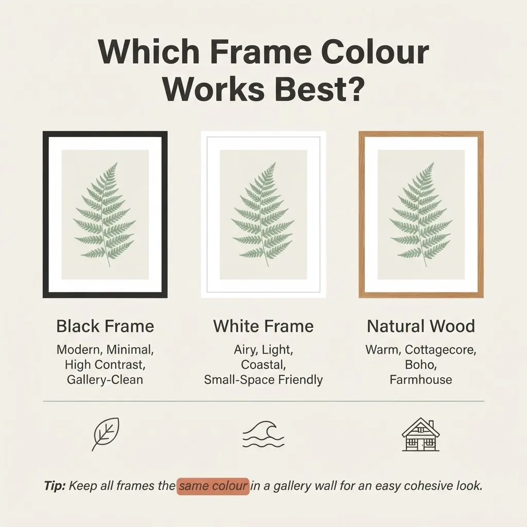
Frame choice makes or breaks a botanical print, and there are really only three directions worth considering for most spaces.
Black frames give botanical prints a gallery-quality edge. The high contrast between the black border and the typically light background of a botanical illustration makes the image pop clearly. Black frames work especially well in minimalist rooms, modern apartments, and spaces where you want the art to feel deliberate and structured. They also hide dust and smudges better than white frames, which is a practical point worth making.
White frames make a room feel lighter and airier. On a white or off-white wall, a white frame lets the print breathe without creating a hard boundary, which works beautifully in small rooms because it keeps things from feeling visually heavy. White frames are the natural match for coastal, Scandinavian, and modern-casual styles.
Natural wood frames (honey, walnut, or light oak tones) are warm and versatile. They feel at home in cottagecore, boho, farmhouse, and transitional spaces. If your room has warm wood tones in the furniture already, a matching wood frame pulls the whole room together in a way that feels cohesive without trying too hard. You can mix light and medium wood tones freely; they tend to live happily together.
The one frame style I would be honest about skipping: the cheap gold-toned plastic ornate frame.
It reads as trying to be vintage without succeeding. If you want a gold-adjacent warm metal, look for matte or brushed brass, which is a different thing entirely.
A note on mats: For smaller prints (anything under 11×14 inches), a mat makes a real difference. A 1.5-to-3-inch white or off-white mat border gives the image visual breathing room and makes a modest print look like something you thought carefully about. Prints that fill a frame edge-to-edge in small sizes can feel cramped. A mat fixes that.
A note on glazing: If you are hanging prints anywhere near a window, UV-protective glass or acrylic matters. Standard glass transmits enough UV light to fade inks over time, sometimes within a couple of years in a sunny room. UV-filtering glazing extends the life of your prints significantly. It costs more, typically $20 to $50 more on a frame, but it is worth considering for any print you love and plan to keep long-term. For a budget set that you expect to swap out seasonally, standard glass is fine.
How to Hang Them Without Damaging Your Walls
This is the section renters need most, and it is where I have the most experience.
Command Picture Hanging Strips are your foundation. According to the official 3M Command weight limits guide, Small strips hold 1 pound per pair, Medium strips hold 3 pounds per pair, and Large strips hold 5 pounds per pair. A typical 8×10 framed print with basic glazing weighs roughly 1 to 2 pounds. A 16×20 framed print can run 3 to 5 pounds depending on the frame and glass. Match your strip size to the actual weight of the framed piece, not just the frame size. When in doubt, use the next size up. They remove cleanly when you pull the tab slowly and straight down, which is the key step most people rush and regret.
Picture ledges are another excellent option. A picture ledge (like IKEA’s MOSSLANDA, which installs with just two screws) lets you lean and layer prints without committing to individual hanging spots for each frame. You can rearrange, swap prints seasonally, and add small plants or objects between frames without any additional wall marks. The trade-off is that ledges do require two screws per shelf, so check your lease on that point.
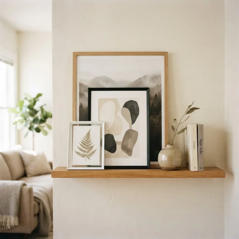
Leaning works better than people expect. A large framed botanical leaning against a wall on a console table, bookshelf, or dresser looks intentional and relaxed. It is also completely commitment-free. This is one of my favorite approaches for a bedroom: one large botanical print leaning on a dresser, with a small plant or candle in front of it, creates a vignette that looks styled without any hanging at all.
Hanging height: The standard that galleries and museums use is to hang the center of the artwork at 57 inches from the floor. Apartment Therapy explains this clearly: the 57-inch center point corresponds to the average human eye level, which is why art hung at this height feels naturally comfortable rather than awkwardly high or low. Most people hang art too high. When in doubt, go lower than your instinct tells you.
When you hang art above furniture like a sofa, bed, or console table, drop that rule slightly and instead aim for 6 to 10 inches of space between the top of the furniture and the bottom edge of the frame.
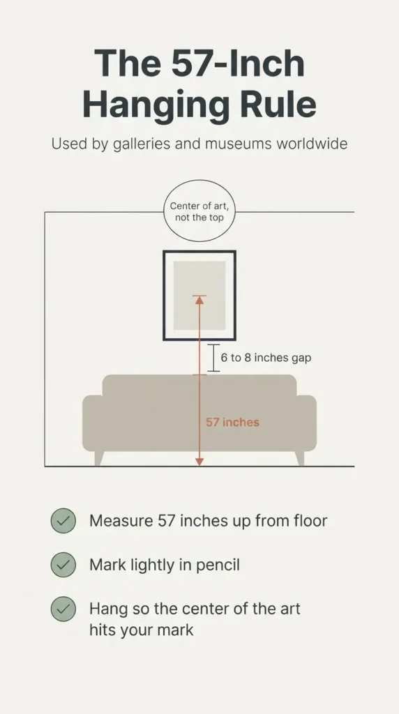
That connection between the art and the furniture below it is what makes the room feel deliberate rather than like someone just put a picture on a wall.
Building a Gallery Wall with Botanical Prints
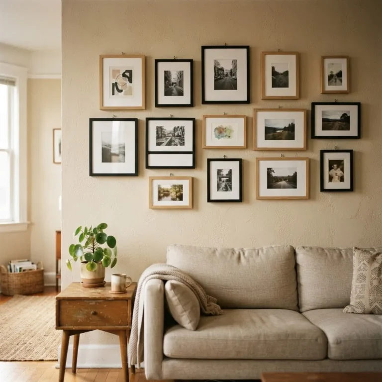
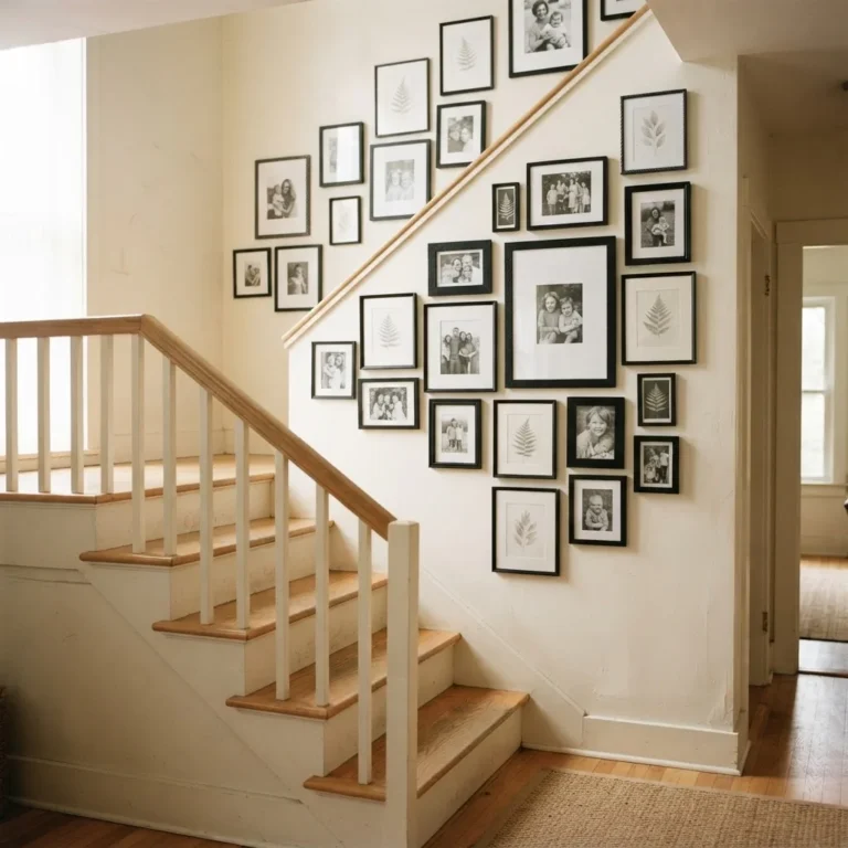
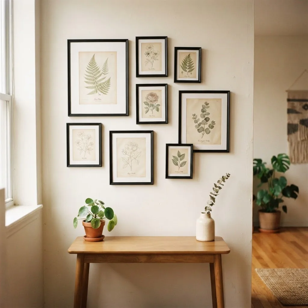
A gallery wall of framed botanical prints is one of the most satisfying things you can put together because the subject matter is cohesive enough to hold the wall without requiring you to match frame sizes perfectly. Here is how to approach it without stress.
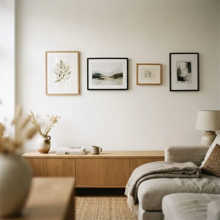
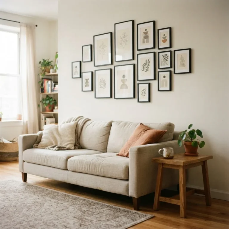
Choose a unifying element and let everything else vary. The easiest approach is to keep all frames the same color (all black, or all white, or all natural wood) and let the print sizes and compositions vary. This creates variety without visual chaos. Alternatively, keep the frames in mixed warm tones (different wood finishes, a little brass) and use the botanical subject matter itself as the unifying thread.
Plan on the floor first. Lay all your frames on the floor and move them around until the arrangement feels balanced. Take a photo of the final layout on the floor before you start marking the wall. This step alone prevents most gallery wall disasters.
Spacing: Mixtiles’ botanical gallery wall guide recommends keeping 1.5 to 2 inches of space between frames for a clean, intentional look. The general rule cited across most design references is 2 to 3 inches between frames. Tighter spacing (1 to 2 inches) looks dense and intentional. Looser spacing (3 to 4 inches) feels casual and relaxed. Both work; just keep the spacing consistent once you pick a distance.
Anchor the gallery at 57 inches. Treat the whole grouping as one large piece and aim for the visual center of the overall arrangement to sit at 57 inches from the floor. Then build the rest of the frames outward from that center point.
How many prints? For a small rental wall (think: the wall behind a sofa or above a dresser), a grouping of 3 to 6 prints is usually enough. More than 6 prints starts to need a very deliberate composition to avoid looking crowded. For a larger or open wall, 9 to 12 prints in a structured grid can be striking and feels very organized, which reads as intentional rather than haphazard.
Room by Room: Where Botanical Prints Work Best
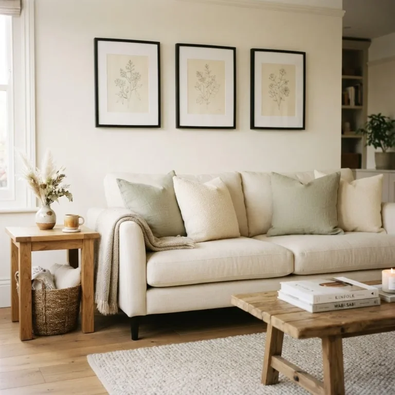
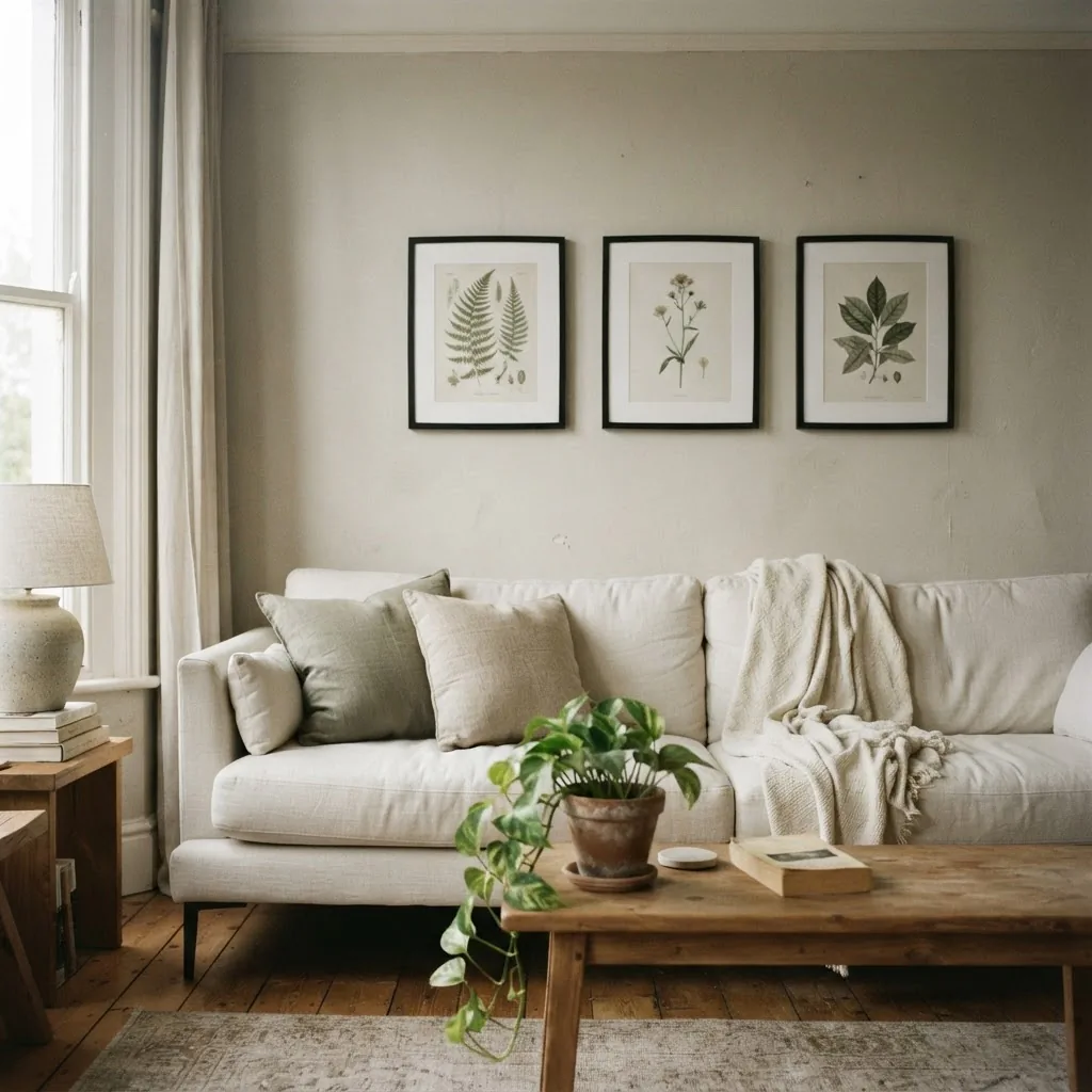
Living room: Above the sofa is the classic spot, and for good reason. A row of three matching botanical prints in identical frames centered above a sofa is one of the simplest and most effective arrangements in home decor. Space them evenly and hang them at the same height with the center of the grouping around 57 inches from the floor. For a more relaxed feel, a loose cluster of different-sized botanicals works just as well. Avoid hanging them too high; the gap between the bottom of the frames and the sofa back should be no more than 8 to 10 inches.
Bedroom: A single large framed botanical above the headboard makes the bed feel anchored and finished.
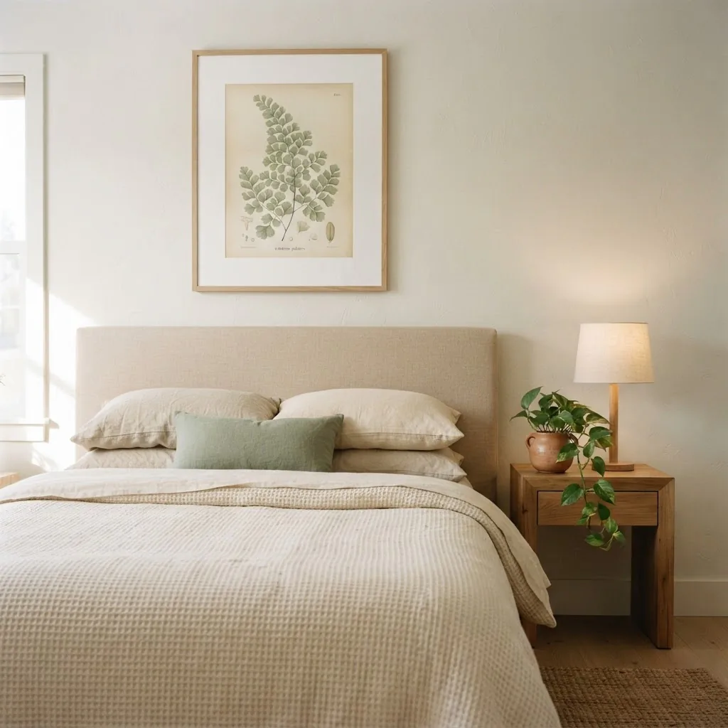
Size matters here: the art should be roughly two-thirds the width of the headboard for good visual proportion. If one large print is outside your budget, two matching medium prints hung side by side at the same height achieve the same effect.
Bathroom: Botanical prints in a bathroom look genuinely beautiful and feel like a small luxury. Use them in well-ventilated bathrooms and choose a frame with acrylic glazing rather than glass, since acrylic is lighter and holds up better in moisture-variable environments. A single 5×7 or 8×10 botanical in a nice frame on a bathroom wall is one of the cheapest ways to make a rental bathroom feel intentional.
Entryway: A pair of slim matching botanical prints flanking a mirror or hung vertically in a narrow entry creates a sense of arrival that punches well above its price. Even in the smallest entryway, two 5×7 prints in matching frames add enough detail to make the space feel complete.
Kitchen: Herb and edible plant illustrations are a natural fit here. Rosemary, basil, sage, thyme, and lavender prints feel at home in a kitchen without needing any theme-y justification. Keep the frames simple and the colors muted so they read as considered rather than novelty.
Styles and Which Botanical Prints Fit Them
If you are working within a particular aesthetic, here is a quick honest guide:
Cottagecore: Loose watercolor florals, pressed flower illustrations, and antique hand-colored plates all feel right at home here. Warm wood frames or thin gold frames work better than black. Layer different sizes and do not worry about exact matching.
Minimalist / Scandinavian: Clean line-art botanicals, single-stem illustrations in white space, or monochrome fern prints in black frames on a white wall. Keep it simple. One or two well-chosen prints beats a crowded gallery.
Coastal: Seaweed illustrations, coral studies, shell drawings, and soft watercolor leaves in white or whitewashed frames. Stick to a soft palette: whites, sage greens, dusty blue, and sand tones.
Boho: Layering and mixing is the point. Different frame sizes, different warm tones, and botanical subjects that range from tropical leaves to dried botanicals to abstract plant forms. This is the style where you can lean into gallery walls most freely.
Modern farmhouse: Black and white botanical illustrations in simple black frames, or antique-style engravings in warm wood frames. Pairs beautifully with shiplap-look walls and natural fiber textiles.
Honest Worth-It / Skip-It Notes
Worth it: Spending a few extra dollars on a frame with a mat opening rather than no mat. The difference in how a small print looks is significant.
Worth it: UV-protective glazing for any print you genuinely love and plan to keep near a window.
Worth it: Printing a beautiful free image from the Biodiversity Heritage Library’s Flickr collection rather than buying a mediocre pre-framed set for $15. The public domain images are genuinely extraordinary. Better quality, no cost.
Skip it: Oversized ornate gold plastic frames on delicate botanical prints. The frame competes with and overwhelms the image.
Skip it: Very small framed sets (4×6 or smaller) on large empty walls. They look lost. Either scale up or cluster multiple small prints together so they read as a group.
Skip it: Hanging botanical prints in direct, unfiltered sunlight without UV protection.
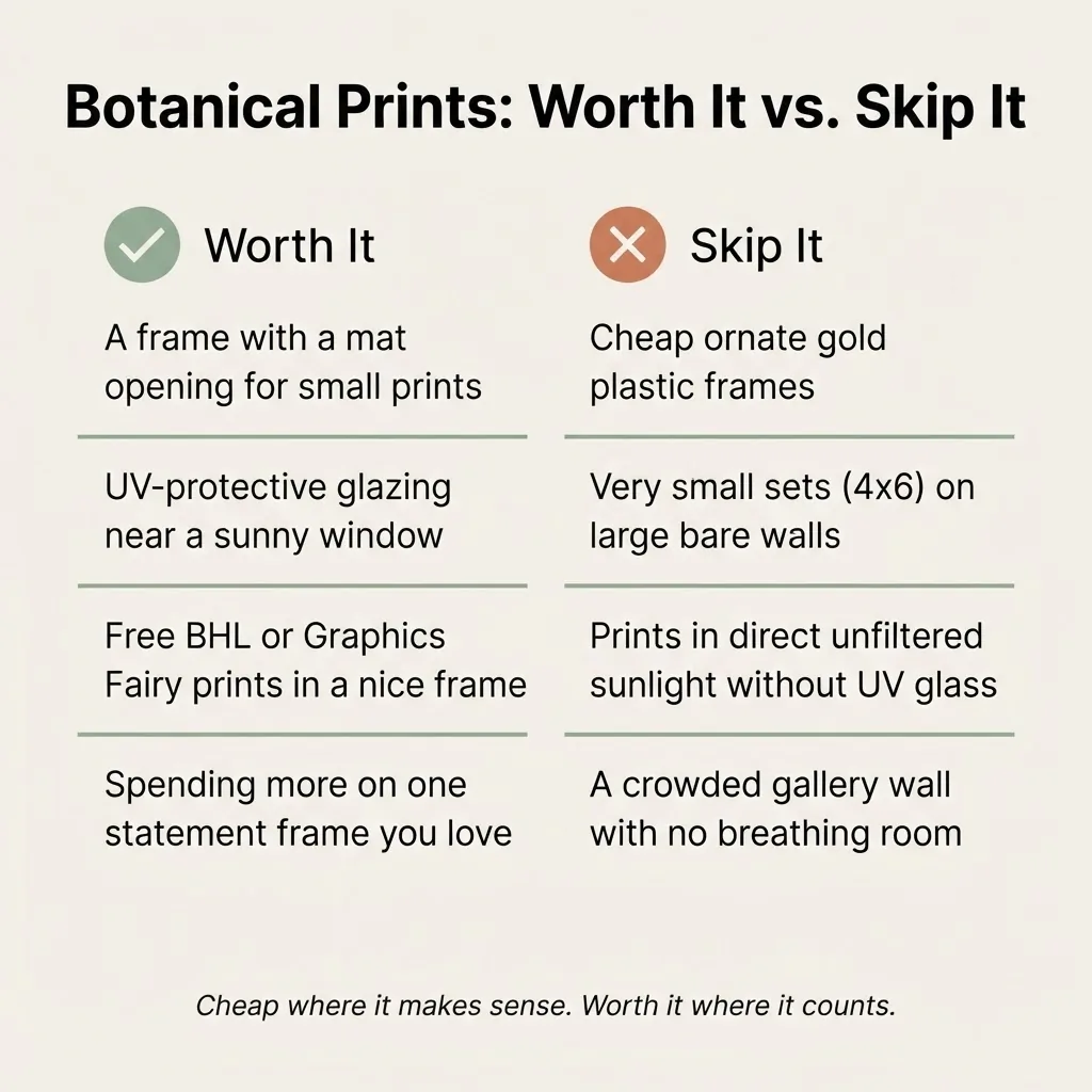
They will fade faster than you expect, especially watercolor-style prints with softer ink saturation.
A Final Thought on Seasonal Swapping
One of the nicest things about framed botanical prints is that they make seasonal decorating genuinely easy. If you have a frame you love, you can swap the print inside it for almost nothing. Spring might call for soft florals and watercolor ferns. Fall might mean rich mushroom illustrations or pressed leaf studies. You keep the frames on the wall and change only the paper inside. This is decorating the way it should be: low cost, low effort, and reversible.
If you have been staring at a blank wall wondering where to start, this is a good answer. A few botanical prints, some Command strips, and a clear sense of where you want to hang them is genuinely enough to change how a room feels