Framed Wall Art Ideas for Renters Who Want Their Deposit Back

There is something about a blank rental wall that messes with your head. You know you want art up there. You probably even have something in mind. But the lease is sitting in your brain like a tiny landlord, whispering “no holes, no damage, full deposit required,” and so the walls stay bare and the apartment keeps feeling like a furnished limbo instead of a home.
I spent years in that same stuck place. Most of my adult life has been lived in rentals, the kind with white walls I was not allowed to touch and clauses I actually read because I needed that money back. And what I learned, slowly and through a fair amount of trial and error, is that the “no holes” constraint is actually less limiting than it feels. You just need to know which approaches genuinely work, which ones are a waste of money, and how to style what you put up so it looks intentional rather than makeshift.
This guide is for renters who want real framed art on their walls, not just posters tacked with putty or tiny prints that get swallowed by empty space. Here is what actually holds, what looks good, and how to pull it all together.
Before You Touch Anything: The Two Questions That Save You Money
Before you buy a single frame or strip of adhesive, stop and answer two questions. First: what does your lease actually say? “No holes” and “no damage” are not the same thing. Some leases allow small nail holes under a certain size and simply require you to fill and touch up before leaving. If yours does, a thin-wire picture hook leaves a hole barely wider than a sewing pin and can hold a surprising amount of weight. It is worth knowing this before you buy twenty dollars worth of adhesive strips you didn’t need.
Second: what are your walls made of? Adhesive products work differently depending on the surface. They perform best on smooth painted drywall. Textured walls, fresh paint (under 7 days old), wallpapered walls, and high-humidity areas like bathrooms and kitchens are all situations where adhesives are less reliable. Knowing your surface lets you pick the right tool from the start.
Adhesive Strips: What They Actually Hold (and What They Don’t)
Adhesive picture hanging strips are the go-to solution for renters, and for good reason. When used correctly on the right surface, they hold well, remove cleanly, and leave walls intact. But the “when used correctly” part is doing a lot of work in that sentence, and most people skip it entirely.
The weight limits matter and they vary significantly by product. According to Command’s official weight limits guide, their small picture hanging strips hold up to 1 lb per set, medium strips hold up to 3 lbs, large strips hold up to 4 lbs, and their jumbo/heavyweight version holds up to 16 to 20 lbs when you use the full set of four pairs. That large-strip range covers frames up to 24 x 36 inches. This matters because a lot of renters grab whatever is on sale without checking the weight, then wonder why the frame ended up on the floor at 2 a.m.
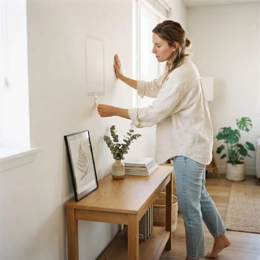
Surface prep is also non-negotiable. You need to wipe the wall with rubbing alcohol before applying, then press each strip firmly for 30 seconds, and wait a full hour before hanging anything from them. Wirecutter’s guide to using Command strips is worth reading before your first application because it covers exactly why most failures happen, including skipping the wait time and applying them to surfaces that aren’t actually compatible. Some adhesives need even longer than an hour to bond, and rushing that is how frames end up falling.
The honest tradeoff: adhesive strips work very well for lighter frames under about 8 to 10 lbs and on smooth painted walls. For heavier frames, glass-front prints, or textured walls, you may want to use a different method entirely. And when it’s time to move out, remove them slowly by pulling the tab straight down (parallel to the wall, not outward), using steady tension. If paint starts to lift, warm the strip gently with a hair dryer for 10 to 15 seconds first.
Worth it: Adhesive strips for frames under 8 lbs on smooth walls. Absolutely. Skip it: Using one pair of small strips on a heavy glass-front frame and hoping for the best.
Picture Ledges: The Smartest Thing in a Renter’s Arsenal
If you only do one thing from this article, let it be this: get a picture ledge or two.
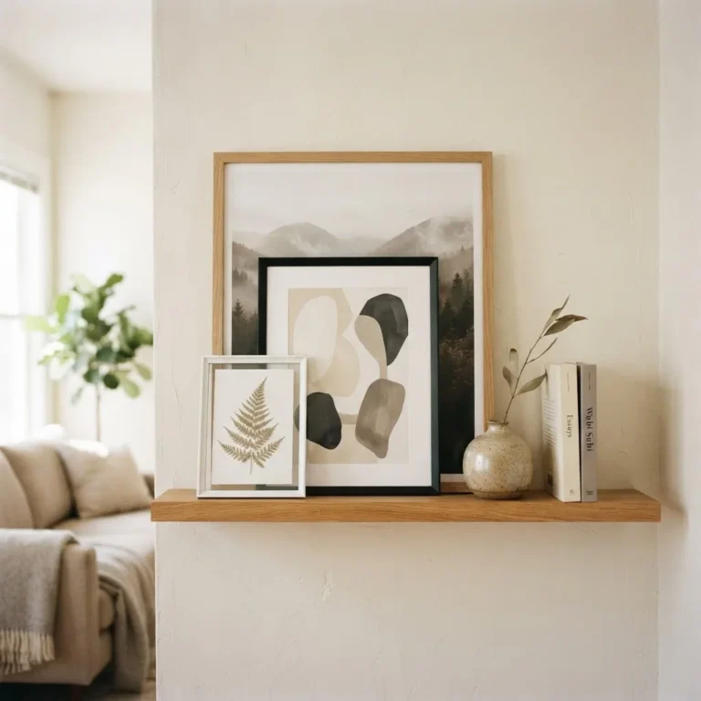
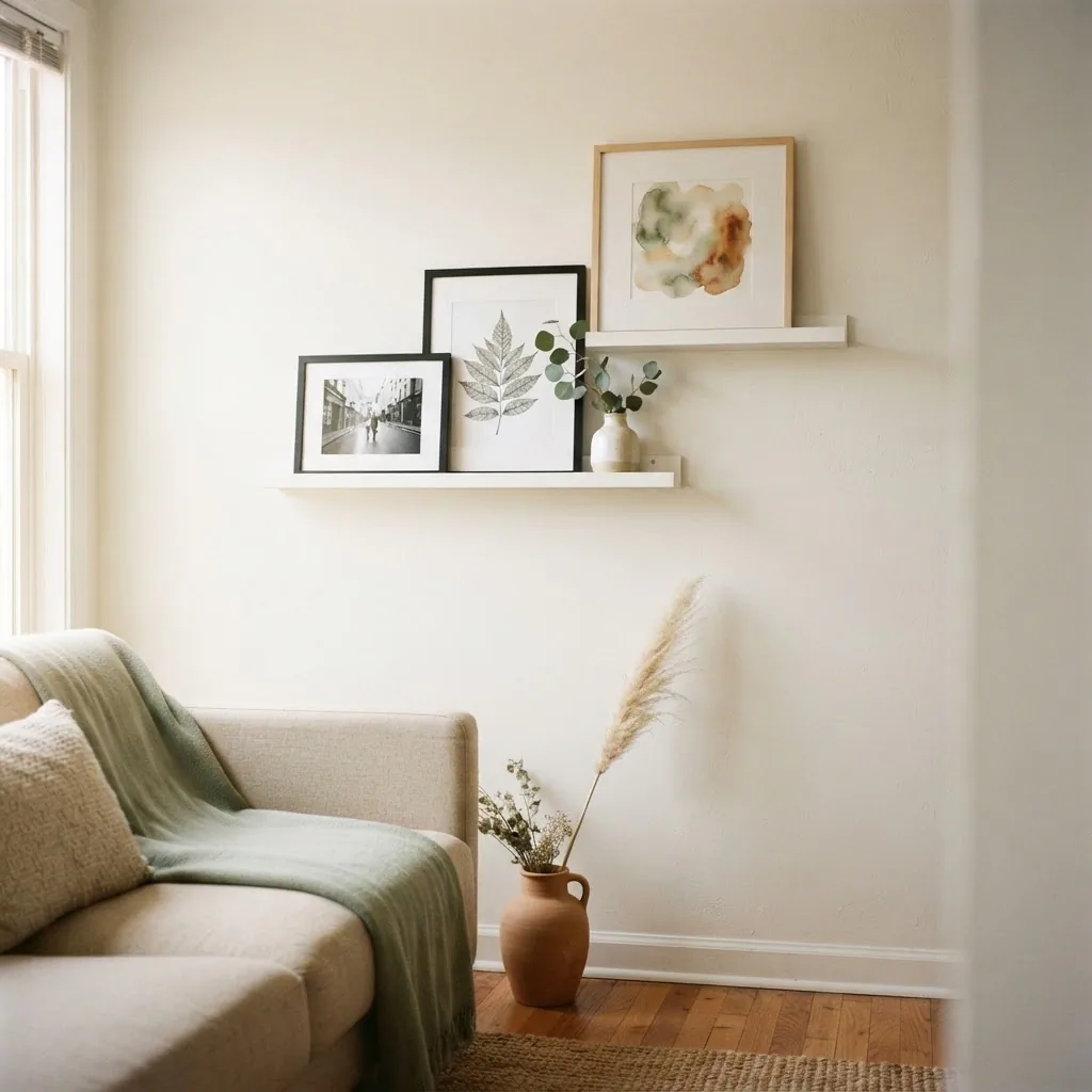
A picture ledge is a narrow wall-mounted shelf with a small front lip that holds frames upright. You drill it in once (or in some rentals, mount it with heavy-duty adhesive if your lease is strict), load it with as many frames as you want, swap them out whenever the mood strikes, and never have to make a new hole for each new piece. It is the most flexible, lowest-damage, highest-impact way to display framed art in a rental.
The IKEA MOSSLANDA picture ledge is the one I point renters toward again and again. It comes in a 21¾-inch version for about $8 and a 45¼-inch version for about $12, in white, black, and walnut-effect finishes. The groove built into the shelf holds frames in place, and the front rail keeps them from sliding forward. You get the look of a styled gallery wall without committing a single frame to a single spot permanently. If you need to patch and paint before you leave, you’re patching two small screw holes for one ledge instead of twelve individual holes for twelve individual frames.
For styling a ledge: start with your largest frame first and work outward. Vary frame heights so nothing looks like a flat parade. Lean frames at a very slight angle rather than perfectly vertical for a more relaxed look. Add one or two small non-frame objects, a small plant, a ceramic figure, a candle, to break up the repetition without cluttering. Leave a few inches of breathing room at each end of the ledge rather than cramming frames edge to edge.
If you want the gallery wall feeling across a larger wall, two or three ledges staggered at different heights give you that layered look without any individual piece being permanently committed.
The Leaning Approach: Bigger Than It Sounds
Leaning art against the wall is one of those things that sounds lazy until you see it done well, and then you realize it might be the most relaxed, deposit-proof approach in existence. A large frame leaned against a wall, especially in a corner or behind a sofa, reads as intentional and stylish when the frame is substantial enough to hold its ground visually.
The size matters here. A small 8×10 leaning against a wall just looks like you forgot to hang it. For leaning art to read as a design choice, you want frames that are at least 16×20 inches, and ideally larger. A 24×36 canvas or a large framed print leaned against a console table, a dresser, or directly on the floor behind a low sofa looks considered and calm. You can layer frames of different sizes in front of each other for depth and a curated feel.
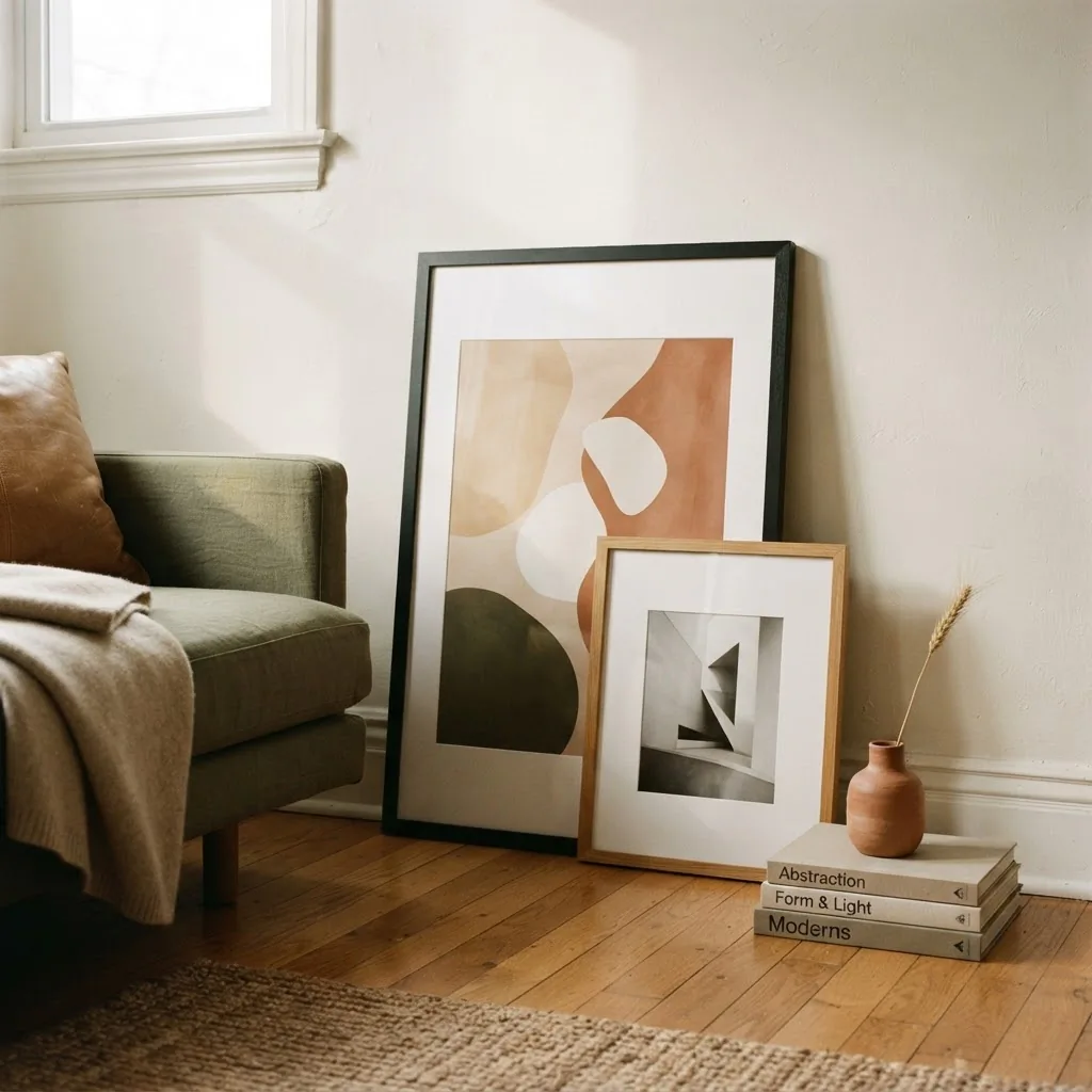
Leaning art works especially well in these spots: behind a sofa against a long wall, on a fireplace mantel or shelf, on a console table in an entryway, and along a wide windowless hallway wall. The only maintenance requirement is dusting the back of the frame and making sure it doesn’t warp in humidity over time (wood frames on exterior-facing walls can shift seasonally).
Getting the Height and Scale Right (This Is Where Most People Go Wrong)
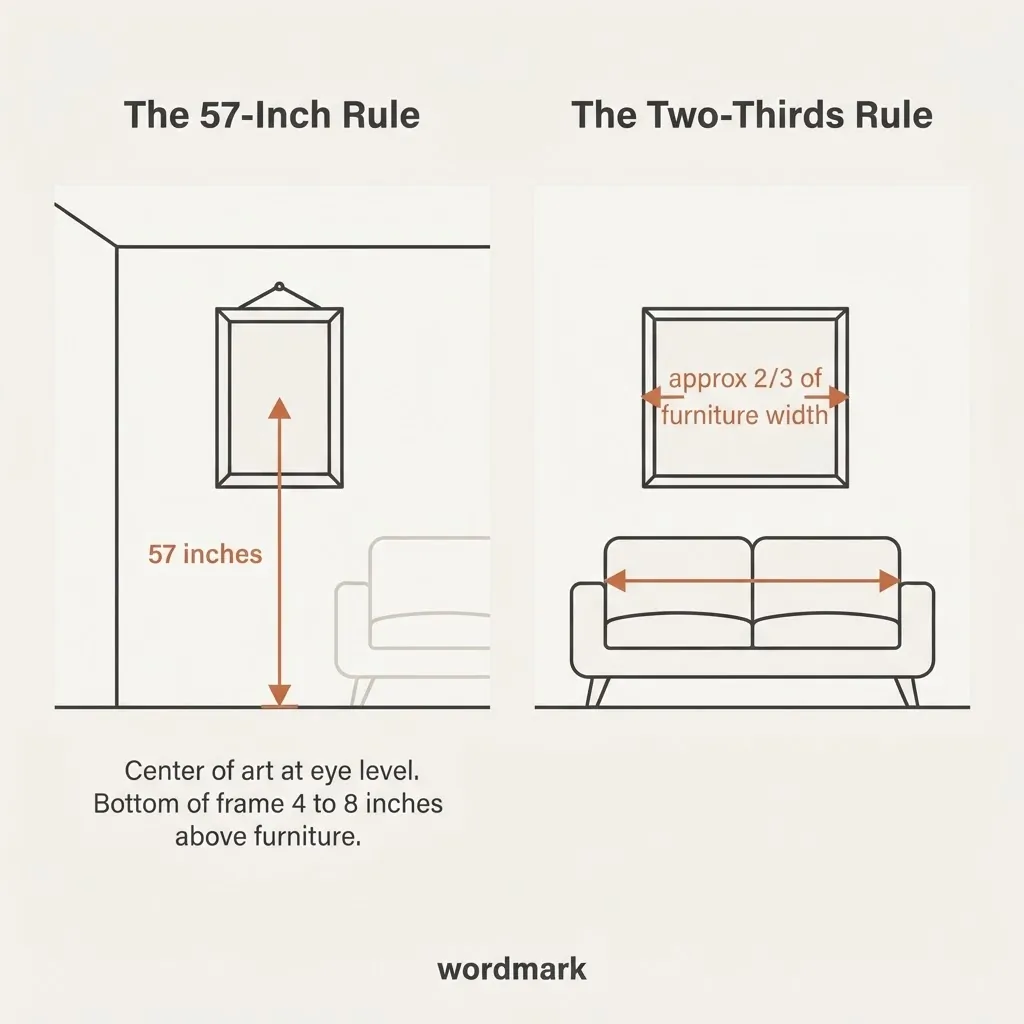
This is the part that separates “looks like I just put something up” from “looks like I knew what I was doing.” And the good news is that it comes down to two simple numbers.
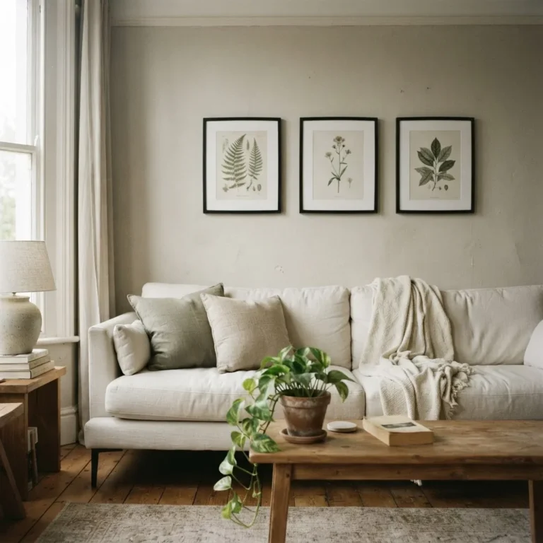
The first is 57 inches. Art galleries and design professionals consistently use 57 inches from the floor as the center-of-artwork standard, because it aligns with average human eye level. When the center of your piece sits at 57 inches from the floor, it feels right to most people without them being able to say why. This applies whether you’re using adhesive strips, a ledge, or a nail. When hanging art above furniture, the bottom edge of the frame should sit about 4 to 8 inches above the top of whatever is beneath it, sofa, bed, dresser, so the art and furniture read as related rather than floating independently.
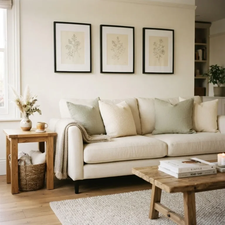
The second is the two-thirds rule. Art above a piece of furniture should span roughly two-thirds the width of that furniture. A sofa that is 84 inches wide looks best with a piece (or a grouping) that is approximately 56 inches wide. Too small and the art looks lost; too large and it overwhelms. This rule applies equally to a single large piece and to a gallery wall arrangement read as a whole. Artfully Walls has a clear breakdown of how to apply the two-thirds rule if you want to work through the math for your specific wall.
For small apartments specifically: resist the instinct to go small with art because the space is small. A single larger piece, 18×24 or bigger, reads more calmly and confidently in a small room than a cluster of tiny prints that create visual noise. One well-chosen piece at the right scale can make a small room feel more settled, not more cramped.
21 Framed Art Ideas for Your Rental (By Situation)
Rather than a flat list, here are ideas grouped by the real-life scenario you might be in.
When you have one blank wall and don’t know where to start
Start with a single piece, not a gallery. Find one print or photo you genuinely love, frame it in a size that’s at least 18×24 inches (bigger if the wall is wide), and center it at 57 inches from the floor using your preferred no-drill method. That one move changes the whole room. You can always add more later, but starting with one gets you out of the paralysis of planning the perfect arrangement before you’ve done anything at all.
When you want a gallery wall without a hundred holes
Mount one or two IKEA Mosslanda ledges in a staggered arrangement and layer your frames on them. Mix portrait and landscape orientations. Keep a consistent frame finish (all black, all natural wood, all white) so the different print styles feel cohesive rather than chaotic. You can add and swap pieces whenever you want without touching the wall again.
When you want a gallery wall on adhesive strips
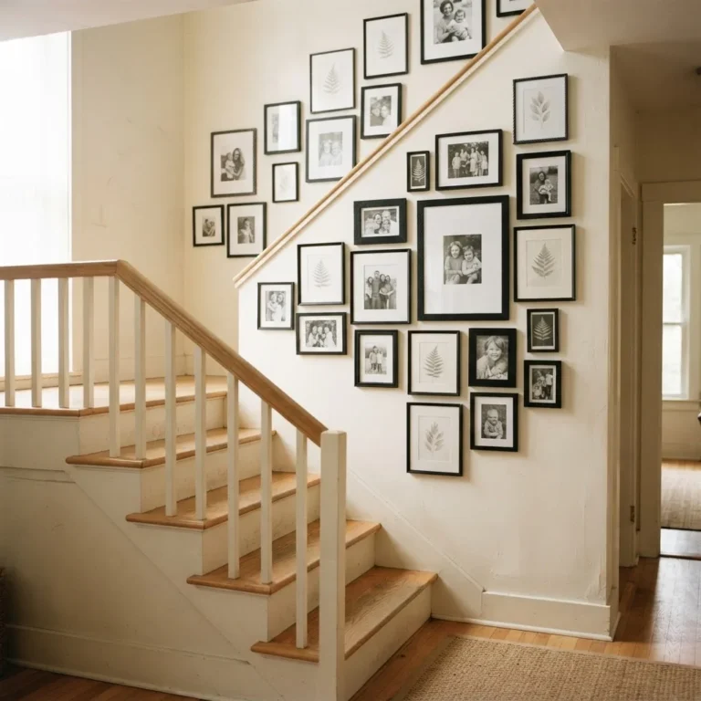
Map your arrangement on the floor first. Lay the frames out on the floor in the configuration you want, measure the overall shape, and transfer those positions to the wall using small pieces of painter’s tape as placeholders before you commit any adhesive. Keep frames 2 to 3 inches apart. Use the appropriate strip size for each frame’s weight, and remember that the total weight is shared across all the strip pairs you apply.
When you love the look of a studio apartment with art everywhere
Use a combination of methods: one or two ledges for smaller rotating prints, one larger leaned piece in a corner, and a single statement piece on adhesive strips above the sofa or bed. The variation in display method actually adds to the layered, collected feeling you’re going for.
When you’re working with a really small wall (entryway, hallway, above a desk)
A vertical stack of two to three matching frames (same finish, consistent spacing of about 3 inches between them) reads as intentional and fills vertical space without needing width. Or try a single horizontal format print, 24×12 or similar panoramic proportions, which works beautifully in narrow spots.
When you’re renting furnished and hate the landlord art that’s already there
Take it down, store it safely, and replace it with your own. Just keep careful track of where everything came from and put it all back before you leave. Most furnished rentals expect reasonable wear; swapping wall decor is usually fine as long as you restore it.
When your walls are textured and adhesive strips won’t work reliably
This is when leaning art becomes your best friend. Stick entirely to the ledge and leaning approach. Textured walls are genuinely unreliable for adhesive products, and no amount of extra strips will fully fix that. Working with the constraint rather than fighting it is a better use of your energy and money.
Frame Choices That Look More Expensive Than They Are
The frame does as much work as the art inside it, and this is an area where budget and non-budget options genuinely differ in visible quality. A few things to know:
Black metal frames with a simple flat profile look clean, modern, and expensive even at low price points. They work across boho, minimalist, and coastal styles without effort. For minimalist rooms especially, a consistent set of black frames turns even free printables into something that looks curated.
Natural wood and light honey-toned frames add warmth without heaviness. These work beautifully for cottagecore, boho, and softer coastal aesthetics.
Thrift store frames are almost always worth buying if the frame itself is solid and the profile is simple. The glass is often the best part of a thrifted frame. You can replace whatever is inside with a new print for a few dollars and end up with a piece that looks like it cost ten times what you paid.
White frames and very ornate gold frames are where I’d urge the most caution on a budget. White frames show scuffs and chips quickly, and a single chipped white frame in a gallery arrangement drags the whole thing down.
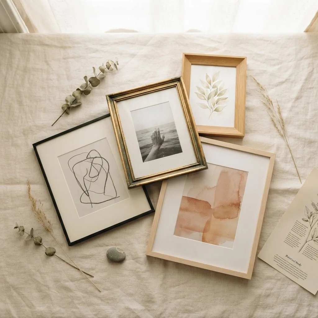
Heavy ornate gold frames are hard to make feel modern and can tip into looking costume-y rather than classical unless the rest of the room is already leaning very traditional.
Mat or no mat? A mat (the border between the print and the frame) makes a piece feel more finished and gallery-like. For photography, botanical prints, and any artwork with fine detail, a mat is worth it. For bold graphic prints or typographic art, no mat often looks sharper.
By Style: What to Put in the Frame
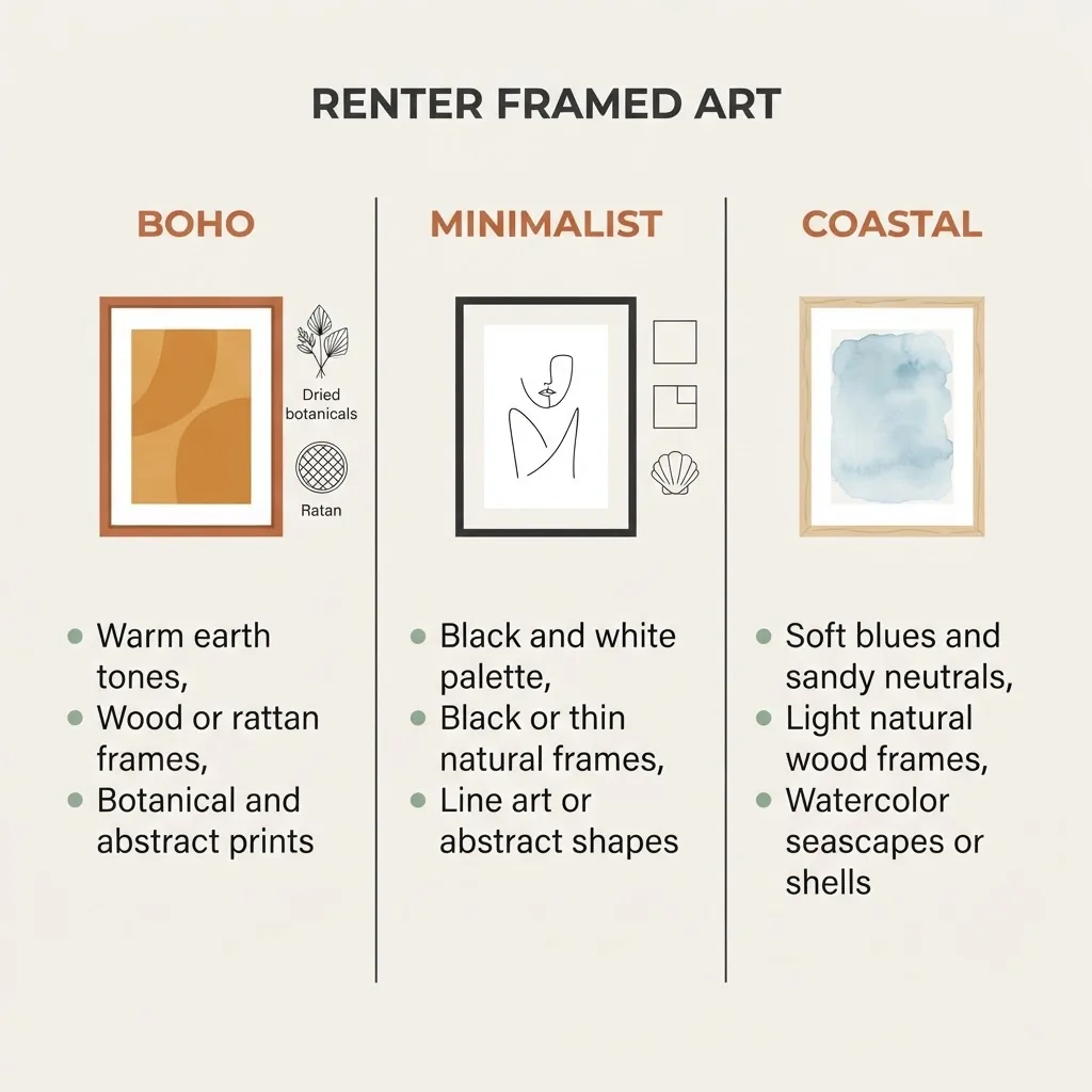
Minimalist: Line art, abstract shapes in one or two colors, black and white photography, botanical outlines. Frames in black or thin natural wood. No mats in busy patterns.
Boho: Warm-toned landscapes, abstract earthy pieces, woven textile prints, sun and moon imagery, dried botanicals behind glass. Frames in warm wood tones, rattan, or simple natural finishes.
Coastal: Watercolor seascapes, shell studies, abstract ocean color fields in soft blues and sandy neutrals. Light natural wood or white frames (keep them in good condition).
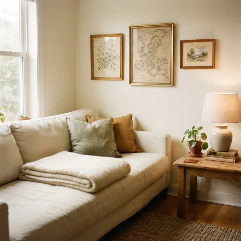
Cottagecore: Vintage botanical illustrations, pressed flower art, soft watercolor florals, old maps. Ornate but not heavy frames in aged gold or painted-wood finishes work here.
Modern/contemporary: Bold abstract prints, typographic art, oversized single-color photographs. Simple frames that do not compete with the art itself.
For budget print sources, Etsy sellers offering digital downloads are a genuinely great option.
You pay a few dollars for the file, print it at a local copy shop or at home, frame it yourself, and end up with something you actually love for under fifteen dollars total.
The Move-Out Plan (Because Future You Will Be Grateful)
Build your exit strategy into the way you hang things from day one. Keep a note, physical or digital, of exactly what adhesive products you used and where. Before you leave, use the slow-pull method to remove strips (pull the tab straight down, not outward), warm with a hair dryer if any resistance, and clean any residue with rubbing alcohol and a soft cloth. For any screws used for ledges, fill the holes with a bit of spackle, let it dry, sand lightly, and touch up with the closest paint you can match. Most hardware stores will mix a small sample size for you if you bring in a chip.
Taking photos of every wall before you hang anything and after you remove everything gives you documentation if any deposit disputes arise.
It is a ten-minute step that has saved more renters more money than any single decorating tip I could give you.
A Few Honest “Worth It / Skip It” Notes
This is the part where I give you the unvarnished version.
Worth it: A set of two IKEA Mosslanda ledges. Even if you have to drill two small holes each, the flexibility you get is worth every penny and every patch on the way out.
Worth it: Buying the correct weight of adhesive strip for your frame rather than grabbing the cheapest ones. A frame falling off the wall at 3 a.m. is not a budget win.
Worth it: One or two larger, nicer frames from a thrift store or a brand with good construction. The frame is what you live with for years.
Skip it: Buying twenty cheap plastic frames to fill a wall quickly. They look like a bulletin board. Go fewer, go better.
Skip it: Washi tape alone to hold up actual framed art. Washi tape is wonderful for mounting lightweight paper prints directly to the wall, but it is not a load-bearing solution for a glass-front frame.
Skip it: Heavy canvas prints in high-humidity rentals where adhesive strips are your only option. Canvas is often lighter than a glass-front frame, which helps. But the adhesive is still fighting humidity every day, and humidity usually wins eventually.
For a thorough comparison of how different adhesive brands actually perform on various wall types before you spend money on them, Consumer Reports tested multiple adhesive strips and hooks for both grip and wall damage on removal, and their breakdown is one of the more honest assessments available.
The Bigger Point
Blank walls in a rental are not inevitable. They are a choice, and often a choice made out of anxiety rather than preference. The tools exist to hang real framed art in a rental space without risking a single dollar of your deposit if you use them thoughtfully. The 57-inch center rule, the two-thirds proportion guide, the right adhesive strip for the actual weight of your frame, a picture ledge that lets you change your mind whenever you want, and a few frames that are worth having regardless of where you live. That is the whole toolkit.
You do not need to own your walls to make them feel like yours. You just need to know what you are working with and make deliberate choices within it. Start with one piece you genuinely love. Put it at the right height. Step back and look. That feeling right there is why it is worth doing.