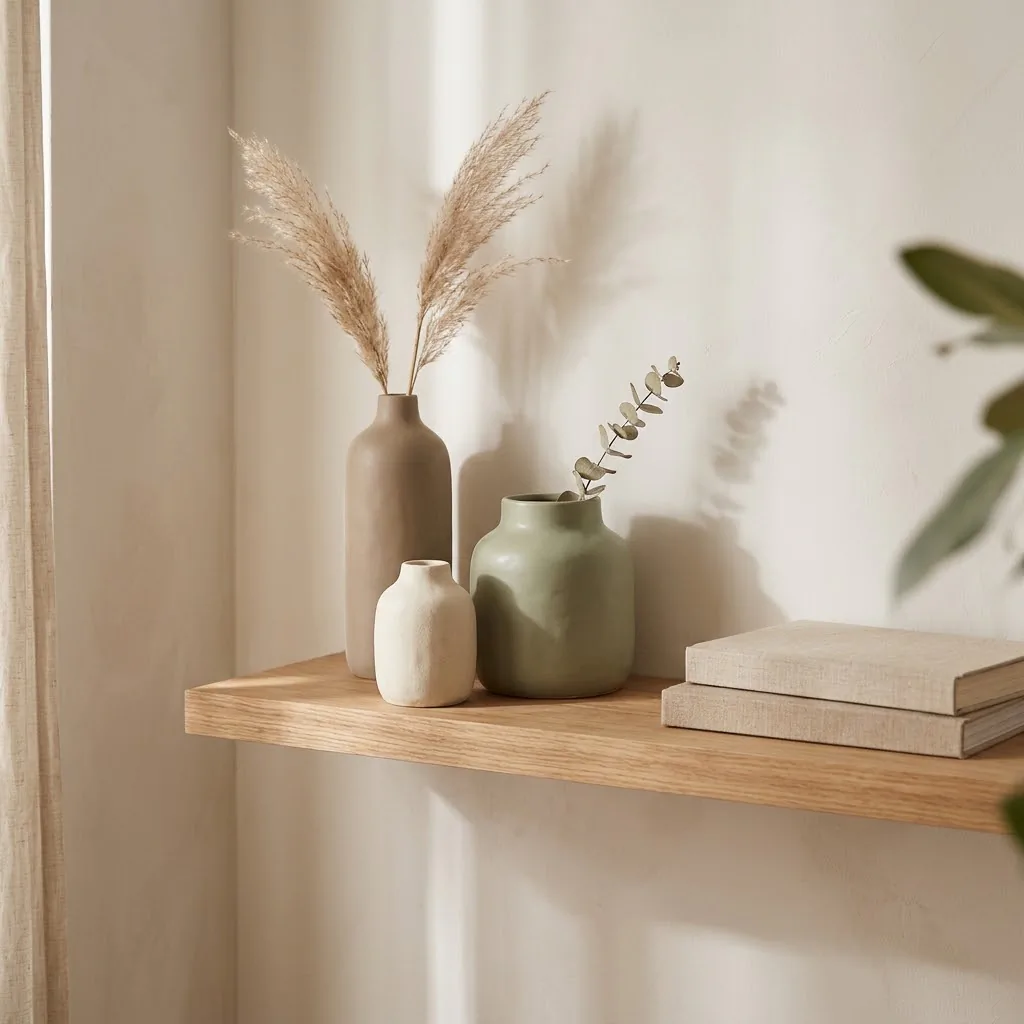
How to Style Ceramic Vases Without It Looking Cluttered

I have a theory about ceramic vases. People buy them because they want that calm, pulled-together look they see on Pinterest, and then the vase sits on a shelf feeling slightly awkward while the room still doesn’t look right. Sound familiar?
The good news is that it’s almost never the vase’s fault. It’s the styling. And styling is something you can learn in about ten minutes, with zero wall damage and no design degree required.
This post is full of specific ceramic vase decor ideas, but more than that, it’s a guide to understanding why some vase arrangements feel peaceful and finished while others just feel like stuff. Once you get that, everything clicks.
Why Ceramic Vases Work So Well for a Calm, Neutral Home
Ceramic vases do something really specific that glass or metal can’t quite replicate: they absorb light rather than reflect it. A matte-finish ceramic vase in cream, sage, warm taupe, or terracotta just sits quietly in a space. It adds weight and texture without demanding attention. For renters and small-space dwellers who can’t repaint walls or add built-in shelving, that quiet visual anchor matters a lot.
There’s also the material itself to consider. Ceramics have been a part of interior life for thousands of years, and part of why they still feel right is because they carry a sense of warmth and handmade quality that factory-finished plastic decor doesn’t. Even a simple, budget-friendly ceramic from Target or Wayfair tends to look more expensive than its price tag because of the matte texture and organic silhouette. That’s a win for anyone decorating on a real budget.
For a calm, neutral home specifically, ceramic almost always outperforms glass for a relaxed, not-trying-too-hard look. You want texture and softness, not shine.
The One Sizing Rule That Changes Everything
Before we get into specific ideas and room placements, here’s the single most important thing I can tell you about ceramic vase styling: scale is everything. The wrong size vase on a shelf doesn’t just look off. It makes the entire surface look wrong.
A general rule that professionals use, and that actually works in real rooms, is this: whatever you put inside the vase (flowers, dried stems, branches) should be roughly 1.5 to 2 times the height of the vase itself.
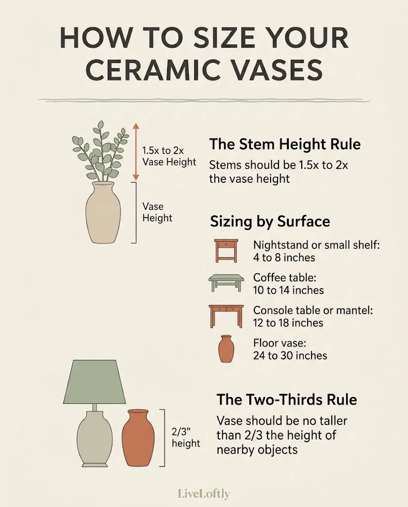
So if your vase is 8 inches tall, your stems or branches should sit 12 to 16 inches above the opening. According to the vase and container styling guide at Saybrook Home, these proportions are what our eyes naturally read as “balanced,” and violating them is usually why an arrangement looks floppy or overpowered.
For surfaces, here’s how I think about it:
A nightstand or a small floating shelf calls for bud vases or small ceramics in the 4 to 8 inch range. A coffee table handles something in the 10 to 14 inch range comfortably, as long as it doesn’t block eye contact across the room when you’re seated. A console table or mantel can take a taller statement piece, 12 to 18 inches, paired with something lower on the side. And a floor vase in a corner or beside a sofa should generally be at least 24 to 30 inches to avoid looking like it got lost.
The Sagebrook Home buyer’s guide for vases and jars puts it plainly: for tabletop pieces, your vase should be no taller than two-thirds the height of the tallest nearby object (lamps, frames) so it sits in proportion rather than competing. That’s a simple check you can do before you even move anything.
The Grouping Principle: Why Odd Numbers Feel So Much Calmer
If you’ve ever placed two identical vases side by side and felt like something was slightly wrong but couldn’t name it, the answer is symmetry. Perfect symmetry reads as formal. It’s why hotel lobbies feel stiff and carefully curated shelves feel relaxed, even when both have nice things on them.
Interior designers rely on what’s often called the rule of threes, or more broadly the 3-5-7 principle. The idea is simple: grouping decorative objects in odd numbers (3, 5, or 7) creates a more natural, organic feel because the eye has to move through the grouping rather than landing on a mirrored pair and stopping. As the 3-5-7 decorating rule explains, odd-numbered arrangements create visual movement and balance that even groupings rarely achieve.
In practical terms for ceramic vase decor, this means:
- On a shelf, try a cluster of three: one tall, one medium, one short. They don’t have to match, but they should share at least one thing, like a similar color family or the same matte finish.
- On a coffee table, a grouping of three feels more intentional than one lone vase. Put one slightly behind the others, not all in a row.
- On a mantel, five works beautifully if you have the length: two larger vessels anchoring the ends with three smaller ones between them at varied heights.
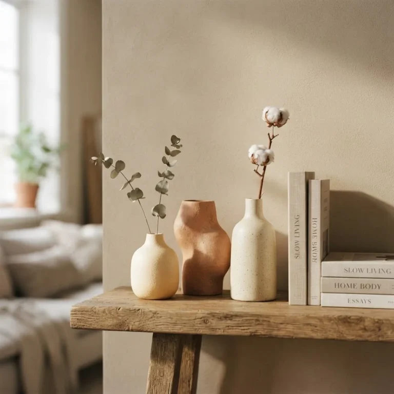
The classic formula for a shelf vignette is: something tall, something sculptural, something grounding. Your ceramic vase usually plays the tall or sculptural role, with a stack of books or a small tray completing the trio. The Shelf Love Co. rule of three shelf styling guide explains this height-shape-texture triangle beautifully: the eye wants to travel up, across, and down, and three objects of different heights make that happen naturally.
17 Ceramic Vase Decor Ideas, Room by Room
In the Living Room
The living room offers the most surface variety, and that’s where most people either nail it or overcrowd it.
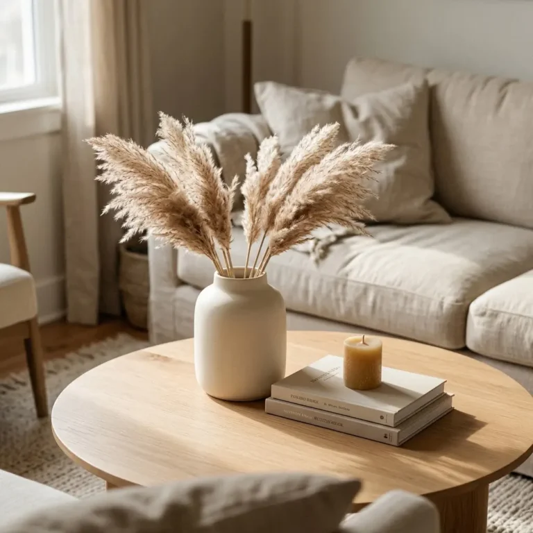
1. The three-vase coffee table cluster. Group a tall narrow ceramic, a shorter squat one, and a small bud vase on a tray. The tray is key. It creates a visual boundary that makes the grouping look intentional rather than scattered.
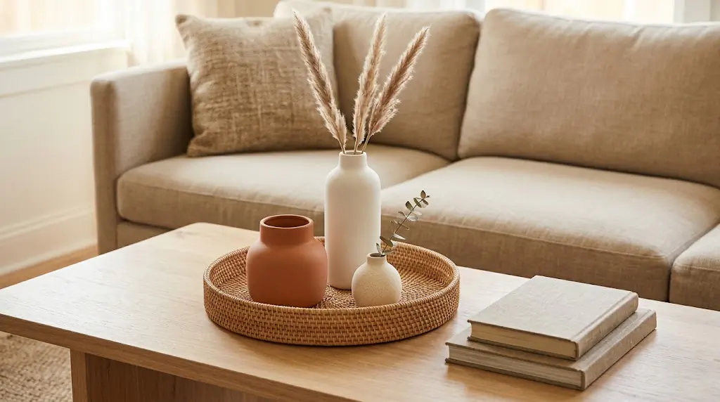
Fill one with dried pampas grass or eucalyptus, leave the smallest one empty, and let the medium one hold a single stem.
2. Console table statement with branches. One taller ceramic vase, 14 to 18 inches, sitting off-center on a console table with a few foraged or bought branches inside is one of the easiest ways to make an entryway or living room wall feel finished. Keep everything else on the table simple: a small candle and maybe a book. The branches do the heavy lifting.
3. Monochromatic shelf grouping. Pick three ceramic vases in different shapes but all in the same color family, cream, warm white, or soft linen tones.
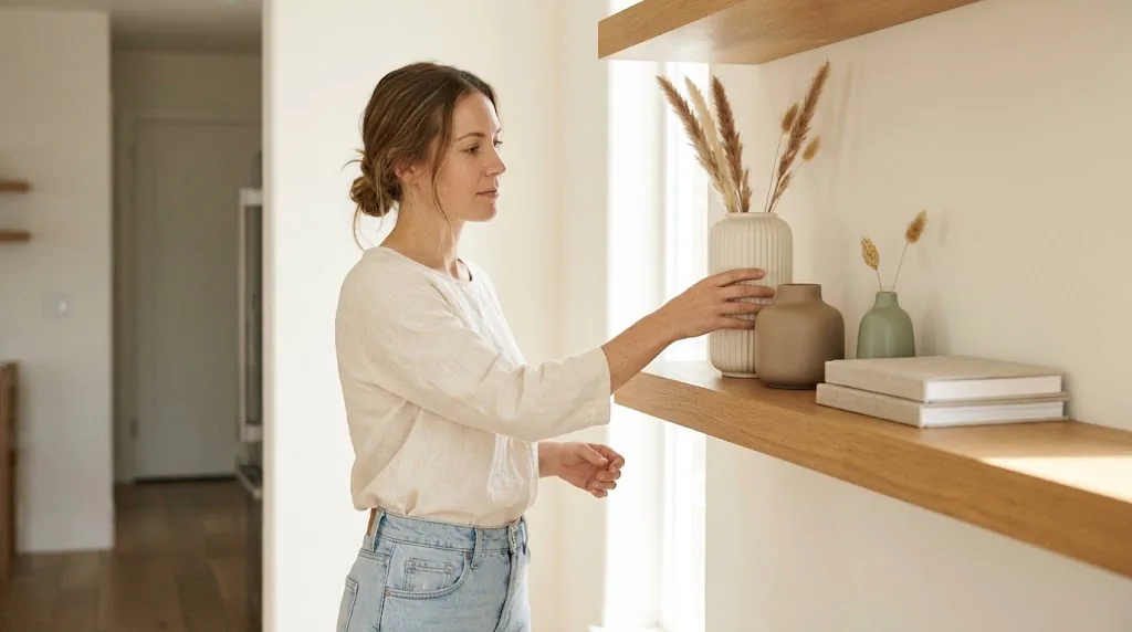
Arrange them at varying heights on a shelf. This works especially well on rental-beige walls because the subtle tonal variation adds interest without creating visual noise.
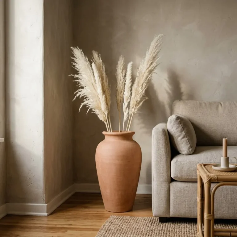
4. A single floor vase in a corner. If you have an empty corner that a plant doesn’t quite fill, a tall floor ceramic in the 24 to 30 inch range with dried pampas grass, tall branches, or nothing at all (if the silhouette is interesting) can anchor the space completely. No wall damage. No commitment. This is one of my favorite rental-friendly moves because it fills vertical space without touching anything.
5. Shelf vignette with a triangle arrangement. Think of your three vases as the points of an invisible triangle: tallest in the back, medium to one side and slightly forward, shortest in front. The Shelf Love Co. triangle formula says your eye naturally follows this shape, creating harmony without effort.
6. Mix ceramics with one natural element. On a media console or low sideboard, pair two ceramics of different heights with a small wooden bowl or a piece of drift wood. The contrast between the smooth matte ceramic and the raw texture of the wood is the thing that makes the whole arrangement feel layered and collected rather than bought-as-a-set.
In the Bedroom
Bedrooms benefit from the quietest, most restrained approach. Less is almost always more here.
7. Single bud vase on the nightstand. One small ceramic bud vase, 3 to 5 inches, with a single dried stem or a small sprig of something from outside. That’s it. It adds softness and organic warmth without crowding your nightstand. In a small bedroom especially, this is the most calming choice.
8. A pair of mismatched ceramics on a dresser. Two is usually the wrong number, but if they’re clearly different (one tall and slender, one short and wide) and share a finish, they can work. Place them slightly off-center rather than perfectly symmetrical, which immediately loosens the formal feeling.
9. Empty ceramic as a dresser sculpture. A beautifully shaped ceramic with an interesting glaze, like one with a crackle finish or a hand-thrown asymmetrical form, needs nothing inside it. Place it on your dresser top alongside your jewelry dish or a candle. It reads as art rather than decor, which is exactly the shift that makes a bedroom feel like it was designed rather than just furnished.
In the Kitchen and Dining Room
10. A small ceramic on the windowsill above the sink. One bud vase with a fresh herb stem or a single flower. Nothing elaborate. This is one of those things that costs almost nothing and makes a kitchen feel genuinely lived in and cared for.
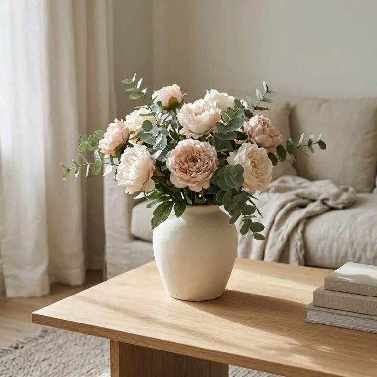
11. A low ceramic centerpiece on the dining table. Keep it low, under 12 inches, so it doesn’t interrupt eye contact across the table. Wide, open-mouth ceramics work well here because they can hold a loose bunch of grocery store flowers without looking forced. If fresh flowers feel like too much maintenance, dried botanicals in an earthy terracotta or stoneware vessel look beautiful on a dining table year-round.
12. A trio of bud vases down the center of a long table. Line up three small ceramics down the center of a rectangular dining table, spacing them evenly. Put a single stem in each. This is easier than one large arrangement and looks more relaxed, which is right for most everyday dining rooms.
In the Entryway
13. Console table layering with a tall ceramic anchor. An entryway console is essentially a stage. Your tallest ceramic, something in the 14 to 18 inch range, goes off-center, paired with a lower decorative object on the opposite side to balance the weight. Homes & Gardens’ guide to decorating with vases notes that a console with decorative vases gives guests an immediate sense of your personal style, and I agree, it’s often the first styled surface anyone sees in your home.
14. The empty-vase-as-sculpture entry moment. If your entryway is tiny (like many rental apartments), one beautifully shaped ceramic on a small table or wall-mounted shelf, completely empty, is the move. Sculptural forms, especially ribbed, faceted, or organic shapes in matte finishes, hold their own without any filler.
In the Bathroom
15. A tiny ceramic on the bathroom counter. Small-space styling applies most in bathrooms. One ceramic bud vase with a small sprig of eucalyptus or a dried stem adds warmth and organic texture to what is often the most utilitarian-looking surface in a rental. This is a $10 to $15 idea that has an outsized effect.
On a Mantel or Floating Shelf
16. A mixed-height mantel lineup. Arrange five ceramics of genuinely different heights along a mantel: two taller statement pieces toward the outside, three smaller ones clustered in the middle at varying heights. Use the same finish throughout (all matte, or all in the same earthy color palette) to tie the lineup together without matching.
17. Seasonal swap, same ceramics. This is more a strategy than a single idea. Buy two or three neutral ceramics you love, and just change what’s inside them by season. Dried pampas in fall and winter, fresh eucalyptus or wildflowers in spring, simple dried lavender in summer. The vases stay. The room refreshes. This is exactly the kind of approach that works well in a rental because you’re not adding to the space, just rotating within it.
What to Put in Ceramic Vases (When You Don’t Want Flowers)
Fresh flowers are beautiful and also short-lived, which makes them a lot to commit to if you’re busy or budget-conscious. Here’s what works just as well or better in many cases:
Dried botanicals are the renter’s best friend. Pampas grass, dried bunny tails, dried wheat, preserved eucalyptus, and dried lavender all look beautiful in a neutral ceramic and require zero maintenance. A single bunch of dried pampas from a craft store typically runs $8 to $20 and lasts indefinitely if kept out of direct sunlight and humidity.

Branches are underrated. A few curly willow branches, dried magnolia stems, or even simple foraged branches from outside fill a tall ceramic vase beautifully and cost almost nothing. For a floor vase, long bare branches have a sculptural quality that’s hard to achieve with florals.
Nothing at all. This one takes confidence but it works. An interestingly shaped ceramic, especially one with a hand-thrown look, an unusual rim, or a matte glaze with depth, is a sculptural object. It doesn’t need a passenger. Leave it empty and trust the form.
Stones and pebbles. Filling a wide, open-mouth ceramic with smooth river stones or pebbles creates a grounded, organic moment on a coffee table or shelf, especially useful if you want the visual weight of a filled vase without the maintenance.
Where to Find Budget-Friendly Ceramics (And What to Skip)
Honest budget ranges to expect: small bud vases in the $5 to $15 range are widely available at Target, TJ Maxx, and Amazon. Mid-size ceramics (8 to 12 inches) run $18 to $40 at most mass-market retailers. A genuinely beautiful handmade-looking ceramic in the $25 to $45 range is achievable if you look at Etsy, HomeGoods, and the clearance sections of most home stores. Floor vases start around $40 for basic options and can run well over $100 for quality pieces with interesting silhouettes.
Thrift stores are one of the best sources for ceramic vases, and I mean this sincerely. You can find vases in interesting shapes at Goodwill and other secondhand shops for $2 to $8, and a coat of matte spray paint (in warm white, sage, or terracotta) can completely transform an outdated glaze into something beautiful. The one thing to know about vintage or secondhand ceramics: if they’re antique, hand-painted in bright orange, red, or yellow, or clearly imported with a crude or irregular appearance, it’s worth noting that the FDA’s guidance on lead-glazed pottery recommends caution, especially if you’re planning to use them for food or beverages. For purely decorative use, the risk is minimal, but it’s good to know, especially if you’re picking up a vintage ceramic vase for a kitchen or dining surface.
For purely decorative ceramics from reputable modern retailers, lead glazing is not typically a concern. But the thrift-store caveat is worth keeping in mind.
The Biggest Mistakes That Make Vase Styling Look Wrong
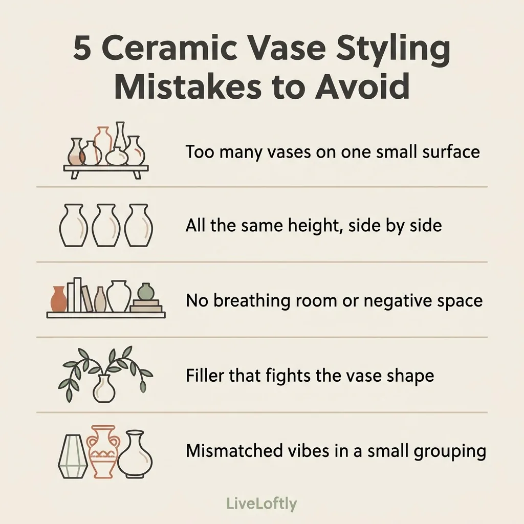
Too many vases on one surface. The most common issue I see is simply too much. Three vases on a small coffee table read as clutter. Two on a tiny nightstand overwhelm the surface.
Scale down before you add more.
All the same height. A row of identically sized ceramics looks like a store display, not a styled home. Mix heights. Always.
Ignoring negative space. The empty space around your vases is part of the composition. If every inch of your shelf is filled, the ceramics disappear into the noise. Leave breathing room.
Filler that fights the vase. A delicate bud vase crammed with a huge pampas bouquet, or a tall narrow ceramic holding a short, bushy bunch that slumps at the lip, both look off. Match your filler to the shape. Narrow mouths want a few stems. Wide mouths want a fuller, looser arrangement.
Mismatched vibes in a small cluster. Three vases on a shelf: one coastal blue ceramic, one farmhouse jug, and one sleek modern matte cylinder. They can all be nice individually, but together they cancel each other out. In small groupings, share at least one thing (color, finish, or material) to make them read as a cohesive choice rather than a random collection.
A Final Note on Making It Feel Like Yours
You don’t need to get this perfect. The goal isn’t a Pinterest grid. The goal is a space that feels calm and genuinely like yours. A ceramic vase you found at a thrift store for $3, sitting with a few dried stems you grabbed from a craft store and placed on a floating shelf: that can be every bit as good as a $200 designer set. Better, actually, because you made it work.
Start with one surface. Get one grouping right. Then let it sit for a week and see how it feels. Good decor is usually more about taking things away than adding more. When in doubt, remove the thing you’re least sure about. The room almost always gets calmer.